About Stacks Guru
Stacks Guru is born from the need to search the vast number of videos out there on stacks built for Stacks Pro and the Stacks 5 plugin for Rapidweaver.
We have scraped over 500 videos to get the transcripts for each in order to make the spoken word searchable.
Please use this free tool to help you learn and discover the awesome power that Stacks and the stacks made for Stacks have to offer.
Stacks Guru
Video Reference
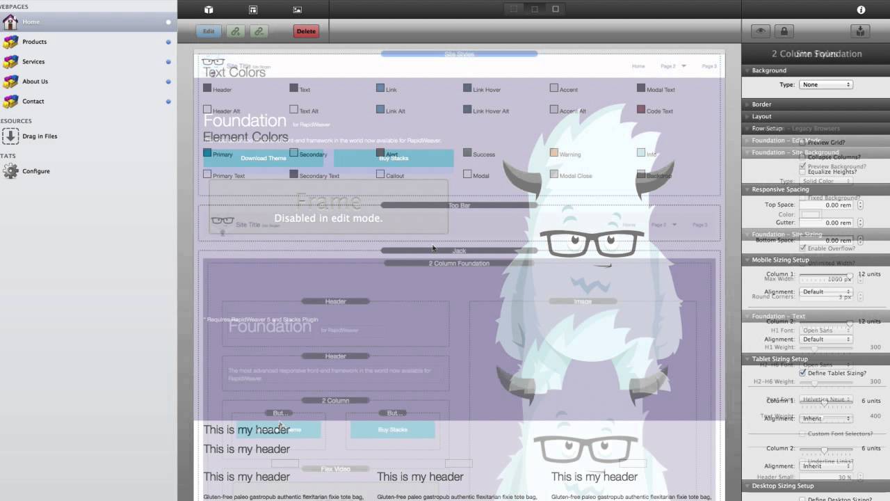
Building the Foundation for RapidWeaver homepage
02/03/2015
This video goes through the entire process of building the Foundation for RapidWeaver homepage. For more info, check out http://foundation.joeworkman.netThis video goes through the entire process of building the Foundation for RapidWeaver homepage. For more info, check out http://foundation.joeworkman.net
Transcript
00:05 hello everyone this is Joe Workman and in this video I thought it would be fun to actually go through and rebuild the00:13 foundation homepage so you can kind of get an idea of the process that I went through to build this page so without
00:21 further ado let's jump on in so the web page that we're going to be building is gonna be the home page for foundation
00:27 and this is the project that is available inside the starter pack disk
00:32 image when you purchase the bundle so if you want to see this exact webpage just
00:37 go ahead and open up the demo project and you can go ahead and freely play with it as much as you want now I'm also
00:45 not going to review all of the settings that are inside every single stack especially site styles and some of the
00:52 others that actually already have detailed explanation videos already done
00:58 for them but this video should give you a general purpose overview of the process to actually build a web page
01:05 using foundation okay so here I have a completely blank project that I'm going
01:11 to create this web page on now luckily I already know my page layout so we're not
01:17 gonna have to worry about that in terms of discovering how you want your page
01:22 layouts to be check out some of the samples we have check out some of the sites other users have created that are
01:28 listed on the forum and in my announcements and just kind of get some inspiration see some websites out there
01:34 chances are you can build something similar to it with foundation so I'm
01:40 gonna quickly just build everything out and then we'll kind of go over each thing that I've done now right now first
01:48 thing I need to do is add site Styles to the page now for this example I'm just
01:53 using the site style stack however um if I were building a site I'd probably be
01:59 using this site Styles global template and like on this page I'm going to be using top bar I'd probably be using the
02:06 top bar global template as well that allows me to make sure that I can have all of those settings replicate properly
02:13 through my entire site but since we're just building this one page for this layout I'm just gonna use these stacks just to
02:19 keep everything kind of clean so I had top bar and then I had a two column
02:26 stack and then I had a header and another header and then I had a to comb
02:32 stack underneath now I'm looking at my other display before as an example so I'm just quickly drag everything out here and then I had an image over there
02:38 and then wouldn't have I had a flex video underneath this to call him and the underneath flux video I had a
02:43 paragraph okay um then so this is my serve as my header then I need my uh my being body content
02:50 so we drag on one column stack out which will be the main content area for my site organ start adding some content in here and I had two headers I had a three
02:58 column stack and the inside the three column stack I had image an image an image and
03:07 underneath those I had a header and a header and a header and then underneath that I had a paragraph and a paragraph
03:14 and a paragraph and underneath this entire three column stack I had another paragraph stack and then below that we
03:21 had a divider okay um so quickly I just I built out at
03:33 least the top kind of part the top section of this page with all the content now let's kind of go over what
03:39 I've done here now let's I'm going to quickly just add in the images that I've defined so on
03:47 this particular image this first one we gonna use warehoused image now since I
03:54 want to use the same image for mobile tablet and desktop all I'm gonna do is
03:59 add a URL to the mobile image and then
04:05 that will cause it to be that same image to be used on tablet and desktop now
04:10 this image is an SVG image which essentially means if I were to open it up in a text editor it's an XML file
04:16 it's not really you know a PNG or a
04:21 binary file format and what's great about SVG files without going too far
04:27 into a tangent here they're essentially vector files for the web so I can scale
04:32 this cool Yeti guy from you know 100 pixels all the way up to a thousand two
04:38 thousand pixels if I want with the same exact file size and its really small I
04:43 think this file is like 20 K and I can scale him up to be as large as I like so
04:49 really cool SVG files so what I've done is I've gone ahead and I've left all the
04:55 settings as default but I've just changed the text to be what I wanted it on the site right so in my header I
05:02 actually had four Foundation as a small segment so in my header I'm gonna add a small segment and we want it to say for
05:10 rapidweaver okay and then this particular header I set to a h1 page
05:16 title and then this header we have set to h2 page subtitle now this one's a
05:23 little bit bold so we'll probably tweak that in a little bit now for my buttons
05:29 what I need to do is I want these to span the entire width of their columns
05:34 so what I'm gonna do is I'm going to go to the buttons and set the actual width of the button to be full with this will guarantee that the
05:42 two buttons are exactly the same size and that they will float nicely with
05:47 each other okay then flux video I just simply set that to be
05:53 the video ID of the foundation video and then I set my paragraph at the bottom to
05:58 have some text now let's start mucking with some styles here
06:05 and I guess where should we start I guess we could start at the top of the page with top bar now with top bar here
06:14 I had on my site the background was set to be a solid color and the color was
06:20 was simply f8 okay and then the text color was this darker purple okay the
06:29 opacity I had set to ninety percent and the hover accent was I believe it was
06:35 just like that now I did have the
06:41 position set to fixed which will make it hover at the top of the browser window all the time and instead of having the
06:48 menu contained within the body I want it to grow past and actually take up go to the edges of the browser so I'm going to
06:55 turn off contain with body and I'm fine with the default sizing I like the size
07:00 that it is and I don't really want to drop shadow when it's fixed so we're good there now what I did want to have
07:07 is I want to have dark accents so I'm going to turn on the dark accents to make sure that it might my accents are dark but I don't really like the divider
07:14 so I'm going to remove the dividers from the styling so if we wanted to quickly
07:19 preview our page to kind of get an idea of what it's starting to look like we can go ahead and use quick preview and
07:25 if you didn't know how to use quick preview us just these view toggles up here I toggle between mode one and three
07:32 so three kind of gives me this for both view and one gives me the quick preview mode for foundation and two kind of
07:39 gives you something in the middle of those okay so in one we see that we have
07:45 you know some of the styles that we like what I'm going to do now is I'm going to add if you notice I had a purple
07:51 background that spanned the entire width of the browser now what I could do is is
08:01 I could actually set a background color of the two column stack and let's use
08:09 that nice purple color that we have okay and actually let's preview this in in
08:15 preview and we'll see that the color actually spans to the edges of the browser so if you do add a background
08:22 color to a column stack that background will bleed out to the edge of the browsers however your content will
08:29 remain you know it will still obey the max width settings that are inside site
08:36 styles now if you noticed on my site I had a nice kind of a background image
08:41 here that had kind of like a pinstripe so let's let's figure out how to do that
08:46 so in that instance I actually didn't use the two column now you could go ahead and do a tiled image and if you
08:53 had that purple pinstripe as a tiled image you could do that but I'm gonna do how I did it okay so what I did I
09:01 actually used the Jack stack because the jack allows me to provide a background image as well as a a fallback color so
09:11 what you want is we want to set the background image of Jack to a tile and
09:16 we actually want to do a warehouse image I'm going to go ahead and paste in the
09:22 image that we have and then I also want to define a fallback color so I'm going
09:30 to do that and if we add our two column
09:35 stack inside we'll see that we magically have a a great pinstriped color and I
09:44 can what's great about that is I can then change that color to be whatever I like because the pinstripes are
09:49 transparent so the coat the background color bleeds through so we're getting close if we do a quick preview on this
09:56 we'll see that you know it's getting nice now I'd like to have some more kind
10:01 of padding up at the top here and at the bottom so what I'm going to do is on
10:07 this two column stack I'm going to go ahead and add some some top space and
10:13 I've kind of already sized these out so I'm going to do 3.5 I'm going to do one
10:19 and then I'm going to do four point five so that three point five plus one equals
10:26 4.5 so the gutter on that so the total top on this space on the top is going to
10:32 equal the space on the bottom so that's going to be nice so if we quickly do a quick preview on this we will see that
10:41 the spacing is a lot nicer now here I have a nice little gap at the top and at
10:47 the bottom okay and if we were to break this I added a 1-room gutter so that
10:53 there'd be space between this content here with the video and the buttons and this image now let's jump in the site
11:01 styles and start styling some stuff here now I know that I want my my header
11:07 weight to be 300 I also want it to be 300 for my other all my header fonts so
11:12 we want those to be 300 all all across-the-board text weight I'm fine with leaving that at 400 now I've
11:19 already kind of played with the sizing here so I'm gonna do each one I want to be 3 I want it to be a little bit bigger
11:25 h2 I wanted that to be small so we're gonna do 1 on that and we'll notice that when I did when I change the site styles
11:33 my my page my subtitle here got a lot smaller and it looks a lot nicer now right
11:39 so then h3 we want that to be to h4 is
11:46 gonna be one point four four and then
11:53 well keep those the same and then h1 on mobile or tablet plus will be three
11:59 point five and then one point two and then we have two point three five and
12:08 one point four four and we'll leave that the rest okay so I've set up my sizing now I've
12:14 already played with the sizing where essentially what you're gonna want to do is I wanted to make sure that you know a
12:20 it looked good aesthetically but also that the the sizing looks good on
12:25 desktop tablets and mobile devices so I didn't actually go through that entire process here but you're gonna want to
12:31 preview your page maybe in Safari you know check the sizes of the browser and
12:36 see how if the fonts fit properly um you know you want to
12:41 make sure they break you know a lot of times headers you want to make sure are on all on one line right so that's that
12:48 now the colors I'm actually fine with I think the default colors here so we have
12:54 header and text are gonna be T two to the links I left those actually as the
13:02 default as blue Tex accent modal texture all those the same as well now the
13:07 alternate colors I'm fine with those those are set to white but I actually
13:12 want to set those alternate colors from a header here because the the default
13:18 header color is great if I have a white background which my site does but on these alternate sections of my site I
13:24 have these purple blocks I don't want the text to be black or in this case two to two so what I'm gonna do is I'm going
13:31 to go ahead and set the styles from default to the alternate style so I'm gonna go ahead and set those to be
13:38 alternate let's go ahead and set this paragraph to be alternate as well and while we're working out this on this
13:44 paragraph will notice that it's adding an extra margin at the bottom which is adding actually a little bit extra space
13:51 so I want to remove that bottom margin on that paragraph so that because I've
13:56 already define the exact gap that I want at the bottom of this when we set the
14:01 bottom gap space on the two column stack so things are starting to look a little
14:07 bit better you know we preview could do a quick preview things are starting to
14:13 look really nice actually so we have my nice gap put down here at the top and the bottom is equal now because I
14:18 removed the bottom margins from there we have my white text the sizing looks nice
14:25 these blue buttons don't really look great so let's let's start working on those so first I know that I'm I
14:32 actually want to use the secondary color for my buttons so in site Styles I've
14:37 already defined my secondary background color is gray so we're gonna go ahead and select the secondary style for both
14:44 of those now I don't really like the black text so I'm actually gonna go and
14:49 change the secondary text color inside site styles from being black to that
14:57 kind of dark lavender purple and there we go we see my buttons are now looking
15:03 really really great now I also want to add some kind of some some spacing
15:08 between this header text and my buttons so I'm going to do is on this two column stack I'm gonna add a top space of one
15:16 and a gutter space of one that will kind of give it a little bit of definition so if we can do a quick preview there we'll
15:23 see that right now I have a little bit more space here because I've added some some top spacing there and I'm fine with
15:29 the video being kind of right below the buttons that's fine so if you actually want to preview this page now
15:37 we'll see that the top part of his site is pretty much done it looks really sharp right now maybe this text could be
15:45 a little bit smaller that's possible not a big deal there but it's starting to
15:50 look super sharp I have my buttons with the gap it's just it just looks really great year okay so now let's start
15:57 working on the content area of the page and I'm gonna quickly just go ahead and
16:02 like I did before type in the content that we had here okay so I've added in
16:07 all of my content I haven't changed any of the default settings yet I've just added in the content so let's go through
16:14 each of these my first header I want that to be an h3 however I wanted the
16:19 the actual alignment of the text to be centered and then this second one I want
16:24 this to be an h4 and I want it to be centered however I actually want this
16:30 text to kind of be graying and stand out so I'm gonna create this style and instead of using an alternate style
16:36 which is white I'm actually going to use a custom style here and I'm going to go
16:42 ahead and select a color so we're gonna go ahead and use that I
16:49 want my size to be 1.4 for 1.44 No so
16:55 there we go this is an instance where I didn't really excite styles really doesn't have exactly what I want so I'm just go ahead
17:01 and define a custom color and define the exact color that I want for this to make
17:07 it stand out or kind of be actually not stand out that's the problem I want that the h3 tag to stand out and
17:13 there's to kind of be a sub header of that right okay so next is a three
17:19 column stack and we have images now these images can actually grow since two
17:24 of these or SVG's ones a PNG I actually want to make sure that they actually stay they never get larger than 128 so
17:32 I'm going to go ahead and define a max width and set the max width on all devices to be 128 I'm going to do that
17:37 for all images and then we're going to
17:43 do that for this one here
17:48 cool so we've done that set our max images to our max width to our images
17:56 and then now for our these sub headers these sub headers are similar to this
18:03 one they're going to be h4 tags and we do want them centered and I think that
18:09 looks pretty good
18:16 as things things are shipping up shaping up quite well and in our paragraphs all
18:22 we wanted to do is Center that text as well
18:32 okay and then this patan paragraph which was a link obviously we want to Center
18:38 that and it is set to a link it's a missing page but I'll just do a I'll
18:46 just set it to a pound for right now and we do want to make sure that it was centered okay so let's go ahead and do a
18:54 quick preview on that and our our content looks really great so far um I
19:01 would like to add a little bit of space in between our where our content starts obviously in this purple kind of banner
19:08 area so let's go ahead and do that that's just that's simple enough to do go ahead here and let's set a top space
19:15 to let's do three I think three is pretty good yeah
19:22 so if we do a quick preview on that we'll see that in fact our we have a
19:29 nice kind of gap between our area things are looking good now we are gonna want to have on my wit as my webpage does
19:36 multiple content areas right so I've kind of set up this little section and
19:42 if we look on my page I have kind of like three of these little bullet point sections that that have points about you
19:49 know facts about Foundation and whatnot and those are all divided with the divider so what I've done here we want
19:58 to add a divider and I am actually going to up the up the margin on it and we're going to set the margin to that two
20:03 three now instead of recreating this entire content area again I'm just going to go
20:09 ahead and copy and paste it okay so now we have two of them okay and
20:17 so if we do a quick preview on that we'll see that we now have a nice page
20:24 with multiple content areas a divider in them that is dividing the content so
20:31 things are really shaping up here and now obviously if you were doing a web page you would copy it if you were you
20:37 would change all of this content here right so just for this purpose it's just different text in different
20:43 pictures but you get the idea now one thing I didn't verify is kind of this spacing I think the the spacing between
20:51 the header and this three column stack could be a little bit bigger so I'm
20:57 actually going to improve that so I'm going to go here so what I'm going to do is I'm going to add a top margin here of
21:03 two to the three column and then I'm
21:10 actually going to add one two one two there so we have a little bit more space between the text and this link here
21:18 and then on this I'm actually gonna remove its bottom margin
21:24 yeah let's do that now since our paragraphs here already have kind of
21:29 margins baked into the bottom of each paragraph by default that will provide padding so when these columns break this
21:37 image is actually gonna have a little bit of space underneath this text because the paragraph already has some
21:43 built in margins in it so we don't need to worry about adding a gutter here and
21:49 if you do a quick preview I think that's starting to look I think that looks really really great so if we
21:55 look our page is really starting to shape up we have a great-looking banner top area with a nice background that
22:02 stretches across the entire width the spacing here looks great our
22:09 transparency and top bar is working well we have pate spacing nicely around here
22:14 now this base too between this divider and this top header here is a little bit
22:19 large I think it's because we added this top padding this top margin here and I
22:25 just copied and pasted that section so we just need to remove that from this second content area and we'll be golden
22:32 so let's go ahead and here and yeah I had the top space set to 3 so we'll set
22:38 that to 0 and and we should be golden but let's go ahead now and work on the
22:44 footer area now before I start building the footer area that we had on the
22:49 foundation page I'm actually going to show you something cool that I did is I once I had built my footer stack okay on
22:59 the page and I had it set up exactly how I wanted it on every page okay what I
23:05 did was I saved it as a user stack and for use that don't know that's this
23:11 little button over here it's a great feature in stacks 2.5 I've already done
23:17 a weaver cast a podcast on this great feature so make sure you look at that so
23:22 when I built the foundation site I got my footer to be exactly how I liked it and then I saved it as a user stack then
23:30 I simply added it to every single page and had all of my content and layouts exactly how I wanted it
23:36 and not only that but if you look at the the actual content that I've added here
23:42 I've made each of these areas a global content area okay so I've made it global
23:51 so what that means is when I add the user stack to my page if I change this
23:57 global content it will change it everywhere so this is going to save you
24:03 lots of time so let's look at what we're trying to accomplish here what we're trying to accomplish is this area down
24:10 here where I have kind of a dark purple band that has a subscribe form and then
24:18 I have some additional data in my footer as well as a copyright string and some some cool Sherrod buttons okay so let's
24:26 go ahead and do that okay so I'm just gonna get the basic layout here let's
24:31 see an add a two column and then I have a header stack
24:40 over there and over here I'm actually going to start building a form so I'm going to add form base and then I add it
24:48 to column stack inside there and then inside there I'm going to add a text
24:55 input and a button
25:02 okay so that kind of does for the top area then we're gonna want a three
25:10 column stack below that and then in each
25:15 of those we have a header and a paragraph
25:29 this paragraph okay great and then below this we had a
25:37 two column stack on the right side we had my footer text
25:45 and then over here I had a three column stack
25:52 actually if you don't mind just take any things a little simpler I'm gonna go
25:58 ahead and copy that so I had a three-column stack
26:04 with three font awesome stacks inside of it okay so let's start styling kind of
26:11 the background because we had like bold background blocks right and this two column stack had a had a background
26:18 color that was solid and was that dark purple that we've been using okay and
26:24 then this three column it had if you notice it was the same exact thing as
26:29 the banner stack that we had so what I'm going to do is we're gonna simply put in
26:37 a jack stack that already has those configuration settings it's the exact
26:43 same thing we did before I added the tiled image I made the background purple so I'm going to go ahead and add that to
26:50 there and then my footer my footer had a background color it was just a solid
26:57 color and I believe it was f8 okay so
27:05 let's just quickly preview this and that looks about right right we have my dark
27:11 purple band now obviously a lot of the styles of the text aren't correct yet but we will fix that so we have the
27:18 basics here so just as before I'm gonna go ahead and customize the content to be
27:26 exactly what I wanted and then we'll go and style at all okay so let's start styling this stuff I've added in all my
27:32 content now on this header I want that to be in h4 and then I actually want to use alternate style kind of how we used
27:39 to before where it's gonna use the alternate styles to find inside site Styles I think that's fine let's go
27:47 ahead and go to my button and this isn't going to be a link button it's gonna be
27:54 a form submit button and since it's actually going to be inline it's in line
27:59 with these two items I'm gonna make it so it's an inline button and then I'm
28:06 gonna set the style to secondary because we want to use the secondary style that we defined earlier lastly I'm going to
28:12 make this button go full-width now for this text field I want to make sure that this is set to be
28:19 an email field and I forgot to put a placeholder in here it's just quickly type email and maybe our field name will
28:26 be email as well okay and then I want to add some form validation so I'm going to
28:32 validate I'm gonna make sure it's required and I am is set the validation rule to be email and the error text will
28:40 be how about will put must be a valid email address okay let's breeze through
28:47 and make all of these please these are going to be H fours with alternate colors
28:56 right h4 alternate color h4 alternate
29:04 color paragraph we want that to be alternate color as well now if you
29:09 notice I have some links here and I'd actually like to have the link colors be
29:16 white as along with my text so so one
29:21 thing I could do is I could set my link alt color to be white as well and then
29:29 my hover color I guess we could what
29:35 maybe purple I don't know how that look about whatever okay so so now we we have
29:41 the text is white and that's exactly what we want so let's go ahead and set
29:47 that to be the alternate as well and alternate now one thing I forgot to do
29:53 on all of these is actually what we want to set the alignment to be centered okay
29:59 and then my footer text we wanted that to be no we don't alter it and I don't
30:07 really want the default color I think I'd like that to be purple so I think I'm gonna set the this to be custom and
30:14 I want my text to be purple
30:21 and if there are we'll set that to purple too
30:26 and I'm not going to the configuration of the foundation but essentially I made the colors purple to
30:33 find my icon and the link that I want to be going when the icons clicked right so
30:39 let's preview this page so in quick preview we we see that a lot of things look ok and some things don't look okay
30:47 right our styling iron colors look good so now let's kind of focus on the
30:54 alignment of things and how everything is going to line up properly so one
31:00 thing so the first thing I notice is we want to add some padding to this dark purple and and kind of some top margin
31:06 to this area as well and probably on our bottom so that it's a little bit more space a little bit
31:11 more buffer so let's go ahead and do that so on here I know I'm going to set
31:17 the top space to 1.5 the gutter I'm going to set to 1 and then the bottom
31:23 space I'm going to set that to 0.5 and then on the three column stack we're
31:31 going to set top space to the do two and one and the
31:38 bottom space will be three and then on the two columns stack let's
31:45 go ahead and we'll just simply set the gutter to be one and the bottom space to
31:52 be one let's just preview that now okay so our
31:58 spacing now looks a lot nicer right so everything's kind of spaced out one thing this link is right on the top of
32:05 this purple box so we might want to add some bottom spacing to the main content
32:10 area up there right so let's go ahead and do that
32:18 we'll select this one column stack and we'll add a bottom space of an ax let's do three okay and I'm certain that's
32:25 gonna look great so let's move on to some things here the the spacing or the
32:32 arrangement of this two column stack didn't really look too great the the form looked kind of off right so let's
32:39 go ahead and fix that so what I want is on mobile I think it'd be fine as 12 and 12 you know making
32:47 sure that each column takes up the entire width however on tablet sizing
32:52 and I want to change it up a bit I'm gonna make the header area eight and the
32:58 form four so that the form is Ola is made actually is made smaller okay so
33:05 let's let's quickly preview that that's starting to start need to look pretty
33:10 good okay looks a little bit better but I
33:16 think we can make it even more better so the this form if you noticed so this
33:23 form if you notice there was a gap between the input and the button and we don't want that so what we knew is we're
33:29 gonna collapse the columns we're gonna make sure that there's no spacing at all between those columns and then I'm also
33:36 going to change the splits here and I'm also going to turn off tablet sizing so
33:42 that it's the same on all devices and we're gonna set this to be maybe eight
33:47 and four okay so we have the the textbox is going
33:56 to be 8 and the button is going to be 4
34:01 okay and let's quickly preview that and if you look things are starting to look
34:06 a little bit better my buttons kind of big I think we can fix that what we want to do is when you're doing
34:12 an inline form like this you want to make sure that it's a tiny button okay and you also have to make sure that this
34:18 inline button is is checked there it looks a little it looks a little bit off
34:24 but I believe if we preview the page let's preview this page and I'll see
34:30 that yes indeed everything does line up nicely so we have our our nice email
34:36 submission form now on these bottom
34:41 stacks here I think there isn't much to be done I think we're probably pretty
34:47 good the I'm happy with the three column layout and the default splits are fine
34:52 with me on this bottom two column stack I think
34:58 we could we want the buttons a little bit you know kind of crowd them a little bit more so what we're gonna do is on on
35:08 mobile so if we turn off desktop sizing right on mobile I want to make column
35:14 one twelve but I kinda want to shrink these down so that they're kind of
35:21 tighter so not spread out across the entire width so I'm going to make them column eight and then I'm actually going
35:29 to do source order and we're going to pull them two columns over so what this
35:36 will do is it will actually kind of Center those buttons on mobile devices
35:43 let's go ahead and turn on tablet sizing and basically what we're gonna do is
35:49 we're gonna want to reset everything right so on tablet sizing I actually want column one to be whiter I want that
35:56 to be nine and then we'll make that and then that will make this column to three
36:03 and then we're going to want to go to source order and we'll pull it over
36:10 well we actually want to pull it over zero so there we go preview that looking
36:17 good I think right I think it's looking pretty good I'm very happy with with
36:22 that so there we have it we have walked through building the homepage for the
36:27 foundation website I hope you kind of learned a little bit some tricks and kind of some thoughts of how to use
36:35 Foundation and and why we use some things and obviously check out the other video tutorials for site styles and the
36:42 grid so that you really learn some more detailed information about some of the things that is breezed through like on
36:48 site Styles some of the options there and the grid and how to use that like the source
36:53 ordering that I did earlier so I hope you enjoy foundation I hope it really
36:58 helps you make great websites so as usual go forth and make your websites
37:03 great thank you very much everybody bye"}]
Search the page
0