About Stacks Guru
Stacks Guru is born from the need to search the vast number of videos out there on stacks built for Stacks Pro and the Stacks 5 plugin for Rapidweaver.
We have scraped over 500 videos to get the transcripts for each in order to make the spoken word searchable.
Please use this free tool to help you learn and discover the awesome power that Stacks and the stacks made for Stacks have to offer.
Stacks Guru
Video Reference
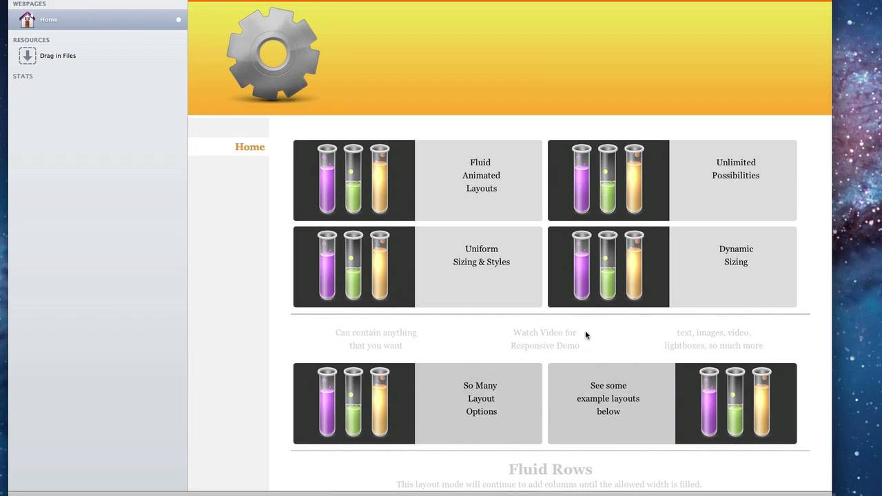
Fluid Columns
07/25/2016
Transcript
00:06 hello everyone this is Joe workman and00:08 today I'd like to introduce you to the
00:10 new fluid column stack fluid columns
00:14 allows you to design fluid layouts for
00:16 both your fixed width and responsive
00:19 design websites fluid columns allows you
00:22 to design a lot of different layouts all
00:24 within the same stack let's look at some
00:27 of these now as you see this top section
00:30 we have four elements here that are
00:32 evenly spaced out and uniformly styled
00:35 now our fluid columns is a little bit
00:37 different is if we look at the second
00:39 set we've we have our top row has three
00:42 columns and our bottom row has two they
00:45 are different sizes so you can see you
00:47 can customize not only have uniform
00:49 layouts but also custom layouts for
00:52 every single element now our next layout
00:55 is called fluid rose now no matter what
00:58 the size of your elements or style
01:00 you'll notice that fluid rose will fill
01:03 up the width of your container and then
01:05 start a new row when necessary the fluid
01:10 grid layout allows you to define a
01:12 specific number of columns and the fluid
01:15 grid will keep to that and automatically
01:17 determine the spacing between each
01:20 element so that the grid is built
01:22 properly the masonry layout is very
01:24 interesting and that it will
01:26 automatically put the puzzle of your
01:29 elements together so that it can fit
01:31 them as tight as possible in the area
01:34 provided and secondly the masonry stamp
01:38 is a similar concept and that it will
01:41 automatically lay out your elements so
01:43 that they fit the best on your page
01:45 however it will always build the layout
01:47 around a predefined static corner stamp
01:51 now we've seen these the flu column now
01:54 in a fixed width environment let's go
01:56 ahead and see the power of this stack
01:58 really shine with a variable with
02:00 responsive site so here we have a
02:03 variable with site and let's look at the
02:06 power of the fluid column stack in this
02:09 environment as we notice we have our
02:11 same layouts however if you notice when
02:13 we
02:13 resize this top layout the columns are
02:17 nicely animated down to their new widths
02:19 and layout if we look at fluid rows will
02:23 see in the inaction exactly how fluid
02:26 row works and that it will dynamically
02:28 create the number of rows that you need
02:30 based on your sites with similarly for
02:35 fluid grid will notice that the grid
02:38 spacing will dynamically be changed
02:40 based on your site with the masonry
02:45 stack is really shines in a fluid
02:47 environment it allows you to do some
02:49 really great effects where it will
02:51 automatically lay out your website in
02:53 your elements based on the width of your
02:56 browser and of course masonry stamp that
03:00 allows you to automatically and fluidly
03:02 arrange your elements around a static
03:06 image or really anything you this could
03:08 even be a video text whatever you'd like
03:11 so as we see here the flu column stack
03:13 is works beautifully an environment for
03:16 not only fixed width but also variable
03:18 within responsive designs now before we
03:21 go let's go ahead and dive and look at
03:23 some of the great settings that the
03:24 fluid column stack has when you drag the
03:27 fluid column stack out the default is
03:29 two columns however you can add as many
03:32 elements as you wish you can change the
03:35 gutter with which is basically the gap
03:37 between each of the elements on the page
03:41 you can define the float do you want
03:43 your elements to float to the right of
03:46 the page or do you want them to kind of
03:48 fall and float to the left of the page
03:50 okay we have our default layouts that we
03:54 saw the float rose the grid and masonry
03:57 now when you click masonry to get the
04:00 masonry stamp layout there is simply a
04:03 check box here which will unveil a new
04:05 drop area that you can put in your
04:08 static stamp now you do have to define a
04:11 static width and height for this stamp
04:13 area so that the masonry layout knows
04:15 exactly where to move elements around
04:18 further down in the settings is where we
04:21 can actually define a style for all of
04:23 the elements that we have we get to find
04:25 rounded corners for all elements
04:28 uniform background colors for every
04:30 single element define static Heights to
04:33 make sure that all the elements are the
04:35 same height now as well as static height
04:37 we also have the ability to define a
04:39 uniform with for all of the elements
04:41 within fluid columns so if you wanted to
04:44 have all of your elements be the same
04:46 exact width and height you can easily do
04:48 that by defining a static height and
04:50 then defining the uniform sizing width
04:53 by default is percent which is
04:55 forty-eight percent but you can also
04:57 define pixels so let's say we wanted
04:59 everything to be 100 pixels wide every
05:03 element would now be 100 pixels wide as
05:05 well as a hundred pixels tall now if you
05:09 wanted to get really detailed you can go
05:11 to detailed custom and define a exact
05:14 pixel or percentage with for every
05:17 single element there I hope you enjoy
05:19 this new stack and have a great game"}]
Search the page
0
