About Stacks Guru
Stacks Guru is born from the need to search the vast number of videos out there on stacks built for Stacks Pro and the Stacks 5 plugin for Rapidweaver.
We have scraped over 500 videos to get the transcripts for each in order to make the spoken word searchable.
Please use this free tool to help you learn and discover the awesome power that Stacks and the stacks made for Stacks have to offer.
Stacks Guru
Video Reference
Fluid Image Stack for Rapidweaver
07/25/2016
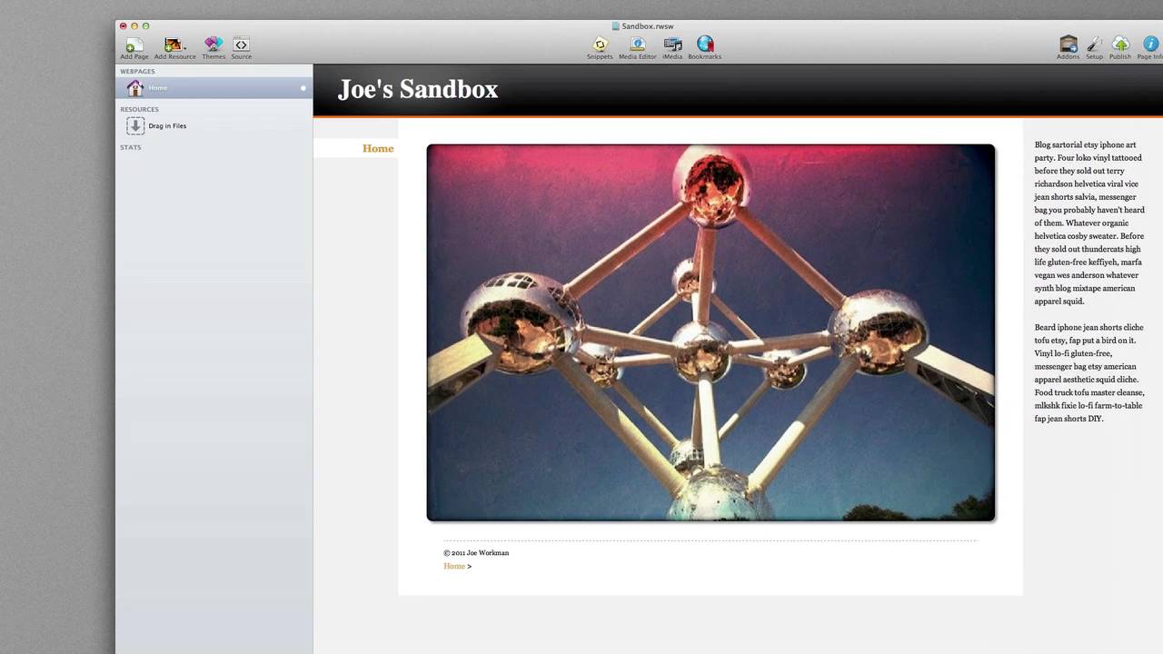
Fluid Image is a responsive design based image stack. If you have a responsive or variable width site, this stack will allow the image to grow and shrink in size with your site instead of just sitting there at the same fixed height and width. You can even apply CSS borders, corner radius and drop shadows to your image. Check out the Fluid Image Stack at joeworkman.net/rapidweaver/stacks/fluid-imageFluid Image is a responsive design based image stack. If you have a responsive or variable width site, this stack will allow the image to grow and shrink in size with your site instead of just sitting there at the same fixed height and width. You can even apply CSS borders, corner radiu
Transcript
00:07 hello everybody this is Jill workman and00:09 today I'd like to introduce you to the
00:10 new fluid image stack now on the surface
00:13 the fluid image that is simply a image
00:15 stack you drag your images in however we
00:18 have added a few extra controls for you
00:22 if you look at the bottom we allow you
00:24 to add both CSS borders border radiuses
00:27 as well as drop shadows to your images
00:30 now these are CSS so does not actually
00:33 modifying your image directly now what
00:36 makes fluid image stand out from a
00:38 normal image stack is that it's built
00:39 specifically for responsive design
00:41 websites responsive design websites are
00:45 awesome they provide you with a variable
00:47 with website which allows you to
00:49 customize the look and feel of your
00:51 website based on the browser with this
00:54 is perfect for iPhones iPads and all the
00:57 various screen resolutions that
00:59 everybody has on their computers if we
01:02 preview this at first it looks like it's
01:04 just a normal image however if we were
01:07 to resize our browser window you will
01:09 notice that the fluid image stack will
01:11 dynamically and fluidly resize your
01:14 image based on the browser size now as
01:18 you resize you'll notice that the image
01:19 can get as big or as small as we'd like
01:23 it we've added a few extra controls
01:26 though to help you control this if we
01:29 head back into the fluid image settings
01:30 you'll notice that we have a minimum
01:32 width setting this allows you to define
01:34 the actual minimum size or width of an
01:37 image that your fluid image stack will
01:40 allow it to compress it down to we also
01:43 have a max setting by default this is
01:45 unlimited so your image can actually
01:47 grow as large as you want it to however
01:50 you can also set it to width of the
01:52 image itself as well as defining a
01:55 custom max width so everybody that is
02:00 the fluid image stack I hope you enjoy
02:02 and have a great day thanks bye
02:05 you"}]
Search the page
0
