About Stacks Guru
Stacks Guru is born from the need to search the vast number of videos out there on stacks built for Stacks Pro and the Stacks 5 plugin for Rapidweaver.
We have scraped over 500 videos to get the transcripts for each in order to make the spoken word searchable.
Please use this free tool to help you learn and discover the awesome power that Stacks and the stacks made for Stacks have to offer.
Stacks Guru
Video Reference
Gyro 2 Stack for RapidWeaver
07/25/2016
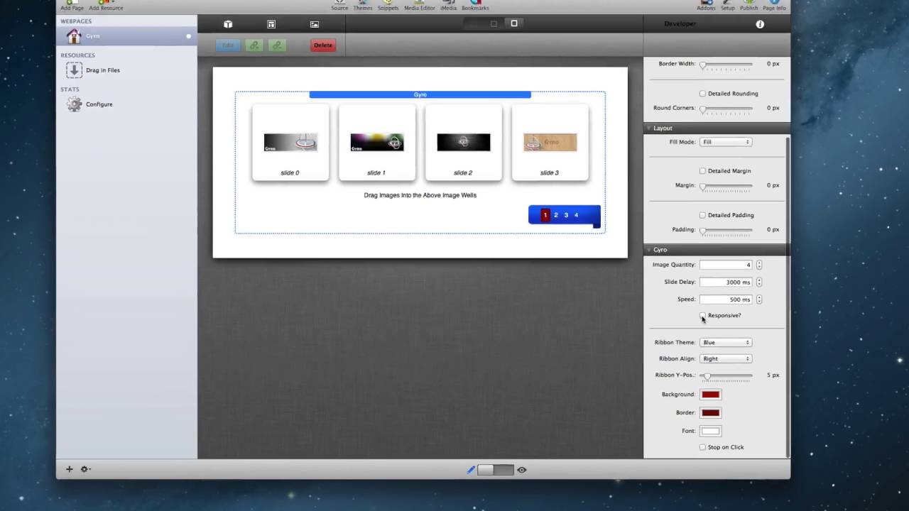
Check out the Gyro Stack at https://joeworkman.net/rapidweaver/st... Gyro is a responsive image slider stack that can create elegant banners for your Rapidweaver site. The interface is intuitive and easy to build, while under the hood, its still very powerful machine. Gyro will hold as many images as you want and will dynamically build an elegant navigation ribbon. There are 12 different ribbon themes to choose from out of the box!!Check out the Gyro Stack at https://joeworkman.net/rapidweaver/st...
Transcript
00:08 hello everyone this is Joe workman and00:10 today I'd like to introduce you to gyro
00:12 Jarrah is a beautiful image based
00:14 responsive slider that has some amazing
00:17 ribbon based navigation options for you
00:19 let's dive in and see what we can do
00:21 with it gyro really couldn't be easier
00:25 to implement simply select how many
00:27 images you'd like in your settings pane
00:29 and then drag in your slider images into
00:32 the drop zone areas now it is
00:34 recommended that all of the images are
00:36 the same size so the animation works
00:39 properly at that point you can then go
00:43 into the settings pane and select one of
00:44 14 available ribbon sizes we have many
00:48 colors available or you can completely
00:50 hide the ribbon if you like you can
00:52 change the rib alignment from the right
00:54 center or left you can change the
00:57 vertical adjustment so we're on the left
00:59 center right does the ribbon exist you
01:03 can then adjust the style and coloring
01:05 for the navigation numbers you then
01:09 simply preview your website and you are
01:11 done now if you're designing a
01:14 responsive based website all you simply
01:17 need to do is click on the responsive
01:19 checkbox in the settings HUD then define
01:21 the maximum width that gyro will expand
01:24 to this will ensure that your images
01:26 always look crisp and clear now let's
01:30 jump in and see how gyro looks on all of
01:32 our devices so on a desktop browser we
01:37 notice that gyro takes up the entire
01:38 width of the area allotted to it however
01:41 since we define a maximum width for our
01:45 slider well notice that as the browser
01:47 gets larger gyro will remain centered
01:51 within the browser window and only take
01:53 up the maximum width that it was allowed
01:55 to now on an iPad will notice that gyro
01:59 looks very similar to the desktop this
02:01 is because we have enough screen real
02:03 estate to actually justify gyro taking
02:06 up the entire width and still displaying
02:07 its ribbon however when we view gyro on
02:11 a smaller device such as an iPhone
02:13 well notice that the navigation is
02:15 actually changed instead of the ribbon
02:17 displaying on top of the slider the
02:19 actual navigation is shown below gyro
02:21 this allows your customers to actually
02:24 see all of the images in their full
02:26 glory so I hope you enjoy Cairo it's a
02:30 really beautiful easy to use responsive
02:32 image slider for your rapidweaver sites
02:35 thank you very much everybody enjoy your
02:38 day"}]
Search the page
0
