About Stacks Guru
Stacks Guru is born from the need to search the vast number of videos out there on stacks built for Stacks Pro and the Stacks 5 plugin for Rapidweaver.
We have scraped over 500 videos to get the transcripts for each in order to make the spoken word searchable.
Please use this free tool to help you learn and discover the awesome power that Stacks and the stacks made for Stacks have to offer.
Stacks Guru
Video Reference
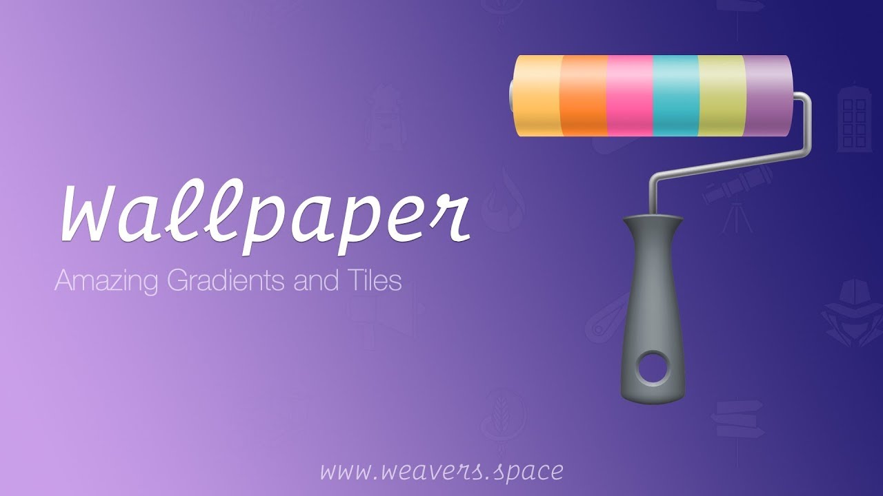
How to use the Layout features of the Wallpaper Stack for RapidWeaver
10/26/2018
In this video we review how use the power layout tools available inside the Wallpaper stack for RapidWeaver. For more information about Wallpaper head over to https://www.weavers.space/rapidweaver...In this video we review how use the power layout tools available inside the Wallpaper stack for RapidWeaver. For more information about Wallpaper head over to https://www.weavers.space/rapidweaver...
Transcript
00:00 hey guys what's up in this video we are00:03 going to be looking at the new wallpaper
00:05 stack and all of the new layout settings
00:08 and how you can size and position it and
00:10 all that kind of jazz so without further
00:12 ado let's dive in so as you probably
00:21 know wallpaper ships with three stacks
00:23 however in this particular video we're
00:25 only going to be looking at the layout
00:27 in settings basically everything other
00:29 than the background okay
00:31 so we're gonna be looking at about all
00:32 the sizing and borders and stuff like
00:34 that about the wallpaper stack so first
00:37 off we have border this is pretty
00:38 obvious right
00:39 we have border settings so you can
00:41 change the border color the border size
00:42 and you can make it have round borders
00:45 right round corners and if you click on
00:47 these little plus buttons just as you
00:49 might expect you have a lot of various
00:52 detailed settings so you could set the
00:53 border width on each individual side so
00:56 top bottom left right and same thing on
00:58 the corners you could have individual
01:00 round corners and you can also change
01:02 the units whether or not you want
01:03 percentages or pixels
01:06 but for now we're just gonna turn off
01:09 these detailed settings and leave that
01:11 as it is right there so next up is the
01:16 layout settings and all the various
01:18 things that we can do with layout
01:19 height:auto that's going to behave
01:22 exactly as you would think of this as a
01:25 one-column stack right where it will the
01:28 height will be dependent upon the
01:30 contents that you put in it right and
01:32 just as you have in a one-column stack
01:34 we have margin settings so you can have
01:36 the margin all around the paint so you
01:39 can put margins all around the entire
01:41 stack and you can also increase the
01:43 padding right which is the space between
01:45 the border and the content okay now just
01:49 as before you click on the plus buttons
01:51 and we have nice detailed settings for
01:54 margin and padding so you can have
01:56 different margin and padding on all
01:58 sides as well as change the units from
02:01 pixels to percentages on proportional
02:04 means basically it'll depending on the
02:06 width of the browser that will expand
02:09 and contract okay and then REM if units
02:11 if you're a familiar with foundation you
02:13 already know what a REM unit is
02:15 essentially one REM is sixteen pixels
02:17 I'm gonna go over some of the other
02:19 obvious settings such as hide the stack
02:21 right so visibility we can hide this on
02:22 mobile hide it on tablet hide it on
02:24 desktop or any combination of those okay
02:27 so if you want to hide this wallpaper
02:29 stack on a particular device you can go
02:31 ahead and use these visibility settings
02:33 should I show you how all this works
02:34 actually let's just go ahead and add in
02:36 some I'll just add some text in there
02:39 right so I'm gonna go ahead and add some
02:41 text into this wallpaper and what we'll
02:45 see is I have my margin set to 20 pixels
02:50 let's go ahead and just put padding at
02:52 20 pixels as well and if we preview this
02:57 you'll see that the height of this
02:58 container of you'll see that now if we
03:02 preview this page we'll see that the
03:04 height of wallpaper is equal to the
03:07 actual content size right so well we
03:09 have 20 pixels of padding and if we
03:11 remove that padding you'll notice that
03:13 the content goes exactly right up to the
03:15 border right obviously that's that might
03:17 be what you want might not be what you
03:19 want depends on what you're designing
03:20 right obviously for text it doesn't
03:21 really look all that great but so but
03:25 the point here is that the height what
03:27 the height auto does right this height
03:29 auto will only size wallpaper to be the
03:33 height of the content okay so let's go
03:37 to the next next level we see that we
03:39 have the ability to do height variable
03:41 so height variable is going to be a
03:45 percentage of the height of the current
03:49 viewport okay so in this instance um the
03:53 default is set the height of 40 percent
03:56 okay so that means that this wallpaper
03:58 will take up 40% of the height of this
04:03 particular browser window so if I were
04:06 to resize this we'll see that wallpaper
04:09 is changing its height based on the
04:12 height of the browser right this is
04:15 great for like banners and things like
04:17 nature right stuff that's kind of on the
04:19 top of your page and you want it to you
04:21 know to be big but you don't want it to
04:22 be big on all devices so basically on
04:24 smaller devices you want to be a little
04:25 smaller right so this is a great way of
04:29 sizing your content with height the
04:32 percentage okay with a variable height
04:34 now also notice that we have limits here
04:36 so we can limit it because maybe we
04:38 don't want it to be too big right or too
04:43 small either so you can set the minimum
04:45 and maximum height that it will be so in
04:48 this instance it's 40% high it will be a
04:52 minimum of 200 pixels tall and a maximum
04:55 of 500 pixels tall right a really
04:58 apparent example of this is if I set the
05:00 height to be 100% right what that's
05:03 going to do it's going to set wallpaper
05:04 V 100% height of the browser window okay
05:09 I'm actually let's go ahead
05:10 and I'm gonna tweak this a little bit so
05:12 that I'm gonna take off the borders I'm
05:15 gonna take off the round corners and
05:17 we're gonna remove the the margin okay
05:20 and now when I preview this it's going
05:23 to be 100% height the right remember the
05:26 min is set to 200 the max is set to 50
05:28 what's gonna happen so here now I'm in
05:32 found in a foundation theme right now so
05:34 this wallpaper is gonna go full width
05:37 depending on on what your browser is or
05:40 what theme you're using um it might not
05:42 right so here I have it set to 100%
05:45 height but didn't go 100% height that's
05:48 because I set the max to be 500 pixels
05:52 so if you really want the wallpaper to
05:56 always be 100% height basically what
05:58 you're gonna want to do is just set this
06:00 maximum to be something big right I mean
06:02 here I'm just gonna set it to 5,000 okay
06:04 and what you'll see now is that
06:06 wallpaper is now 100% height of the
06:10 browser window so here we have we have
06:13 three wallpaper stacks all of them are
06:15 set to have a height of 100% okay with
06:20 maximum of 2,000 pixels so basically
06:23 we're ensuring that every wallpaper is
06:25 gonna be 100% height right so what this
06:27 is going to give us is we can now scroll
06:30 down the page and we'll see that
06:31 wallpaper is 100% height on all of these
06:36 right so very cool I know this is a
06:40 style of website that you know a lot of
06:42 people you know like to create you'll
06:44 see how easy that is you know with
06:46 wallpaper and obviously if we were to
06:49 set this to be you know 80% height on
06:52 that you know this top one is gonna be
06:53 80 and so on and so forth right I think
06:56 you get the point so this variable
06:59 height is very powerful especially with
07:01 these minimum and maximum values now
07:03 what you might have noticed is this
07:06 wallpaper the content was centered by
07:08 default so when I I made this the 80%
07:11 height this text is always going to be
07:14 centered within wallpaper we can we have
07:17 the adjustment for that right so in this
07:19 aligned content setting we're gonna set
07:21 it to the top we could we can have the
07:23 all the content align to the top we can
07:25 also have the content aligned to the
07:27 bottom right so most time you're
07:29 probably gonna want centered but
07:30 depending on what your layout is and
07:32 what you're trying to accomplish um you
07:35 might want to have a top or bottom okay
07:37 now the next type option here is called
07:40 100% now you might think that that means
07:44 100% the browser height but it doesn't
07:47 okay um if you ever want to do based on
07:51 the browser window you're gonna want to
07:53 use variable height okay inset that to
07:55 be 100 what 100% means it basically
07:59 means full height that's going to take
08:01 up the entire height of a particular
08:04 container that it's within now the real
08:07 use case of this is sort of if you have
08:10 you know a lot of grids there's gonna be
08:12 a lot of really great grid you know
08:14 components and stacks coming out that
08:17 allow you to you know grid things
08:19 automatically on your page and those are
08:22 awesome except a lot of times you might
08:24 want the background to be 100% height
08:26 right so what I can do is for instance
08:29 in total CMS to which as of this
08:32 recording is currently in private beta
08:33 okay but in there there's a stack called
08:36 infinity grid and inside there there is
08:40 a grid that the content could be
08:41 variable height inside that grid it's
08:44 going to grow as tall as that particular
08:47 container can be okay so right now I'm
08:49 gonna show you a
08:50 whose case of that using the static
08:52 height stack which is free on my website
08:54 um but just kind of show you that a
08:59 wallpaper is gonna grow to the height of
09:01 a container so if you ever use a stack
09:04 um you know such as you know the total
09:06 see must two grids coming out or any
09:09 other stack where you want wallpaper to
09:11 stretch to the height of something um
09:14 try out this 100% height okay here we
09:18 are I'm gonna add my static height stack
09:20 to the page okay let's go ahead and
09:22 close this out and I'm gonna add make
09:25 this be 800 pixels tall okay and then
09:30 I'm gonna add wallpaper inside of it and
09:32 just for learnings sake I'm gonna set
09:36 the height of wallpaper to be Auto and
09:39 let's go ahead and set the background
09:42 color of static height to be a color so
09:46 this background is gray so we're gonna
09:48 preview this what you'll see here is
09:51 static height is gray okay and wallpaper
09:54 up at the top even I should have picked
09:56 up maybe a better contrasting color here
09:59 we're gonna pick something so wallpaper
10:01 is only going up you know the height of
10:03 the its content because we set it to be
10:05 Auto so let's go ahead and I'm gonna go
10:07 into wallpaper and set this to be 100%
10:10 height and we're gonna align the content
10:13 to the middle
10:13 let's go preview and there it goes
10:17 that ugly yellow is gone but that yellow
10:21 is only to show us that wallpaper is now
10:23 taking up 100% height of its parent
10:26 container right so this is probably not
10:31 a very huge use case you're probably not
10:33 gonna use this very often but when you
10:35 need this this feature in wallpaper is
10:38 very powerful now one thing I wanted to
10:41 show you is that so far in all of these
10:43 examples wallpaper has been full width
10:45 right but it doesn't need to be right
10:47 you can use wallpaper wherever you want
10:49 right so here I have a two column stack
10:51 each has a wallpaper in it and you know
10:54 maybe we add a you know I have the
10:56 borders into it a little bit and you
10:58 make some round corners on here let's go
11:00 ahead and just copy that over right we
11:03 preview that
11:04 there we go right so you can use
11:06 wallpaper in a lot of different ways not
11:08 just for like you know full-on you know
11:10 full screen banners you know you can
11:13 really use it and size it and even
11:15 inside here you can set this to be you
11:17 know variable height so if I set that to
11:21 be variable height and you know set it
11:22 to be you know 50% height the browser
11:24 window right that's going to grow that
11:27 particular container to be fifty percent
11:29 high of the browser window right um but
11:32 it stays within that two column stack
11:34 right so all of these layouts and you
11:37 know you can mix and match all of these
11:39 right so you don't need to don't
11:41 shoehorn yourself into thinking that
11:42 wallpapers just for big banners know if
11:45 you want to you know size maybe a nice
11:47 little content box within your content
11:49 you know feel free to do that
11:51 it wallpaper is a very flexible tool and
11:55 as soon as you start playing around with
11:57 the background settings which we have in
11:59 other tutorial videos so the last
12:02 settings that I kind of skipped over so
12:05 far is at the very bottom we have some
12:06 advanced settings um here we have a
12:09 class setting and what this does is
12:11 whatever you type in here this is if
12:13 you're familiar with any sort of coding
12:15 if you you can apply whatever class you
12:18 want or classes to wallpaper and that
12:22 will allow you to maybe to define your
12:23 own custom CSS styles or if you're using
12:25 some JavaScript that you want to you
12:28 know apply or use that class right this
12:31 this will make it useful for you the
12:34 next setting is for foundation styles
12:35 right so if you are using foundation you
12:38 know that you can use color schemes
12:40 inside all the column stacks well you
12:42 can now apply those color schemes to
12:44 wallpaper as well so if you want all of
12:46 the content within wallpaper to be your
12:48 alternate colors you can do that or you
12:50 can use the various swatches available
12:52 within foundation right so this will
12:54 style all the text and content within
12:56 that this particular wallpaper with all
12:59 the content from swatch one
13:04 now this last saving custom total CMS
13:07 object link this is something specific
13:09 for total CMS - if you want to use this
13:13 with in total CMS - grids this will
13:17 allow you to link basically turn
13:19 wallpaper into one big link for the
13:21 object that you're importing from the
13:23 CMS
13:24 so that pretty much does it for this
13:27 video for the wallpaper layout settings
13:29 right as you see wallpaper is a very
13:31 good tool it gives you a lot of
13:33 flexibility in terms of how you want to
13:35 use it in terms of sizing and you know
13:38 and things of that nature right now make
13:39 sure you check out the other two videos
13:41 that we have on gradients and patterns
13:45 right so you're gonna want to check
13:48 those out because those really are the
13:50 beautiful part of wallpaper right this
13:52 is kind of like the functional stuff
13:54 like how do you make it functional right
13:56 but the other two videos on gradients
13:59 and patterns are really what you're
14:01 gonna want to use to really make your
14:03 website shine so I hope you enjoyed this
14:05 video and we will talk to you later
14:14 you
14:15 "}]
Search the page
0
