About Stacks Guru
Stacks Guru is born from the need to search the vast number of videos out there on stacks built for Stacks Pro and the Stacks 5 plugin for Rapidweaver.
We have scraped over 500 videos to get the transcripts for each in order to make the spoken word searchable.
Please use this free tool to help you learn and discover the awesome power that Stacks and the stacks made for Stacks have to offer.
Stacks Guru
Video Reference
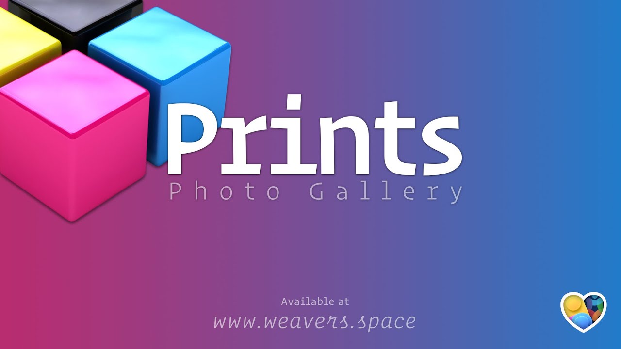
Introducing Prints: The Ultimate Elegant and Customizable Image Gallery Stack Demo
06/17/2025
Discover Prints, a powerful yet simple gallery stack designed for beautiful, customizable image displays. In this video, Joe Workman walks you through everything you need to know to get started and make the most of Prints. * Elegant gallery layouts with advanced hover effects and themable lightbox * Flexible navigation: mouse, keyboard, and touch controls * Custom captions and support for both po
Transcript
00:09 Hey everybody, Joe Workman here and today I'm super excited to introduce you to Prince. And without further ado, let's dive into the demo. Now, Prince is00:17 a super elegant and simple gallery that is everything that you need. It serves all the basics. It does a great looking
00:26 gallery. And true to its origins, the new version of Prints has this amazing hover effect that when you hover
00:35 over the images kind of randomly rotate in various directions. I think it's just a really nice effect. And if we go ahead
00:44 and click on any of these images, you notice that we open up in a beautiful light box um that is completely themable. So you can have full control
00:52 over the background colors, the navigation colors, the borders, the shadows, all that. Now for navigation,
00:59 you can go ahead and click on the navigation buttons. You can also swipe with both your trackpad or on touch.
01:09 Now, not only that, but you can actually use your keyboard navigation as well. So you can use your arrows or you can tab to the buttons and hit the enter key on
01:16 the buttons, but you can use the left and right arrows to navigate super cleanly through the image gallery. Now let's dive into the other demo just so
01:25 we can kind of see what other styles we have available. Now here we have a a more subtle subdued hover effect where we just have kind of a very small scale
01:34 and a kind of a bigger shadow. So it looks like the image is popping up a little bit but we don't have really that kind of rotation going on. So, if you want something much more simple and
01:43 subtle for your site, uh we have that ability here as well. Now, one thing that's really important about this gallery here that we're looking at right
01:50 now is look that we have a mixture of both portrait and landscape images and both of them look great within the grid.
01:58 Now, also notice that we have captions in here. By default, the alt tag from the images can be used as a caption.
02:06 However, you can define a custom caption as well.
02:10 Now, let's go ahead and look at this demo here. When we open this, we'll notice that we have great custom navigation
02:17 buttons, but we also have a caption at the bottom here. Now, you can have a caption on the thumbnails or in the
02:24 light box. And it doesn't need to be an and thing. They're controlled independently. So, if you want them on the thumbnails but not in the in the light box, or if you want them in the
02:32 light box, but not in the thumbnail, that's not a problem. But one thing to also note is we have a beautiful blurred
02:40 background. Not only do we have control over the actual color of our backdrop, but we can actually blur the background of the website. So it really obscures
02:49 the background and really makes our images pop.
02:52 Now let's dive in to see how easy it is to implement prints. Now this is the demo project that ships with prints. So you have access to all of this that I'm
03:08 want. Now you can drag and drop images with the prints image stack or you can use the print image URL to actually
03:14 define warehoused images and you can define both the thumbnail and the full image. Now for performance reasons the
03:22 only the thumbnails are loaded on page load and the full scaled images are actually loaded very intelligently in the background when you hover over
03:30 images or as you're navigating through it intelligently loads the images on the fly so that we have the most performant
03:38 page possible. Now if we look in here we can also define the width and height of both the thumbnails and the full images
03:46 as well as define an all tag. And here is where you would define your custom caption if you didn't want to use the alt tag as the caption.
03:54 Now let's dive into the prints stack.
03:57 Now there are a lot of settings here. So let's go ahead and focus on them on a group bygroup basis. So the first
04:04 setting group here is actually building out your grid. Kind of the layout of your thumbnails and the grid. Now by default the captions are turned off. If
04:13 you turn those on, you'll notice that there is another settings group here that shows up that has our caption colors, our caption sizes for small,
04:21 medium, and large, and then whether or not you want to center those captions as well.
04:28 Next up is we can define the minimum and maximum width and height for our images so that we can make sure that our images are sized and we can create the grid
04:36 that we want. Now, we define the sizes for small, medium, and large. And the height settings are really important for those portrait images to make sure that
04:45 they don't grow too large. And then we also have the gutters. That's the spacing in between each image for small, medium, and large devices.
04:56 Next, let's dive into this thumbnail settings. And these are pretty simple, right? We have border color and border size and round corners. We have shadows
05:03 for default and on hover. A lot of times if you have a different shadow on hover, you can make it a really nice effect where it looks like the image is coming
05:11 off the page. So here you can actually do different shadow colors, maybe increase the opacity of the shadow. And
05:18 here you can increase the actual size of that shadow. Now something I skipped over briefly for borders is we have different sizes for borders for small,
05:27 medium, and large. The reason for that is depending on the size of your thumbnail, you actually might want a smaller border size. Sometimes when we
05:35 have a fat border size, it doesn't look great on really small images. So if your thumbnails are going to be really small on mobile, you might want to have a
05:43 smaller border size. Next up is we could have our scale on hover. So this allows you to actually make the image slightly
05:51 larger when you hover over it. And then here we have our rotation settings. Now the variance has to do with the plus or
05:58 minus 7°. So by default right now it is set to 7°. And what that means is the image will randomly rotate from left or
06:07 right plus or minus 7°. Now that could be 7 or -4 or 3, right? So it'll
06:14 randomly choose anything be from -7 to 7°. It'll choose any number within that range to kind of randomly rotate the
06:23 image. Depending on what sort of variance you want, you can actually adjust this to be as much or as little as you want in terms of the rotation
06:31 variance. or if you want to completely disable it, just set it to zero. Okay, next up is let's look at all of the
06:38 modal settings. Now, here it's kind of split up into three different groups for the modal. We have the general modal settings. We have our settings for our
06:46 backdrop and settings for our navigation. Now, if we turn on captions for our modal, we actually have settings
06:54 for our t captions as well. So here we have the color of the caption and then our sizing for small, medium, and large and whether or not you want to center that caption.
07:03 And then for our backdrop, we control the actual color of the backdrop. Now, if you click on this, this is where you can also set the opacity of that color.
07:11 So you can actually see the contents of the background of the website. And then we can adjust the blur as well. Now, if
07:19 you don't want any blur, you can set that to zero and no blur will be applied. Next up is our sizing. So the
07:25 max sizing is by default 80% width and height. And what that means is the images will not go more than 80% the
07:34 width of the browser and 80% the height of the browser. This is so we can both um take into account landscape and
07:44 portrait images. And just like our thumbnails, we have the border colors and then different sizes for small, medium, and large for your border. And
07:53 lastly is our modal navigation. These are the next and previous buttons so we can navigate between our images within
08:08 icon color. And then we have the opacity. Now this is the default opacity. Uh when the modal opens when you hover over that it'll always be one.
08:18 It'll always be 100% opaque.
08:21 Then we have our icon size and then our padding. So if you want to have a you know a look you can have different vertical and horizontal padding. And
08:29 then if you want to have the icon on the inside of the image or on the outside of the image and then lastly you can
08:36 obviously define custom icons. Now by default these are just chevron left and right. But if we look at the other demo
08:44 on this page, we'll see an example of how we can actually put SVGs in here as well. So if you put in an SVG in here,
08:53 um you can actually still use the icon color um to influence your SVG. Um just make sure that you set in the tool tip,
09:01 it reminds you here, just set your color inside your SVG to be current color, whether or not that is the stroke or the
09:09 actual fill. Um, you can also use SVG swatches to, you know, to maintain the colors of the SVGs if you want something
09:15 even more fancy. Now, it's nice that we can manage prints an entire gallery manually, right? So, we can actually add
09:24 our images in here, right? But what if we want to dynamically generate our galleries? This is where our integrations with something like total
09:31 CMS are a real gamecher. Um, and here is an example implementation of how we can implement prints with total CMS3. Inside
09:41 the print stack, you'll just add in your loop gallery stack from total CMS3. And then inside there, you will use the
09:48 prints image CMS stack. Now, this was a stack uh a stack that I actually skipped over. It is in the child menu. And
09:55 you'll add that inside of your CMS integrations. And the reason this stack is here is that it gives us a lot of
10:03 kind of space inside the settings to put our macros. So in this example of a total CMS 3 integration, I'm actually
10:10 loading in a square image from total CMS. So total CMS is dynamically resizing that uh thumbnail and making it
10:18 a square. No matter what the actual original images is is, it'll actually create a square thumbnail for us uh with
10:25 this macro. And then you can go ahead and put in the macro for the full scale image here as well. And then we use the macros for the width and height and our
10:34 alt tags. Now, here's an example of how we can integrate with feeds. This uses feeds files to actually um watch a
10:41 folder on your server and it will uh process all the images on your server uh within that folder that you configure in
10:49 the settings and it will create a gallery for every single image uh within that folder. Pretty cool. And here's an
10:57 example of how you can use prints the the print stack with that where you can basically take the uh macros from the feeds files and load those directly into
11:06 the stack. Now, if you're using total CMS, you don't need to worry about that.
11:10 You have a wonderful interface online to manage all of that. But this is a great way as well if you want to load images in uh via uh a folder on your server.
11:21 Now, Prince doesn't ship with feeds or total CMS. These are special integrations that we've made sure that they work great. And all of these
11:29 examples are again available within this project file that comes with prints. So you can just copy these into your project files and they're ready to be used.
11:40 [Music]
