About Stacks Guru
Stacks Guru is born from the need to search the vast number of videos out there on stacks built for Stacks Pro and the Stacks 5 plugin for Rapidweaver.
We have scraped over 500 videos to get the transcripts for each in order to make the spoken word searchable.
Please use this free tool to help you learn and discover the awesome power that Stacks and the stacks made for Stacks have to offer.
Stacks Guru
Video Reference
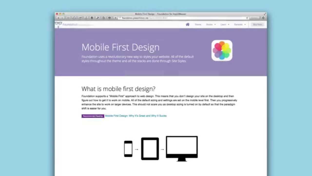
Mobile First Web Design with Foundation for RapidWeaver
02/03/2015
This video goes over the mobile first web design approach and how Foundation can help you in using this awesome workflow. More more info head over to foundation.joeworkman.net/learn/mobile-first/This video goes over the mobile first web design approach and how Foundation can help you in using this awesome workflow.
Transcript
00:07 hello everyone this is joe workman and00:09 in this video we're going to be going
00:10 over mobile first design and really
00:13 how it differs from what we
00:15 traditionally
00:16 use to build websites or philosophy
00:19 so what is mobile first design
00:21 essentially
00:22 it is the opposite of what we're used to
00:25 normally when we want to build a website
00:28 we build it for a desktop
00:30 then we evaluate how our site looks like
00:33 on the mobile device
00:35 and we think how can we squeeze all this
00:37 content that we created for a desktop
00:39 device to something that is about a
00:42 quarter of the size we've been doing it
00:44 backwards
00:46 and what mobile first design uh says is
00:48 that you should design your website for
00:51 a mobile device first
00:54 because you only have 300 to 400 pixels
00:56 in width and maybe i don't know 40
00:59 pixels tall right or maybe 600 pixels
01:01 tall
01:03 to show your content to make an
01:05 impression on your customers that are
01:07 looking at your websites on the go
01:10 so by designing for mobile first
01:13 essentially we're designing for mobile
01:16 and we we make sure that we find the
01:18 content that is most important to our
01:20 customers
01:23 and then we enhance that as it goes up
01:26 to tablet and desktop
01:29 so if we look at this mobile first
01:31 design page that i've created i have
01:33 this recommended reading for you and
01:35 it's
01:36 why mobile first is great and why it
01:38 sucks
01:40 essentially it says it's great for kind
01:41 of a lot of the reasons i just said
01:43 right you're designing your site for
01:45 mobile devices and not only because
01:48 quote unquote mobile is it's growing and
01:50 blah blah blah blah blah no it's because
01:53 it focuses you on figuring out what
01:56 content is most critical for your
01:58 customers
02:00 you don't need to have all this
02:03 whiz-bang flash
02:05 that confuse your customers give them
02:06 exactly what they want what do they need
02:09 to see what is the most important
02:10 content that is what you put on mobile
02:13 and chances are it will completely
02:15 revolutionize what your desktop site
02:17 will look like as well because you
02:19 really don't need a lot of flash just
02:21 focus on the content and give users what
02:23 they want right
02:27 and then progressive enhancement so you
02:29 start with mobile and you can gradually
02:30 add things as you uh you know the
02:33 browser sizes go up so you can actually
02:36 provide more content on a desktop than
02:38 you can on a mobile device so again read
02:41 this recommended reading i recommend it
02:44 and the reasons i guess i should say the
02:46 reasons why that article says it sucks
02:49 it's mostly just because
02:51 we aren't used to it
02:52 right we're used to designing for
02:54 desktops and changing that in our mind
02:57 is just different right so it's a
02:59 different workflow it's going the
03:01 opposite of what we've been used to
03:03 all these years
03:04 so that's really the only negative thing
03:06 he had to say about it and
03:08 i think that says a lot a thing so
03:11 recommend this i recommend this reading
03:14 go ahead and read that
03:15 now without further ado i'm going to
03:16 jump in and show you why
03:19 a foundation how it uses mobile first
03:21 and what you can do to actually
03:24 leverage it
03:26 so inside site styles you'll notice that
03:28 there is an edit mode
03:30 settings section and inside there you
03:32 can say view with
03:34 so essentially uh let's go down and view
03:36 with at mobile 640 pixels so it's kind
03:40 of a wide phone right or if you want to
03:42 go all the way down to mobile 320 we can
03:44 do that as well but just because for
03:46 video sake a little bit wider could be
03:48 better so we're going to
03:50 set our mobile width to be 640.
03:53 so now what we do is we can go ahead and
03:55 start building our website as if we were
03:58 building it for this particular device
04:02 now what i do recommend is that
04:04 the stacks here aren't going to know
04:06 that you're actually on a mobile device
04:08 it's going to still
04:10 you know influence the desktop and
04:12 tablet sizing so what you need to do is
04:14 you need to turn off tablet sizing
04:17 and then
04:18 build your content for mobile
04:21 so let's say here i wanted to have
04:25 a header
04:26 okay and maybe some text
04:29 and then in column two let's say i
04:31 wanted to have um an image
04:34 okay
04:36 so on mobile this is what i want it to
04:38 look like i want my uh you know header
04:42 and my text and then my image to show
04:44 below that
04:46 at this point we could just keep
04:47 building our content out right so you
04:49 can then start adding uh you know if you
04:52 wanted you know to do a three column
04:54 below that and so on and so forth right
04:56 so here we're just focusing simply on
04:59 and remember you're going to want to
05:00 turn off tablet sizing
05:03 we're focusing on exactly what our
05:06 site's going to look like on a mobile
05:07 device
05:09 now once you're happy with your web page
05:11 with mobile sizing what you can do is
05:13 then you go to site styles
05:16 and you increase that so then you go to
05:18 tablet 76
85:21 okay or maybe you do tablet 102
45:24 okay
05:25 so then at that point what you can do is
05:27 you can say okay for this two column
05:30 i'm going to turn on tablet sizing
05:32 and then for
05:34 uh you know this three column maybe
05:36 maybe i want to keep that in one column
05:38 on on mobile or i'm sorry on tablets
05:42 okay now you can also if you wanted to
05:45 start adding content at this point
05:47 what you could do then is you can then
05:49 say
05:50 uh i'm going to add my visibility stack
05:54 and then maybe you hide uh some content
05:57 for uh you know mobile only
06:00 okay so that it starts showing on
06:02 tablets maybe you wanna add and enhance
06:04 your content okay once uh you know the
06:07 browser size gets a little bit larger
06:10 once you're actually happy with the
06:12 content on a tablet you can then encrypt
06:15 go to site styles and increase that all
06:17 the way up to desktop
06:19 and then you can start doing it all over
06:21 again so this two column stack it
06:23 probably doesn't make sense we probably
06:24 want to keep it the way it is now
06:26 but maybe this three column we now want
06:28 to turn on desktop sizing for this and
06:30 have it you know go to three columns
06:33 wide
06:34 just for desktops
06:36 so as you see we are progressively
06:38 enhancing our web pages using foundation
06:42 now one caveat is
06:45 going backwards
06:47 right so
06:48 trying to say i want to
06:50 go ahead and i've built my desktop site
06:53 out and i want to see what it'll look
06:55 like on mobile
06:56 um inside edit mode
06:58 really what you need to do is you need
06:59 to roll back a lot of things so you need
07:01 to turn off desktop sizing then you need
07:04 to go to the two column and turn off
07:06 tablet sizing then go to site styles and
07:09 and set this to be down to mobile right
07:13 but then the bad part is you need to go
07:15 back and and
07:16 recheck all the settings that you've
07:19 unchecked just now just to see it right
07:21 so this workflow works great if you're
07:24 really doing mobile first and then
07:26 enhancing uh your page to go to desktop
07:30 right
07:31 hopefully you know maybe we can improve
07:32 this in the future but i think this is a
07:34 great step forward to helping you
07:37 move forward with mobile first design
07:40 now obviously you can preview your site
07:42 in in safari or your favorite web
07:44 browser
07:46 and then you know change the size and
07:48 look at what yours you know
07:50 websites going to look like in various
07:51 devices just by changing the browser
07:53 with or by using things that such as the
07:55 ios simulator that comes with xcode
08:01 so i hope this is a great start overview
08:03 for mobile first design for you i hope
08:05 that you kind of try to embrace it and
08:08 think about how your content will look
08:11 like and exactly what you need just for
08:14 mobile
08:15 and then build your websites on from
08:16 there it can really help you hone down
08:18 your your content and make your website
08:21 so much more effective
08:23 so with that information go forth and
08:25 make your websites great thank you very
08:27 much everybody have a great day bye
08:43 you"}]
Search the page
0
