About Stacks Guru
Stacks Guru is born from the need to search the vast number of videos out there on stacks built for Stacks Pro and the Stacks 5 plugin for Rapidweaver.
We have scraped over 500 videos to get the transcripts for each in order to make the spoken word searchable.
Please use this free tool to help you learn and discover the awesome power that Stacks and the stacks made for Stacks have to offer.
Stacks Guru
Video Reference
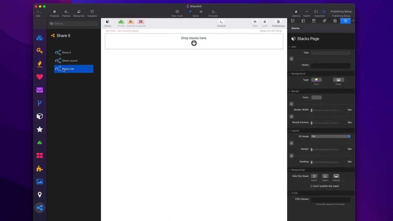
Share It Stack - Implementation Overview
10/12/2023
Share it makes it easy for your visitors to share your website on their favorite social networks. You can also use it to easily link to all of your social media profiles. Share it has been rigorously developed to bypass content blockers so your visitors will always be able to see and share your sites. Check out Share It at https://www.weavers.space/stacks/share-it
Transcript
00:10 so in this video we're going to be00:11 looking at how to implement share it and
00:13 the share link
00:15 Stacks now here we are in the share it
00:17 demo file and we're going to be looking
00:19 at this particular grid of icons here
00:22 and all the different variations that we
00:24 can do with our
00:26 icons now I think to kind of get the
00:28 gist let's go ahead and create a
00:30 completely new instance so here we have
00:33 a new page let's go ahead and add the
00:34 share it stack to the page and let's go
00:36 through the settings here so here under
00:39 icons we can choose which social network
00:42 we want and what you'll notice is by
00:44 default the various social networks have
00:48 their particular brand color integrated
00:50 by default so you don't need to worry
00:53 about what is the LinkedIn blue or what
00:56 is Facebook blue all right what is
00:59 Twitter
01:00 x black it's actually not black right um
01:03 it's slightly different what is Twitter
01:05 if you still want the old school Twitter
01:07 bird right what is Twitter bird blue
01:09 right these colors are there by
01:13 default then you can configure their
01:15 size right so obviously you can just
01:18 choose your pixel dimensions here you
01:19 can CH 64 whatever okay you can set your
01:22 size of your icon next we have the
01:25 ability to customize the style so we
01:27 have three different styles first you
01:29 can have just the icon the default icon
01:32 as is then you can also customize just
01:35 the color of the logo so let's say you
01:37 know I wanted Twitter um the Twitter
01:40 bird but I wanted it my own custom color
01:43 then we have a third level which allows
01:45 us to actually enclose our icon within a
01:49 circle then we can customize the
01:51 background the border the SVG color as
01:54 well as a drop shadow on
01:57 Hover now if you are a foundation 6 user
02:00 or a CSS Guru you can go ahead and use
02:02 your own custom classes here to apply
02:05 swatches to even accentuate or style
02:07 these even
02:09 farther so once you've configured your
02:11 icon we can go ahead and configure what
02:14 service we want this particular logo to
02:17 trigger so in this case obviously we are
02:19 at Twitter so we're going to go ahead
02:20 and choose um X formerly known as
02:23 Twitter okay now by default the
02:27 attributes that are going to be shared
02:29 are pulled from your website
02:32 metadata now we have the SEO helper
02:35 stack and part of that stack set is the
02:37 SEO meta tags and this allows you to
02:39 Define things such as your OG title open
02:42 graph image OG URL so on and so forth
02:46 this metadata is the data that share it
02:50 will look for when generating your share
02:53 actions now there are other ways you can
02:55 use you know your own metadata
02:57 generators to do this as well SEO
02:59 helpers is just our product that is a
03:01 really efficient way of doing this now
03:04 if you don't have SEO Helper and you
03:06 want to potentially Define this metadata
03:09 manually for the share service you can
03:11 go ahead and click on manual in the
03:12 share data and you can manually Define
03:14 it for this particular share action so
03:17 you can Define the title you can Define
03:19 the actual URL that's going to be used
03:21 you can Define the text so in this case
03:23 this is the text that's added to the
03:25 tweet that will be posted okay an image
03:28 this is primarily used for Pinterest um
03:31 so if you're actually using a Pinterest
03:33 action um you want to be able to have an
03:36 image so that that image is posted to
03:38 Pinterest along with your
03:40 content then as you saw um in the demo
03:44 uh we have the ability to open up in a
03:46 popup window and this is what is uh the
03:49 actual size of the popup window that
03:51 opens up now on mobile devices it is
03:54 very nice in that if a user has the
03:57 Twitter client installed it'll actually
03:59 open up
04:00 Twitter um the only exception to this as
04:03 of this recording is Facebook where
04:05 Facebook will still use the web
04:07 interface it won't actually open up
04:09 inside Facebook however if you are on
04:12 touch you'll notice that there is a
04:14 checkbox here that says share sheet on
04:16 touch and what that will do is that will
04:19 actually instead of open up the native
04:21 or the web share interface it'll
04:24 actually open up the OS share sheet so
04:26 that someone can share to a particular
04:29 service such as Facebook or Twitter or
04:31 whatever other apps they might have
04:33 installed you'll notice that there is
04:35 another Shar data called manual Plus
04:38 warehouse and what this allows us to do
04:40 it the only difference here is it
04:41 actually has an image Warehouse URL
04:43 instead of a drag and drop image again
04:45 this is uh an integration really only
04:47 used for Pinterest and actually for
04:49 share sheets as well so if you are
04:50 integrating with a share sheet this
04:52 image can get sent along with the share
04:54 sheet now let's let's have a look at the
04:57 share link stack and as you see see this
04:59 is going to be a very similar interface
05:01 to the lot to the previous stack um you
05:04 can go ahead and configure your service
05:06 now one thing I didn't mention when we
05:07 looked at the share action stack we can
05:10 go ahead and click custom here and you
05:11 can actually configure your own custom
05:14 icon so if you have an SVG that You'
05:16 like to use you can go ahead and paste
05:18 the SVG code directly into here and that
05:21 will be used instead of one of the
05:22 default icons that comes with share it
05:26 now for links we don't really have it's
05:28 not nothing crazy fancy would just have
05:30 a title for accessibility so you have a
05:32 little title tag and then the URL that
05:35 you want to link to so this is purely a
05:38 way of linking to either pages on your
05:41 site or to your social media profiles so
05:45 a lot of times you can have multiple
05:47 instances of these on the page that you
05:49 can then link to all your different
05:51 social media profiles
05:54 online so I just want to show you some
05:56 common use cases that we can use share
05:59 it for now a lot of times we're going to
06:01 just have maybe up in our layouts maybe
06:04 in the top Corner maybe a list of
06:06 various icons right they're going to be
06:08 right next to each other and the way
06:10 share it and share it link
06:15 work is that inside edit mode they'll
06:18 actually look like they are on top of
06:20 each other however they're configured so
06:22 when you do that they just magically
06:23 just sit right next to each other on the
06:26 live page so if we look here in preview
06:29 you'll notice that even though they're
06:30 on top of each other in edit mode um
06:32 they just live directly right next to
06:34 each other okay now how can we control
06:37 the alignment here by default they will
06:39 be aligned left of whatever layout you
06:42 have them
06:44 in however they follow the common just
06:47 content alignment options within your
06:49 layout Stacks so here I have the column
06:52 Stacks from my starter pack my free
06:54 starter pack and in there we can set the
06:57 text alignment or the content alignment
07:00 um of the content within that layout so
07:02 if I would like to Center these I can do
07:04 that they'll centered and you'll look
07:05 here and now they're centered and then I
07:08 can also set them to a line right and
07:11 then they're aligned to the right right
07:13 so again uh kind of a different way you
07:16 might be used to um I do this in a lot
07:19 of my other Stacks but yeah little
07:22 things like this like little buttons and
07:23 whatnot it just makes it convenient
07:25 where if you just put them on top of
07:27 each other inside edit mode in real life
07:30 on the on the page they just sit
07:32 directly next to each other um and then
07:35 using the content alignment options
07:36 inside your layout Stacks is a really
07:39 efficient
07:48 way
Search the page
0
