About Stacks Guru
Stacks Guru is born from the need to search the vast number of videos out there on stacks built for Stacks Pro and the Stacks 5 plugin for Rapidweaver.
We have scraped over 500 videos to get the transcripts for each in order to make the spoken word searchable.
Please use this free tool to help you learn and discover the awesome power that Stacks and the stacks made for Stacks have to offer.
Stacks Guru
Video Reference
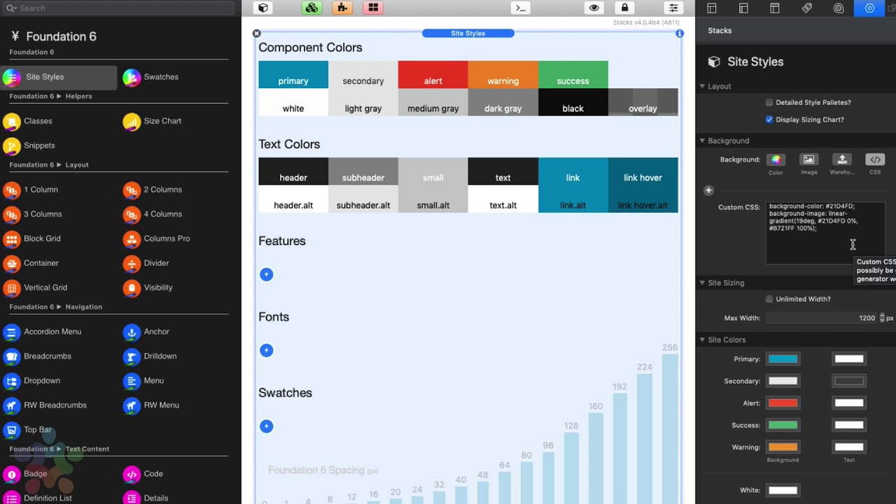
Sites Styles Overview for Foundation 6 Stacks
01/27/2020
Transcript
00:09 so let's think of site Styles as the00:11 control center for our entire websites
00:14 now here directly in edit mode we have a
00:17 great overall vision of what our entire
00:19 site is styled like we have all of our
00:22 component colors which are the colors
00:23 that are used throughout various
00:25 components so buttons and accordions and
00:27 menus and various alerts and warnings
00:30 right we have all the various shades of
00:33 white through black that are used within
00:35 all the components as well
00:38 next is we have all of our text colors
00:40 so these are the default font colors
00:41 that are used for headers and text and
00:43 links throughout entire site and then we
00:46 have things where we can manage various
00:48 features we can add fonts and font
00:51 families and then lastly we have
00:53 swatches which are really powerful we're
00:56 not gonna try to cover all this in this
00:57 one video right now in this video what
00:59 we're gonna look at is let's go ahead
01:01 and look at what base styles we have
01:03 directly inside site styles so what are
01:06 the settings that we have directly in
01:08 site styles and how can we use those so
01:11 the very top of these settings we have a
01:12 detailed site Styles palettes this just
01:14 gives when you check this that just
01:16 gives us a little bit more detail on all
01:18 the various colors um and when you have
01:20 swatches installed it'll actually give
01:22 you more swatches more details of every
01:25 single swatch as well next week we can
01:27 display or show that sizing chart and
01:30 you might be wondering what is this
01:32 sizing chart um this is just a
01:34 convenient sizing grid that is kind of
01:36 baked into a lot of the sizing settings
01:40 throughout foundation 6 and throughout
01:42 their swatches and so when you see these
01:45 it's just that gives you a visual
01:46 visible representation of like how big
01:49 is 40 pixels how big is curtain
01:51 twenty-eight pixels so it kind of gives
01:53 you an idea of how much space something
01:56 will take next up is we have this
01:58 background settings and this has to do
02:00 with the site background see here you'll
02:03 notice that we have color we have image
02:06 so this is the background image along
02:08 with all the tiling and image sizing
02:10 options so do you want to cover do you
02:12 want to fill the screen do you want - is
02:13 it a tiled image you can provide
02:16 different images on small medium and
02:18 large devices and then we have the same
02:21 thing for warehouse so if you want to
02:22 warehouse your images as well you can do
02:25 that now one great thing is you're using
02:28 this link tool that's built in a wrapper
02:30 you can actually navigate and actually
02:32 use the images that are built directly
02:34 into the rack Weaver resources as well
02:37 that's a great way if you don't want to
02:39 upload images via an FTP app and last
02:43 thing we have custom CSS this is great
02:45 there's a ton of great like gradient
02:48 generators out there on the web and
02:49 basically you can build out custom
02:51 grading
02:52 or a custom background get the CSS from
02:54 a lot of these background generating
02:56 tools and just paste it directly here
02:58 inside the custom CSS and it'll display
03:01 straight in your website background
03:04 now one thing you'll notice is actually
03:06 you can turn on multiples of these
03:08 settings as well so let's say for
03:10 example if you are using a tiled image
03:12 but you wanted to also set a color in
03:14 the background you can easily enable
03:16 both color and image
03:19 now if you click on this plus button it
03:21 actually unveils some more advanced
03:24 background settings at the bottom so if
03:26 you wanted to fix background or if you
03:27 want to play with background clipping
03:29 and whatnot um you can do some really
03:31 cool advanced stuff with some of these
03:32 settings
03:34 next is our site sizing so we can either
03:37 go unlimited width or you can set a max
03:39 width that you want your website content
03:41 to go um so the default is 1200 pixels
03:44 next up is we have our site colors our
03:46 component colors and these are the gonna
03:48 be the various colors that you can
03:50 choose for things like buttons and
03:52 accordions and a lot of other components
03:54 within foundation um they will utilize
03:57 these colors so if you want to customize
03:58 what the primary color is you can
04:00 definitely do that
04:01 and for you'll notice that you have the
04:03 ability to change the background color
04:04 as well as the text color that is used
04:07 on top of components so for example when
04:10 you have a primary button um it'll be
04:12 this blue background with white text but
04:15 you have control over both colors
04:19 next as I described earlier we can
04:22 customize all the various shades from
04:24 white to black these colors again are
04:26 used across all the various foundation
04:29 components and let's say for example you
04:31 wanted your site to have a kind of a
04:33 blue tint or a red tint you can kind of
04:36 do change these up so that it's white
04:38 but maybe it's a slight blue shade of
04:40 white or it's a you know a red tint of
04:42 black right so that um if you wanted to
04:45 really morph these colors into um you
04:48 know customizing it very just how your
04:50 site is going to look and feel you can
04:51 definitely do that
04:54 next is going to be our text color so we
04:56 have of course colors for headers sub
04:59 headers small units that are a part of
05:01 headers as well as our default text
05:03 colors and links and link hovering then
05:06 we also have the ability to have just
05:08 like foundation one alternate colors
05:10 so um within foundation you can have a
05:13 default color as well as well as an
05:15 alternate color what are we reviewing
05:17 that inside a different video on how do
05:19 you leverage this alternate styles then
05:23 next up tools notice that we have a lot
05:25 of really great tech sizing options so
05:27 headers h1 all the way through text
05:30 which is default you know paragraphs and
05:32 lists um you'll notice that we have
05:34 sizing for small medium and large now
05:38 what you'll notice is these settings are
05:40 actually done inside pixels however on
05:42 the published page the remm unit will be
05:45 used so that the size is properly scale
05:48 between mobile all the way to desktop
05:50 devices lastly we have some kind of some
05:52 generic settings toward the bottom for
05:54 bullet lists that kind of give you the
05:56 ability to define what your default
05:58 bullet lists will be do you want it to
06:00 be a circle or a dot or no bullets at
06:02 all and do you want your numbered list
06:04 to be alpha or decimals or Roman
06:07 numerals and things of that nature in
06:09 the very last setting here is for global
06:11 radius so for things like buttons and
06:13 other components when you define it as
06:15 rounded this is the exact border radius
06:18 that will be used for all of those this
06:21 allows us to have a really kind of
06:23 global feel to all of our components
06:25 when we make them rounded
06:29 now I'm sure overtime sites thousands
06:31 probably gonna get a little bit more
06:32 settings maybe a few settings added
06:34 towards the bottom here but hopefully
06:36 this will give you a great overview of
06:38 how to use Site styles and what its
06:40 purpose is for
06:48 "}]
Search the page
0
