About Stacks Guru
Stacks Guru is born from the need to search the vast number of videos out there on stacks built for Stacks Pro and the Stacks 5 plugin for Rapidweaver.
We have scraped over 500 videos to get the transcripts for each in order to make the spoken word searchable.
Please use this free tool to help you learn and discover the awesome power that Stacks and the stacks made for Stacks have to offer.
Stacks Guru
Video Reference
weavercast 17 advanced responsive layout
07/25/2016
Transcript
00:07 hello everyone welcome to Weaver cast00:09 Weaver cast is a weekly podcast
00:11 providing tips and tricks for
00:13 rapidweaver and web design i am your
00:15 host Joe workman and indymac and web
00:18 developer based in the San Francisco Bay
00:19 Area this is show number 17 and today's
00:22 Monday februari third 2014 Weaver cast
00:26 is never longer than 10 minutes so let's
00:28 get started so in today's show sorry I
00:32 was a little late I was at a conference
00:34 last week and whatnot so had to do the
00:38 podcast a little bit late i'll try to
00:39 use to this week though so we catch up
00:41 and but today we're going to go over
00:42 some advanced responsive layout so i'm
00:46 not going to really go over responsive
00:47 web design kana should already know that
00:49 check out some other podcasts and
00:51 whatnot and tutorials if you don't know
00:52 what it is essentially it's customizing
00:55 your website so it looks good on all
00:56 devices alright the same website will
00:58 look good on a mobile device on a
01:00 desktop device on tablet so on and so
01:02 forth so without further ado let's go
01:04 ahead and jump on in and see some cool
01:07 layouts so let's quickly review some
01:10 basic responsive layouts here we have
01:13 two columns all the way to a five column
01:15 layout if on the desktop will notice
01:17 that we have the columns laid out
01:18 exactly how we think however on a mobile
01:21 device we can actually configure them to
01:23 break into different layouts so as you
01:26 see here on the mobile device I have all
01:28 of these layouts to find so that they
01:30 all stack on top of each other this
01:33 makes perfect sense because on a mobile
01:35 device having five columns wide or
01:37 depending on your content even two
01:39 columns wide can be just too much for
01:42 the reader to actually read it can
01:44 squeeze things too small so breaking
01:46 that layout out into multiple columns is
01:48 really important and these stacks are
01:51 really simple to configure they work
01:53 exactly like having a normal two and
01:56 three column stack to your page however
01:59 there's a few new options on the
02:00 settings that allow you to configure the
02:02 breakpoint so like when the two column
02:05 stack breaks down to all one column
02:07 where does that happen by default it's
02:10 set to the Kindle portrait mode which is
02:12 600 pixels
02:13 okay you can also vary stacks halves
02:17 ways to define which columns are
02:20 breaking first so on the two column do
02:23 we want on a mobile device do we want
02:24 column two to be on top or column one to
02:27 be on top so check out throughout
02:29 various settings such as the the two
02:31 column stack has two column on stop on
02:33 top and the three column stack has a
02:36 break column to first that defines
02:38 whether or not column two will be on top
02:41 of column three and column three or on
02:42 top of two and so on and so forth but
02:45 for now let's jump jump into it some
02:47 exciting new ways of doing some
02:49 responsive layouts okay so here's a
02:52 sample layout that we're going to be
02:54 working on right now here we have on the
02:56 desktop we have some text that is
02:58 aligned to the bottom of our image and
03:00 then on the mobile device over here we
03:03 have the text line directly below the
03:06 image now this may seem really simple
03:09 let's see how to accomplish it so to
03:13 start off I have a responsive to column
03:15 stack then inside column 1 i've added my
03:17 image inside column 2 i've added some
03:20 text let's see exactly how this works so
03:23 if we look on the mobile device it looks
03:25 exactly pretty much how we want it to
03:27 look on mobile we have our image with
03:30 our text directly below it however if we
03:32 look at the desktop layout the text is
03:35 aligned to the top of the image not the
03:38 bottom so how can we get that fixed so
03:42 in order to align the text to the bottom
03:44 of our parents tack we're going to use
03:45 target target is a great way of taking
03:48 stack content and defining exactly the
03:51 position relative to the page or the
03:53 parent stack that you would like it to
03:55 be positioned so what in target I've
03:58 done is I've defined the position of the
04:01 text to be bottom 0 and write 0 so we
04:05 have bottom 0 right 0 let's see exactly
04:09 what this looks like so in preview up
04:13 we're close right we have the text on
04:15 the bottom however we don't want it to
04:17 span the entire width of our container
04:20 well that's an easy fix simply go to
04:23 target and set your flexible with 24
04:26 nine percent and that will make the
04:30 content of target take up forty-nine
04:32 percent of the width of the parent
04:34 container and that's exactly what we
04:36 want this is exactly what we want it to
04:39 look like on our desktop let's see what
04:41 it looks like on mobile so as we saw in
04:43 rapidweaver that desktop version looks
04:45 exactly how I want it I have the image
04:47 and the text aligned at the bottom
04:49 however on mobile this is exactly not
04:52 how I want it right we broken mobile
04:55 before it looked great but now it
04:57 doesn't because target has positioned
05:00 the text to be forty nine percent and
05:02 then it's aligned to the bottom right of
05:05 the container now how can we take what
05:09 we've set up as the desktop to look good
05:10 and then how we set it up to look good
05:12 on the mobile device and combine them so
05:16 this is where it gets a little bit
05:18 tricky so bear with me what we're doing
05:20 is we're combining the layouts that we
05:23 had from example one an example to the
05:26 example where we it looked great on the
05:28 mobile device in the example where it
05:30 looked great on the desktop device how
05:32 do we merge those two layouts together
05:34 so when it looked good on mobile we had
05:37 the text show up basically at the top
05:40 level um it did was not within a target
05:43 stack however we only want that to show
05:46 up on mobile devices so what we're going
05:48 to do is we're going to use the
05:49 responsive show/hide stack and I've
05:51 added my text into a responsive
05:53 show/hide stack and set it to show when
05:57 we've hit iphone landscape commercially
06:01 we only want the target stacked to be
06:05 reflected above iPhone landscape so on
06:08 tablets and desktops we want the target
06:11 stacked to text to show so what I've
06:13 done is I've added the text that was
06:15 inside the target stack inside a
06:17 responsive hide stack that will hide
06:20 that text when we've hit iPhone
06:24 landscape now if you notice we've
06:26 actually duplicated some content here
06:28 it's so we've duplicated the text stack
06:31 in two different locations in order to
06:33 achieve this this isn't ideal but it is
06:37 just a very small amount of text so
06:40 we're really not going
06:40 see a lot of performance hit on our
06:42 webpage so if we look at our content in
06:45 the browser we have exactly what we want
06:47 we have on the desktop browser we have
06:50 the text lines up perfectly with the
06:53 bottom of our image and then on mobile
06:55 devices it will line up directly
06:57 underneath the image just how we want it
07:00 so now let's look at our last example
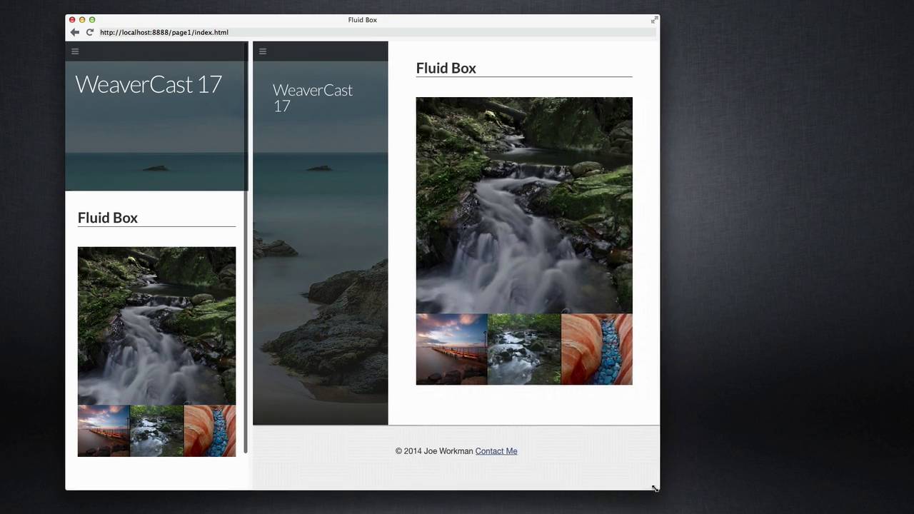
07:03 for some responsive layouts so here I've
07:07 created a nice collage of images I have
07:10 a larger image and then three nut
07:12 thumbnails directly below it and what's
07:15 great is these actually have a maximum
07:17 width of right now set to 500 pixels and
07:21 after when it's reached that maximum
07:23 width of 500 pixels the content is
07:25 centered then as the browser shrinks
07:30 will notice that eventually when it hits
07:34 500 pixels the content will dynamically
07:37 start shrinking down with the browser
07:40 window yet my proportions of all the
07:43 images remain the same throughout so
07:48 here is how I achieved this layout
07:50 simply I've placed a placeholder stack
07:54 which is essentially an imaged my free
07:56 image stack for doing placeholder images
07:58 but essentially you're going to want a
08:00 responsive image here and then below
08:03 this I've created a response I've used
08:05 my responsive three column stack with
08:07 three images inside of it now in my
08:11 responsive three column stack what I've
08:13 done is I wanted to have as little gap
08:16 as possible between the images so I set
08:20 up my column width to be thirty-three
08:22 percent the column gutter to be zero
08:25 percent now I actually don't want D
08:29 columns to break at all I wanted to be
08:31 three columns throughout even on mobile
08:33 devices so what I've done is I've set
08:35 the two break points to ignore break now
08:40 with this layout you're going to want to
08:41 make sure that you have a break column
08:42 to first checked or else it won't work
08:44 there's some small quirks there okay now
08:48 the last key to this is making sure that
08:51 we have a maximum width set for
08:54 everything
08:54 and to do that we're using jack and jack
08:58 there is a maximum width setting so
09:01 inside Jack you go and you check min max
09:03 width and we set the I set them in with
09:06 2 100 and the maximum width of 500 and
09:10 make sure that you set the alignment to
09:13 Center as well and what this will do is
09:15 once the content reaches 500 pixels the
09:19 content will stop growing and then jack
09:21 will make sure that the content remains
09:23 Center on the screen now you may be
09:26 thinking what's the catch this is too
09:28 simple this isn't hard but here's where
09:31 things get tricky the trick here is with
09:34 the image sizes so as we see my larger
09:37 placeholder image I've set to 500 pixels
09:40 wide and height okay my smaller images
09:45 I've set to 170 which is a little bit
09:48 more than one-third of 500 right now
09:52 however I've these set to responsive so
09:54 they'll dynamically change sizes on if
09:57 need be now however with responsive
10:02 columns what I've done is what we've
10:05 done here is we've set the columns to be
10:07 thirty three percent each okay well 33
10:12 times three is only 99 percent what do
10:17 we do about that extra one percent so if
10:20 we've noticed here the middle image here
10:24 is a little bit larger than the side
10:26 images and the reason for that is that
10:29 the center column is actually going to
10:32 be thirty-four percent not the
10:35 thirty-three percent that we expected
10:37 because responsive columns calculate it
10:39 out it wanted to fill up that extra
10:41 space because we said we wanted a 0%
10:44 gutter so the left and right columns are
10:49 thirty-three percent the center column
10:51 is thirty-four percent how do we adjust
10:54 for that well we know the width of our
10:57 image here in desktop mode is 500 pixels
11:00 and we need to differentiate that by 1%
11:06 so one percent
11:08 of 500 is going to be five pixels so
11:13 what we need to do is we need to add
11:15 five pixels to the width of our Center
11:19 image so instead of 170 we're going to
11:24 request a hundred and seventy-five pixel
11:26 image and if we notice now it is exactly
11:30 how we wanted it the size of the center
11:33 image proportionately takes a new
11:35 account the extra one percent that that
11:37 middle column has and it nicely lines up
11:40 everywhere on every single edge and if
11:44 we check this out on our mobile device
11:45 will see that it still works perfectly
11:47 everything is aligned from desktop to
11:49 mobile on all edges now if you will
11:53 notice on the mobile device we have one
11:56 pixel thin white lines and that's
11:58 because the web browser didn't exactly
12:00 calculate 34 pic 34% for that middle
12:03 image and it left a couple pixels on the
12:07 left and the right of it let's see
12:09 exactly what we can do kind of a
12:10 workaround and make that look a little
12:11 bit better so quick shimmy for this is
12:14 to essentially assign a background color
12:17 to the response of three column stack so
12:19 basically I'm going to do is I'm going
12:20 to set the background color of that
12:21 stack to black now when we've done that
12:24 we'll notice that the one line the one
12:26 pixel lines aren't gone however setting
12:29 them to black um really just disguises
12:32 them so you hardly barely notice them at
12:35 all um actually I kind of like it I
12:37 think it adds a little bit of definition
12:39 in separation between the smaller images
12:41 so there we have it we have a great
12:44 image layette collage layout that is
12:47 responsive from desktop all the way to
12:49 mobile devices well and that wraps it up
12:52 today everyone I hope you enjoyed the
12:53 show hope you learned a couple little
12:55 tips and tricks for building some better
12:57 responsive layouts and if you have any
13:00 questions comments or concerns please
13:02 feel free to shoot me a note i'm on the
13:04 various internets at joe workman on
13:07 twitter and app.net you can always email
13:10 us at support at joe workman net and as
13:14 always please send us some feedback send
13:16 us exactly what shows you want to learn
13:18 what do you want to learn on these
13:19 podcasts I want to do these
13:21 for you so that you know um you know
13:24 everything and you're you become a
13:26 better Weaver so thank you very much
13:29 check out my products on Joakim net they
13:32 you know help fund these great free
13:34 podcasts so go ahead and peruse and buy
13:37 some stacks and have some fun thanks
13:39 everyone talk to you later bye"}]
Search the page
0
