About Stacks Guru
Stacks Guru is born from the need to search the vast number of videos out there on stacks built for Stacks Pro and the Stacks 5 plugin for Rapidweaver.
We have scraped over 500 videos to get the transcripts for each in order to make the spoken word searchable.
Please use this free tool to help you learn and discover the awesome power that Stacks and the stacks made for Stacks have to offer.
Stacks Guru
Video Reference
Bento Areas for Stack Pro: How to
02/15/2024
In this video, we will go over how to use Bento Areas for Stacks Pro to build a bento grid for our website. For more information about Bento, head over to https://www.weavers.space/stacks/bento
Transcript
00:10 so in this video we're going to be00:11 looking at the Bento areas stack now the
00:14 Bento areas stack can build very similar
00:17 style grids pretty much the exact grids
00:19 that you can build with the Bento stack
00:21 you can build with Bento areas but the
00:23 two stacks take a very very different
00:27 approach in some ways Bento area is
00:30 simpler and in some ways it's also a
00:33 little bit more
00:34 advanced so let's jump in and kind of
00:37 show you uh why it is both more simple
00:40 and complex uh right now so Bento areas
00:45 allows us to Define content areas by a
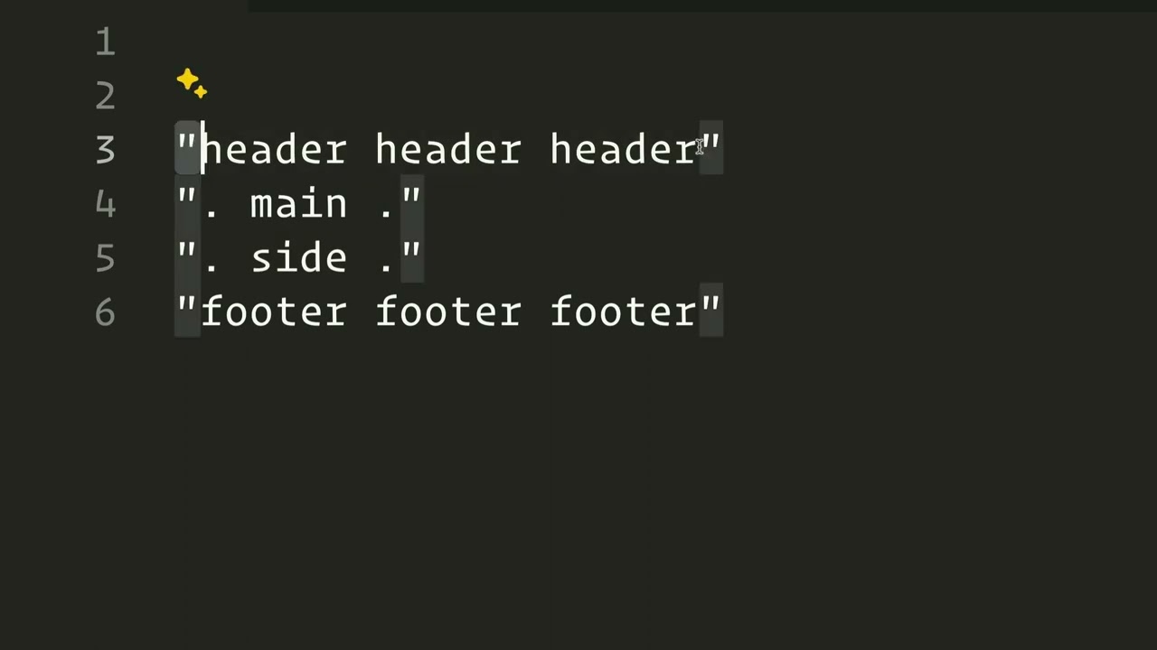
00:49 name okay so here inside the areas Let's
00:53 ignore these area rules for right now
00:55 and let's show you how we can actually
00:57 build out um our content
01:00 so what we're going to do is I'm going
01:01 to build just a generic run-of-the-mill
01:04 layout for a web page I'm not going to
01:06 use this you can use this to build out
01:08 um smaller layouts within your web page
01:11 but I'm going to build this to be the
01:13 overall layout for our web page so in
01:18 here I have defined four content areas
01:21 and what I'm going to do is I'm going to
01:22 go ahead and set this area name to be
01:26 header and uh for edit mode so that we
01:28 can use our uh grid designer we're going
01:31 to assign this to be area number
01:33 one okay so now we have area number one
01:36 and it says that we have header right
01:38 there okay and let's go ahead and add in
01:41 a new area and we're going to make this
01:43 be Main and that's going to be number
01:47 two and then we're going to add one more
01:50 and this is going to be side for our
01:52 sidebar and that's going to be content
01:54 number
01:55 three and we're going to add one more
01:58 and that's going to be footer
02:01 and we're going to make that item number
02:04 four so now that we kind of have that
02:08 situated um let's go ahead and look at
02:11 what we can do
02:12 here so just like other Bento Stacks we
02:15 have our preview grids so we can uh see
02:18 our extra small is by default then we
02:20 have small medium and large and see how
02:24 this morphs and completely changes based
02:26 off small we have our header then our
02:29 main content our sidebar is below our
02:31 main content and then we have our footer
02:34 right and then once we jump up to medium
02:36 kind of some more traditional layout
02:38 where we have our header we have a
02:39 little bit of a gutter on the left and
02:42 the right we have our main content we
02:45 have a sidebar and then below all that
02:47 we have a footer that goes full width
02:49 and that's the same on
02:53 large now how do we Define this grid cuz
02:56 here we're we're not the other Bento
02:59 Stacks were kind of kind of building out
03:00 a grid and then we're sizing them by
03:02 like you know it's going to be two
03:04 columns wide and three rows tall right
03:07 um You Were defining the sizes of those
03:09 particular items but here we're not
03:11 we're just defining labels and in order
03:14 to understand what those are we need to
03:17 look at these area
03:21 definitions right so here is the area
03:24 definition that is by default on the
03:26 extra small break point and let's this
03:30 as you see you'll probably notice that
03:32 we have our labels these are the same
03:34 labels that we created when we created
03:37 our areas we have header main side and
03:43 footer now essentially what we're doing
03:45 is we are building out a grid with
03:48 words now if we look at this I have four
03:51 rows of content I have one 2 3 four rows
03:57 of
03:58 content now within those four rows I
04:01 have three
04:03 columns here in the first row I have
04:06 header is going to take up all three
04:09 columns in the second row of content I
04:13 actually just have my main and Dot is a
04:16 special thing where it's basically like
04:18 a gutter it's just empty space we don't
04:20 have any content there at all and if you
04:23 remember that's the little the little
04:25 padding or gutter that we have from this
04:28 side of our browser window
04:30 windows so here we have a little bit of
04:32 empty space and then we have main our
04:35 main content area and then we have a
04:37 little bit of empty
04:39 space same thing in our sidebar but then
04:42 in the footer we don't want to have
04:44 empty in our footer and our header we do
04:45 not want empty space we want the header
04:47 and the footer to go full with the
04:49 browser window with no empty space at
04:51 all so that footer is going to take up
04:54 the empty space the the main content
04:57 area of the footer as well as that empty
05:05 space now another thing that is very
05:08 important is that each row needs to have
05:10 double quotes in here this is a very
05:14 particular very syntax specific solution
05:19 um that once you get your head around it
05:21 it makes things very powerful and easy
05:22 to use but the syntax is very and is
05:26 very
05:28 strict
05:30 now if we looked at when we morphed up
05:33 into medium and large devices our layout
05:38 changed a little bit and let's go ahead
05:40 and do that essentially what happened is
05:43 um we have main inside were on the
05:47 same row so here we had uh we didn't
05:52 have this row at all so in
05:55 our medium and large devices we actually
05:58 are going to have four columns and three
06:01 rows of content now here we have again
06:05 our gutter kind of our padding between
06:07 the edge of the browser in our content
06:09 and then we have a sidebar and then we
06:11 have that padding
06:13 again now up here though header is only
06:17 taking up three so basically what we're
06:18 going to have to do is because we want
06:20 the header in the footer to be full
06:22 width we're going to have to modify that
06:24 so that those have four as well now we
06:29 see here if you want to take an area and
06:31 expand it across multiple columns you
06:34 just simply repeat that header um in
06:37 this case a header over multiple columns
06:39 and basically it's saying this header is
06:41 going to take up four columns but how do
06:44 we make something expand multiple
06:48 rows so let's say for example um I
06:51 wanted to have a second content area um
06:55 so I'm going to have gutter on the side
06:57 let's say we want to have extra here so
07:00 this is our extra um and
07:03 essentially now since side is in two
07:07 rows and it's also matched up to the
07:09 same column okay so this side and this
07:13 side are in column three and because I
07:17 put them spanning across two different
07:20 rows that side will expand across two
07:26 rows now another thing that could help
07:28 is you can actually add in as many
07:30 spaces as you want in here so if you
07:32 wanted to kind of you know visually see
07:36 this so that they're spaced out into
07:39 their various um actual columns you can
07:43 do that so here we can see here's my
07:46 here's column one here's column two
07:49 here's column three and then here again
07:52 the sidebar is spanning across two
07:54 different rows and then here's our
07:57 column four let's play around with these
08:00 directly inside edit mode and we can
08:02 kind of see how things play out so as
08:04 you see here inside extra small mode I
08:07 can go ahead and let's just go ahead
08:09 and start overwriting what we have here
08:12 so I have my sidebar and I'm just going
08:14 to I'm going to cut that and I'm going
08:17 to put it before our main now in order
08:19 to add a return here you just do option
08:22 and the return key and that will make it
08:24 multiple lines and what you'll notice
08:26 here is our layout has shifted inside of
08:29 our grid designer it now shows us that
08:31 we have our header our sidebar then our
08:34 main content and then our
08:37 footer now let me show you what happens
08:40 if I go ahead and turn off these little
08:43 dots in the
08:45 sidebar and in the
08:48 main okay well it kind of breaks things
08:51 because we not we now no longer have
08:54 three columns inside of our row so that
08:57 means something is wrong with our syntax
08:58 here so we're going to have to modify
09:00 that right well we can do side
09:09 side so if we look now what I did is I
09:12 added side side and so now our main
09:16 content and our sidebar are going to
09:17 start way at the edge of our browser now
09:21 they're at the edge of the browser
09:22 because I'm using found a blank theme
09:25 and this bento's area stack is not
09:27 inside of a container that doesn't any
09:29 sort of gutter right but essentially th
09:32 this will start at the edge of the
09:34 layout in this example here it's going
09:36 to be the edge of the browser but it
09:38 could be the edge of your layout um if
09:40 you're using this within um other stacks
09:43 on your page or within a traditional
09:46 theme now what determines the size of
09:50 our
09:51 layouts what determines the size of
09:54 these columns if you look above so here
09:56 we are on the large layout and we see
09:58 that our header goes full width and then
10:01 our main content uh basically our second
10:03 row of content which has our main
10:04 content and sidebar it doesn't go full
10:06 width it has these little gutters okay
10:09 and then the footer goes full width um
10:11 as well so what controls the sizes of
10:13 that and that has to do with the large
10:16 columns or the column setting so we have
10:18 large extra small small medium and large
10:21 columns and if you notice this is has a
10:25 set of measurements in here okay and for
10:28 large we have four columns so I have
10:31 four
10:33 measurements let's look at these so here
10:36 is our areas grid definition okay if you
10:40 notice here we have four columns and
10:43 down here I have four
10:46 measurements now these are all standard
10:48 CSS measurements and we'll talk about
10:51 them um but you can use more than just
10:54 what is here here I have REM you're
10:56 probably familiar with REM one REM is
10:58 approximately 16 pixels if you're more
11:00 familiar with pixels you can change this
11:02 to be 16px so basically column number
11:05 one is 16
11:08 pixels column number two is 3fr column
11:11 number four or three is 1fr we'll get
11:14 back to that unit and then one R let's
11:16 go ahead and change that to 16 pixels as
11:19 well so it's a super familiar um unit
11:24 now the FR unit is relatively new and it
11:28 might be complet complely new to you
11:30 what does that mean so it is a
11:33 fractional unit so essentially what what
11:36 this is saying is column 2 needs to be
11:40 three times larger than column
11:43 3 so basically if we divvied
11:46 up these two columns this one is going
11:49 to be three times larger than this
11:52 one in other respects you could say this
11:55 is
11:55 75% and this is 25%
12:00 the same thing right this will work just
12:03 the same um that fractional of the FR
12:05 units are just something kind of
12:07 relatively new um and they work within
12:10 CSS
12:11 grid so that's fractional units um you
12:14 can use any CSS unit you want here you
12:17 can use pixels you can use percentages
12:19 you can use um you know Vmax V whatever
12:23 CSS unit you are aware of you can most
12:26 likely use it here okay um now I left
12:29 this very wide open um so that you can
12:32 do what you want as a power user the
12:36 only caveat is you have to make sure
12:37 that you define the number of units that
12:40 are equal to the number of columns that
12:42 you
12:44 defined so hopefully now that we've seen
12:47 this um we can kind of understand how
12:50 this is working now so here in column
12:53 one of header this is 16 pixels wide
12:57 this one is 75% % this one is 25% and
13:01 this last column is 16
13:04 pixels in our second row of content this
13:07 dot it doesn't have anything there's no
13:09 content assigned to it but it is 16
13:12 pixels
13:13 wide then we have our main content which
13:16 is
13:17 75% our sidebar which is
13:20 25% and then we have again another empty
13:23 column that is going to be 16 pixels
13:26 wide this is why we have little gutters
13:28 on this side and then our footer is
13:31 behaves exactly like header so all four
13:33 of these columns ma to these
13:37 sizes so what we've built here is
13:39 essentially this demo that we have on
13:42 the Bento product page at the top we
13:45 have our header and again maybe you're
13:47 going to have inside that header stack
13:49 uh the area you're going to have an
13:51 impact stack or some sort of large image
13:54 Banner that has whatever you want and
13:56 then in your main content area this is
13:58 where we're going to put your your
13:59 actual main content maybe it's a blog or
14:02 a product page or whatever right and
14:04 then your sidebar that could be maybe a
14:06 partial that contains all kinds of
14:08 information and links and whatnot right
14:10 and then you have your footer which is
14:12 again probably going to be another
14:13 partial that has you know all your links
14:15 to various things on your website and
14:17 your contact us and and other things
14:19 your copyright and all that jazz goes
14:21 down in your footer right so again this
14:24 is just Bento here is a webpage layout
14:27 tool or a layout tool in general that
14:30 you can then put whatever Stacks you
14:32 want inside of
14:42 it
Search the page
0
