About Stacks Guru
Stacks Guru is born from the need to search the vast number of videos out there on stacks built for Stacks Pro and the Stacks 5 plugin for Rapidweaver.
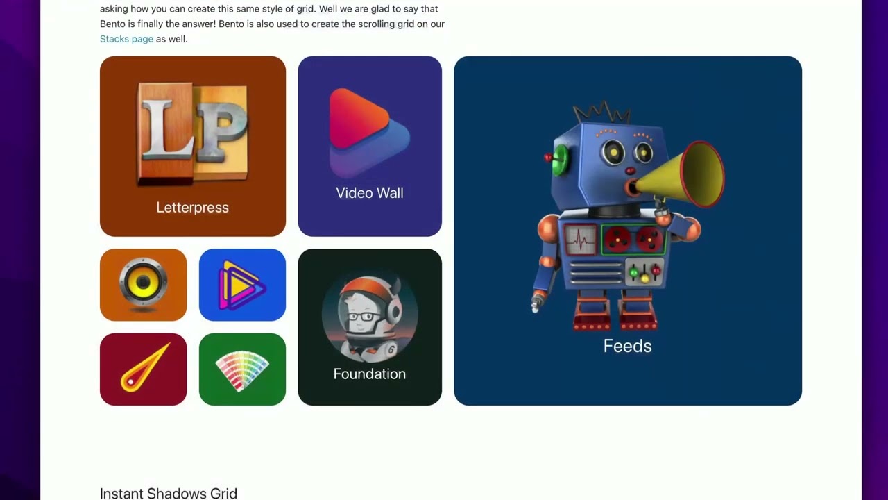
We have scraped over 500 videos to get the transcripts for each in order to make the spoken word searchable.
Please use this free tool to help you learn and discover the awesome power that Stacks and the stacks made for Stacks have to offer.
Stacks Guru
Video Reference
Bento Stack: How to build a bento grid with no code
02/15/2024
In this video, we will go over how to use Bento for Stacks Pro to build a bento grid for our website. For more information about Bento, head over to https://www.weavers.space/stacks/bento
Transcript
00:10 hey so in this video we are going to be00:12 looking at the Bento stack and what
00:14 we're going to be doing is we're going
00:15 to be building out this layout that we
00:18 have inside of the Bento demo this is
00:22 also the layout that's been used for
00:23 years on the Weaver space homepage so
00:26 without further Ado let's Jump On In now
00:29 edit mode for bento is different than
00:31 any other stack you've probably used at
00:33 the top here we have an entire grid
00:35 designer that we can design and
00:37 customize for each break point we have
00:40 extra small small medium and
00:44 large now if we look at the grid that we
00:47 want to build we actually want to start
00:49 off and design what our grid is going to
00:51 look like on mobile devices so I'm going
00:55 to use the device viewer from our
00:56 measure stack and I'm going to go ahead
00:57 and select an iPhone 15 and now we'll
01:00 open up this particular demo for our
01:03 mobile layout so let's go ahead and
01:05 build this now when we're designing
01:08 grids for bento essentially what we want
01:11 to do is we want to think of an
01:14 underlying table such as like an Excel
01:17 table where we have to find the smallest
01:19 cell that we have and in this example
01:21 it's these boxes that are down in the
01:23 lower right hand lower leftand corner
01:26 and if you'll notice here if this is one
01:30 cell here in this particular lay we're
01:32 going to be 1 2 3 4 columns wide okay
01:38 and let's look at how many rows of
01:40 content we have we have 1 2 3 four rows
01:44 of content so on mobile we want this to
01:47 be a
01:48 4x
41:50 grid so if we notice here inside uh
01:53 Bento we're going to go ahead and what
01:55 we're going to do is we're going to
01:56 start off with extra small which is the
01:57 default and we're going to Define the
02:00 number of columns as four and we want
02:04 the number of rows to also be four now
02:07 here we can also customize the gutter um
02:09 for columns and rows as
02:12 well and uh number of items let's just
02:15 leave that at zero for now let's go
02:17 ahead and build out this layout and
02:19 you'll see how easy and fun this
02:21 actually is so below our grid designer
02:24 you'll notice that we have Bento item
02:26 number zero by default and let's go
02:29 ahead and change that to be item number
02:31 one if you notice here when I changed
02:33 the item to be number one it actually
02:36 highlighted that directly in here inside
02:39 edit mode inside of our grid designer
02:42 which is really
02:43 cool now let's go ahead and Define the
02:46 sizing for this if we look at our
02:49 original layout we actually want this to
02:51 be two columns wide so let's go ahead
02:55 and do that we're going to set columns
02:56 to be
02:58 two and basically what we can do is we
03:00 can add another Bento item we can go
03:03 ahead and set that to be number
03:06 two and I want number two to also be two
03:09 columns wide so we're going to set
03:11 columns wide for extra small to be
03:16 two let's just keep on adding items
03:18 we're going to add in number
03:21 three and item number three is going to
03:24 be four wide because this particular
03:26 item is going to take up the entire
03:27 width of my grid so I'm do is I'm going
03:30 to make that columns
03:33 four and then here we have number
03:36 four and number five those are also
03:39 these smaller areas so we're going to go
03:41 four five and then six is going to be
03:44 foundation so let's start building those
03:46 out I'm going go ahead and uh I'm just
03:48 going to go and copy and paste number
03:49 three we're going to make that number
03:51 four um but that one's just going to be
03:53 one right and we're going to copy paste
03:57 and make that one number five
04:00 and then we're going to copy paste that
04:02 one make that number
04:06 six but now number six is foundation
04:08 this one's going to be too wide and Too
04:13 Tall so this is going to be it's going
04:15 to take up two columns and two rows and
04:19 if we look at the grid we're getting
04:21 very close to what our layout is here
04:23 which is really cool let's go ahead and
04:25 add our last two which is number seven
04:27 and number eight which is just going to
04:28 be um a one so we're going to go ahead
04:30 and uh duplicate number five and just
04:32 make that content number
04:34 seven and we can go here and copy paste
04:38 that and that has number
04:40 eight so there we go I I now can
04:43 populate all of these items um with
04:46 actual content and we'll do that shortly
04:49 but I just want to show you get you
04:50 really quick to show you how we actually
04:51 design these and let's go ahead and I
04:54 can customize these colors as well what
04:56 you'll notice is the um colors match
04:59 okay we can have we have a highlight
05:01 color here inside the settings and that
05:03 color will be displayed up here as well
05:06 as in the label of each individual item
05:09 you'll see it actually tells you which
05:11 item number um it is being used inside
05:13 the
05:16 grid so let's say for like number three
05:19 let's go ahead and change that highlight
05:21 color let's make that one maybe blue and
05:23 then maybe like four five 7 and eight I
05:27 am selecting all of them just by holding
05:29 down the option key and let's make those
05:32 like an orange
05:33 color right so now here I have my little
05:36 layout so I kind of have you know one
05:38 two and six are kind of you know they're
05:41 kind of similar sized sizewise and then
05:44 four five and four five seven and eight
05:46 are small so we can kind of visualize
05:48 our grid a little bit here in edit mode
05:50 and as you see the colors um directly
05:53 for each item will change as well so
05:55 it's easy to kind of locate them so you
05:57 can see where your items are going to be
05:59 placed within the
06:01 grid now we had skipped a setting
06:04 earlier and you'll notice that it is the
06:06 extra small items and in this basically
06:09 after you build out your grid you should
06:10 put in here the number of items that we
06:13 have so in this case I'm going to say we
06:14 have eight items I going to click
06:17 eight now before we move on to the next
06:20 break points I do want to show if you
06:21 click on the plus button here you can
06:22 actually customize the actual break
06:25 points that will be used within uh the
06:28 Bento layout so we're not going to cover
06:30 all these right now we'll cover those in
06:32 a separate video um but just let you
06:34 know that you can customize the break
06:36 points that are used um for your uh
06:39 responsive
06:41 layouts so now that we have our extra
06:43 small layout built essentially what we
06:45 need to do is we need to go to the other
06:47 uh break points and Define those layouts
06:49 as well so what we'll do now is we're
06:51 going to go into
06:53 small and now for me I just want extra
06:56 small and small to be exactly the same
06:59 so I'm just I'm just going to copy this
07:00 out so I'm going to say we had eight
07:01 items um we have a
07:05 4x4 okay and let's do maybe our our Gap
07:08 be a little bit bigger let's do 15 for
07:10 our gutter so now extra small and small
07:14 are going to have basically the same
07:17 layout but now we want to change things
07:19 up for medium so we're going to go up to
07:21 medium you notice that things are a
07:23 little wonky right now so let's bring up
07:25 what our medium grid is going to look
07:26 like so we're going to go over here and
07:28 let's Swap this to be say an iPad so as
07:32 a reminder here is the layout that we
07:35 want for medium and large devices and
07:38 what we want to do is we want to find
07:39 the smallest common denominator for our
07:41 cell size right it's going to be for
07:42 this particular layout the smaller uh
07:45 items here so if we were if this this
07:48 was to be one item let's go this is 1
27:52 3 4 and then this one is four so we're
07:54 going to have eight wide and height wise
07:57 we're going to be one two three four
08:01 tall so our grid here our underlying
08:05 kind of grid is is going to be four rows
08:10 by eight
08:12 columns so let's go ahead and build that
08:14 so I know I'm going to keep the same
08:16 number of medium items so let's set that
08:18 to eight and then I said we wanted
08:20 number of columns was going to be eight
08:23 and number of rows was going to be
08:25 four okay and um let's let's put leave
08:29 our gutters for medium at 2
08:32 pixels okay so what we now need to do is
08:35 we need to go through all of
08:38 our items and adjust the sizing so if we
08:42 look at our sizing before we had only
08:44 modified the default sizing which is for
08:46 extra small and if you remember the
08:48 small sizing we wanted it to be exactly
08:50 the same as extra small so what we're
08:52 going to do is we're going to leave that
08:53 as inherit which is the default setting
08:55 so for small it's going to inherit from
08:58 extra small small but on medium we want
09:01 different sizing so what we're going to
09:02 do is we're going to click on
09:06 size so for bento item number one what
09:10 what size do we want let's have a look
09:12 at that again so if we look at this
09:14 layout essentially if you look at this
09:17 icon here it's about the same size as
09:18 these four so basically I want this to
09:20 be a 2X two and I'm going to want that
09:23 for number one number two and then
09:26 number six let's go ahead and do that so
09:29 we're going to do is we're going to go
09:30 to number one uh I'm going to highlight
09:32 number one number two and number six and
09:35 uh we're going to go ahead and set the
09:38 medium size to be two columns wide and
09:42 two rows
09:44 tall there we go
09:48 perfect right now number three okay
09:52 number three if you remember that was
09:53 the really big one right that's kind of
09:55 like and what that was is going to be a
09:58 4x4 it's so it's going to take up pretty
10:00 much half the grid uh it's going to be
10:03 four columns wide and four rows tall let
10:07 just go ahead and set that we're going
10:08 to set custom sizing for medium and
10:11 we're going to set that to be a
10:15 4x4 and just like that magic our grid is
10:19 now done right if we if we look at this
10:22 grid layout it's exactly what we had
10:24 defined um and and what we designed
10:26 inside of our
10:28 layouts and like I said just we did from
10:30 extra small to small I want my uh large
10:33 grid to be exactly the same so I'm going
10:35 to do is here is we're going to large
10:36 items is eight and we're going to do um
10:39 eight columns not 808 and four and there
10:43 we go now all of our items we don't need
10:45 to tweak those
10:47 because we want the large to inherit
10:50 from
10:51 medium but I want to tweak things a
10:53 little bit I want to I thought it would
10:55 be fun to show you um if you notice
10:57 there are two options here for sizing we
10:59 have size and
11:01 position so I can do for large just for
11:04 number let's say number
11:06 three I want to adjust the position a
11:09 little bit okay let's say on large
11:12 devices I'm going to go ahead and change
11:14 the
11:15 position and I want the sizing to be I
11:17 would still want it to be
11:19 4x4 okay but what we now have a we now
11:23 have access to is position we can Define
11:26 where this is going to be Loc at so um
11:30 by default it's going to be one in one
11:32 so if we have this to be a 4x4
11:36 cell the position is going to be at
11:38 start at column one row one but we can
11:42 also start it at column two or column
11:45 three right so let's say we wanted that
11:48 right so now on medium this large one is
11:51 going to be off again flush to the right
11:54 but then on large it's going to move and
11:56 change its position so that it's
11:59 actually centered within the
12:02 grid so that's the kind of slightly more
12:05 advanced position position setting it uh
12:08 again you can customize the sizing as
12:10 well as the starting position of that
12:13 particular
12:15 item so let me go ahead and populate uh
12:17 these with content and let's preview our
12:20 grid so what I've done here is I've just
12:22 added some containers and header from my
12:24 free starter pack um and just added some
12:27 gray boxes that just have a number in
12:29 them so we can kind of see those item
12:31 numbers let's go ahead and preview this
12:35 so here we are in preview and we can now
12:37 see our grids now I have a measure stack
12:39 on this page to kind of show us what
12:41 where we are in our break points right
12:43 so right now we're in small and we have
12:45 1 2 3 4 5 6 7 8 right all right here now
12:49 what you might notice is number six it
12:52 kind of looks a little odd because it's
12:53 not actually stretching its content um
12:56 we're going to look at that really quick
12:58 essentially the by default what what's
12:59 going on is Bento has reserved this
13:02 space for our content but by default
13:05 Bento is going to Center our content but
13:08 we can easily make that stretch so if we
13:11 look at our project let's go ahead and
13:13 look at number six and I'm going to take
13:16 the alignment option as you see the
13:17 default is Middle I'm just going to go
13:19 ahead and set that to be
13:21 stretch and if we refresh the page we'll
13:24 see that voila number six is now
13:26 stretching its height so that uh it's
13:29 exactly the layout that we were
13:31 expecting let's go ahead and make our
13:34 grid a little bit larger and we have a
13:37 little issue we kind of have a similar
13:39 issue with number three right but we
13:40 know the easy fix for
13:42 that we're just going to straight go
13:44 into number three we're going to set the
13:47 alignment to be
13:51 stretch refresh our page refresh our
13:55 page and voila there we go okay and
13:57 let's just keep going and and there we
13:59 are now you might be looking at this
14:01 grid and be thinking wait but number one
14:04 and number two they're kind of not the
14:05 same height as number 6 what's going on
14:08 there so essentially what's going to
14:09 happen is Bento is going to react to
14:12 whatever content you add into it here I
14:14 just have something very simple it's
14:16 just a gray box with a header but as you
14:19 put more content either with paragraphs
14:21 or with images Bento is going to morph
14:25 the sizes of our grid and dynamically
14:28 make it all look uniform based on the
14:31 rules that we've defined so if we look
14:34 here at the Bento uh demo that we built
14:37 remember we built this exact grid
14:39 essentially what's making these these
14:42 items taller is the images as well as
14:45 padding that I've added right if you'll
14:47 notice down here it's just the images
14:49 there's no words so that's going to make
14:52 those particular items smaller have I
14:55 had titles in this that would make each
14:57 of these taller which then turn make the
14:59 foundation one taller right so it's
15:02 going to all kind of mesh and it grid
15:05 will dynamically figure out um the
15:08 height that it needs to create for its
15:10 containers and it's going to make
15:11 everything look
15:22 uniform
Search the page
0
