About Stacks Guru
Stacks Guru is born from the need to search the vast number of videos out there on stacks built for Stacks Pro and the Stacks 5 plugin for Rapidweaver.
We have scraped over 500 videos to get the transcripts for each in order to make the spoken word searchable.
Please use this free tool to help you learn and discover the awesome power that Stacks and the stacks made for Stacks have to offer.
Stacks Guru
Video Reference
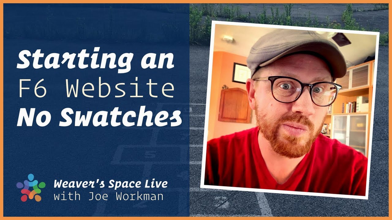
Forget about Swatches. Just build your webpage!
03/02/2022
Do you get hung up with an idea that you saw for a webpage? Do you get stuck trying to figure out how to make a particular part of a page? Sometimes you may never even get past the banner at the top of the page. You get overwhelmed with all of the possibilities. You have added 20 stacks and 30 swatches to the page trying to accomplish this one bit that seemed so simple. Did you really need all of that? In today's video I am going to be building a web page with NO SWATCHES! Well ok, we may sprinkle a couple towards the end. But if the above paragraph speaks to you. I think this new workflow to building a webpage with Foundation 6 may be the ticket for you.
Transcript
Transcript coming soon...
Search the page
0