About Stacks Guru
Stacks Guru is born from the need to search the vast number of videos out there on stacks built for Stacks Pro and the Stacks 5 plugin for Rapidweaver.
We have scraped over 500 videos to get the transcripts for each in order to make the spoken word searchable.
Please use this free tool to help you learn and discover the awesome power that Stacks and the stacks made for Stacks have to offer.
Stacks Guru
Video Reference
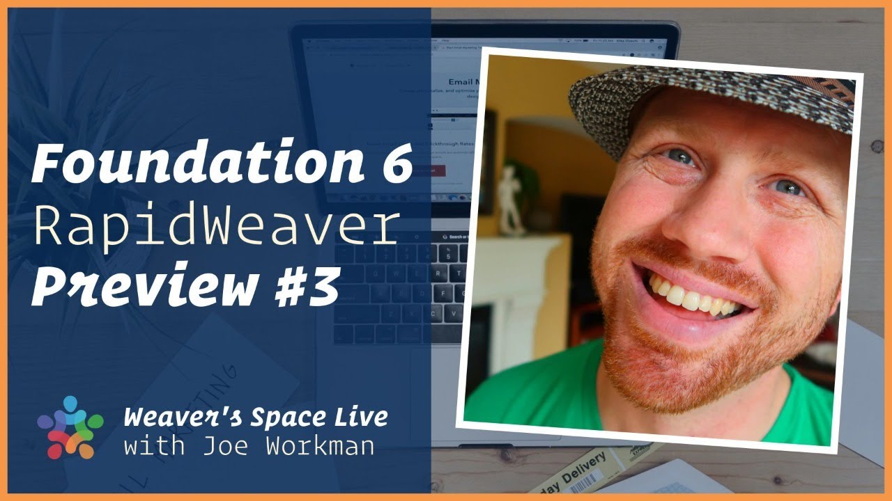
Foundation 6 for RapidWeaver Preview #3 - Let's Build a Website
11/27/2019
Today is Foundation 6 launch day! Come celebrate with me on today’s live stream. I will be building an entire webpage with F6 live. This will give us a good chance to really see F6 in action.
Transcript
Transcript coming soon...
Search the page
0