About Stacks Guru
Stacks Guru is born from the need to search the vast number of videos out there on stacks built for Stacks Pro and the Stacks 5 plugin for Rapidweaver.
We have scraped over 500 videos to get the transcripts for each in order to make the spoken word searchable.
Please use this free tool to help you learn and discover the awesome power that Stacks and the stacks made for Stacks have to offer.
Stacks Guru
Video Reference
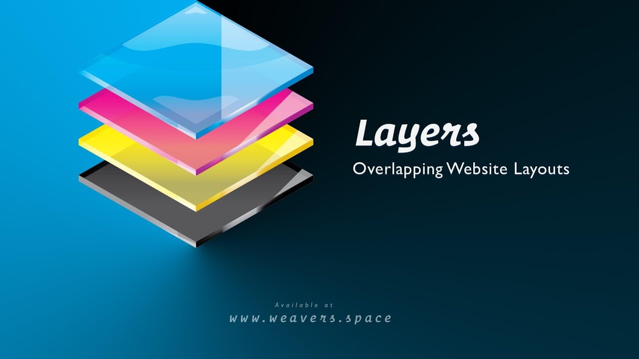
Layers Stack Overview
05/05/2023
Are you tired of the same old boring website layouts? Want to create something truly unique and eye-catching? Look no further than Layers! Our website addon allows you to break free from the constraints of traditional grid and column layouts, and instead create stunning designs with overlapping layers. And the best part? Our responsive design ensures that your website will look amazing on any device. With the ability to add as many layers as you want, and customize them with any content you desire, the possibilities are endless. Don't settle for ordinary - elevate your website with Layers. Check out Layers at https://www.weavers.space/stacks/layers
Transcript
00:00 don't know00:10 so layers allows us to create amazing
00:13 layouts that kind of break the mold of
00:15 your traditional column and grid-based
00:17 layouts as you see here we can have a
00:20 layout that has overlapping layers these
00:23 layers can be positioned wherever you
00:25 want within your layout and as you see
00:27 we can also apply a many different
00:29 styles and rotations and things like
00:31 that to our content so here's a few
00:34 examples of things that we can do and
00:36 we'll review a lot of these today in
00:37 this video
00:39 so you see here we have a gallery where
00:41 we have images kind of like thrown out
00:43 on the page this kind of central image
00:46 kind of is our focal point and all the
00:48 other images are kind of thrown out on
00:50 the outskirts of that and positioned and
00:52 rotated
00:54 um all around it
00:56 here we have a simple kind of two column
00:58 card layout here where our two columns
01:00 are overlapping each other and then we
01:02 have a nice little title that's kind of
01:05 floating above our form
01:08 and you've probably noticed this this is
01:09 the layout that's on our reverse Weaver
01:12 space start page and this layout we've
01:16 been asking for years people have been
01:18 asking us how we've created this so we
01:20 finally released the layer stack which
01:21 is how we've done it
01:23 um and this is exactly what it does
01:24 right it basically uses layers takes all
01:27 these various components and uh you know
01:30 layers them and and kind of stacks them
01:32 on top of each other so you can create
01:33 these really interesting layouts that
01:36 are actually fully responsive as well so
01:38 let's jump into rap Weaver really quick
01:39 and kind of show you uh how these
01:41 layouts were created
01:43 um so first off we'll just show you by
01:45 adding a base layer stack to the page
01:47 right it's just so you can kind of see
01:49 what things look like uh blank so here
01:52 we have a default drop area where you
01:54 can add kind of your static content
01:57 and then if you wanted any floated
01:59 content or any layers you can go ahead
02:01 and click this plus button and there's
02:03 two different things that we can add a
02:05 layer shift and a layer float
02:08 um the layer shift allows us to
02:10 basically think of it as static content
02:13 but it allows us just to kind of shift
02:15 things up down left or right okay
02:18 and then if we want the the full-blown
02:20 floating capabilities we would add a
02:22 layer float stack that allows us to
02:25 really position this content anywhere
02:28 that we want within our layout
02:30 so let's quickly uh review the layers
02:32 stack
02:33 um inside the main layer stack uh it's
02:36 kind of broken down into two main
02:37 sections first we have a container okay
02:40 um so basically the the wrapper around
02:42 our layout we need to define the height
02:45 so by default is auto so it'll be based
02:47 on the stacks that you add in here the
02:49 static Stacks that you add but we can
02:52 also make things like variable so if you
02:53 want it to always be let's say 40 height
02:55 of the browser 50 or maybe even 10
02:58 height the browser you can do that
03:01 um you can fill this is kind of a more
03:03 advanced technique
03:04 um if you already have an existing
03:05 layout and you want this to just fill
03:07 that layout you can use that it's
03:09 probably like only like one percent of
03:11 the time you'll use something like that
03:12 and then lastly we can do scale which is
03:14 basically allows us to create an aspect
03:16 ratio so let's say like a 16 by nine or
03:19 maybe you want a square layout that
03:21 would be a one by one and then you can
03:22 set minimum and maximum height limits on
03:24 that as well
03:26 then we have our paddings and margins
03:28 this is horizontal or top and bottom
03:30 padding okay and top and batting top and
03:33 bottom padding and margin uh and then we
03:35 can set our overflow okay and then if
03:37 you're for all the foundation six and
03:39 CSS lovers out there we have the ability
03:41 to add classes to this wrapper so you
03:43 can add additional styling or things
03:45 like that with swatches
03:47 so now the rest of the settings within
03:49 the layer stack all have to do with
03:50 styling and setting up the background
03:53 layer within your layers layout so by
03:56 default we can add in a background image
03:58 let's go ahead and add in this image
04:00 here
04:01 and that gives us our background layer
04:04 that's kind of a the background that all
04:06 the other layers sit on top of even the
04:08 static content sits on top of the
04:10 background layer now we can apply an
04:12 overlay we can actually blur the image
04:14 as well so we can kind of apply a blur
04:17 uh we can apply an opacity and then we
04:20 can also change it maybe we make it a
04:22 static color we can make it actually
04:24 have stack content
04:26 which we'll I'll show you in a little
04:27 bit and then we can also do Warehouse
04:30 image which also gives you total CMS
04:31 support as well
04:34 so let's go back to this color so we can
04:35 kind of see play around with things here
04:37 let's go back to the image that's a cool
04:39 kind of stacks Stacks Pro Image there
04:41 now if we look at the background sizing
04:44 okay we can either have the background
04:46 be on the left or the right we can
04:49 adjust the width of that background
04:51 layer and then we can also adjust the
04:53 offset so if you see here as I as I'm
04:56 moving it it's kind of like a I'm
04:57 determining the location of that
04:59 background layer
05:00 now we can also apply round corners so
05:03 if we want it let's say a little bit
05:05 more rounded we'll see that those round
05:06 corners are there you can also um do
05:09 detailed rounding
05:10 um so you can actually do rounding for
05:12 each Corner can be unique okay
05:15 uh and lastly is we have some responsive
05:18 settings for the background because we
05:21 can position this and we can size it but
05:23 maybe this these sizes don't necessarily
05:26 work well on mobile or even tablet okay
05:28 so we can basically say we can make the
05:30 background Go full width on a particular
05:32 size so by default I think it's medium
05:35 but we can set it to let's say small on
05:38 small it's actually going to go full
05:40 width so that background layer is going
05:42 to take up the entire width and then you
05:43 can also set a height as well so that on
05:47 this particular breakpoint I want to
05:49 adjust the height of this
05:51 um you know the layers container to be a
05:53 different height than what it is by
05:54 default
05:57 all right let's dive into the layer
05:59 shift and layer float Stacks
06:01 um very similar the layer shift as I
06:03 said it keeps your content static but it
06:06 just basically shifts it left or right
06:09 or up or down you can constrain you can
06:12 adjust the sizing and the height and if
06:14 you want to adjust the direction you can
06:16 adjust top or bottom and then you can
06:18 shift it by either a percentage or a
06:20 pixel amount okay now the percentage is
06:23 the size of the actual content within
06:26 the layers shift stack right so
06:29 um if you do let's say I want to move it
06:31 10 percent it'll be 10 of the size of
06:34 the content within that layer basically
06:37 and the same goes for horizontal you can
06:39 do left or right and then you can either
06:41 shift it by percentage or pixels
06:44 and last but not least we can actually
06:46 do some rotation as well and let's say
06:49 if we rotate I can go ahead and preview
06:51 that within oh well it's within this
06:54 layer shift stack but you can preview
06:56 the rotation as well if you kind of want
06:57 to see because sometimes it's kind of
06:59 hard to visualize what a percentage
07:01 rotation is or what you know what 3
07:03 degrees really is this allows you to
07:06 visualize that with the preview button
07:09 next is the layer float stack now this
07:11 kind of takes it up a notch from the
07:13 layer shift because it also gives us
07:15 break points okay
07:18 um so here we can do the horizontal and
07:20 vertical float so we can give it the
07:21 actual position within the layout so do
07:24 we want it top uh or left zero top zero
07:27 things of that nature uh we can also
07:30 constrain the width just like we could
07:32 in the layers shift stack
07:34 we can still rotate like we did in the
07:36 other stack as well uh and here
07:38 important thing is stacking order uh the
07:41 stack order the larger no the number the
07:44 on more on top of what will be so this
07:46 allows you to uh create the layered look
07:49 to Define what objects lay on top of
07:51 other objects
07:54 um so there we go next is we have the
07:56 break point so I kind of skipped over
07:57 that
07:59 if we break on small medium or even a
08:01 custom break point okay it will use the
08:04 brake settings within the float settings
08:07 here okay so
08:09 um if we Define you know it's break
08:11 point small
08:13 um it would be Zero by default but then
08:15 on at that particular break point it
08:18 would use the break point values
08:22 okay so you can add as many layers as
08:25 you want you're not limited you can have
08:26 again as many as you want let's go ahead
08:28 and look at some of these
08:29 implementations that we have here so
08:31 here in that top
08:33 um let's look at that that's that top
08:34 Gallery here
08:37 okay so in this layout let's look how
08:40 how we're going to build this again this
08:42 picture of the Golden Gate Bridge is
08:44 kind of Center focused it's right in the
08:46 middle it's our static content and then
08:49 all the other ones kind of float around
08:51 it so let's look at those
08:53 so if you notice inside the layers I
08:54 just have the picture stack in there and
08:57 um that picture stack is anchored
08:59 directly into there and then I have a
09:00 bunch of layer floats okay and this
09:03 layer float allows me to this particular
09:05 image here is uh at top 20 percent right
09:10 zero percent
09:12 and then the width is 25 okay so let's
09:15 look at that so here it's at top 20 so
09:19 it's 20 from the top
09:21 it is zero percent from the right
09:22 because so it's it's all the way out
09:24 here on the right
09:26 um and then uh we're restricting it to
09:28 25 the width of the entire layout
09:33 now you also notice here that when you
09:36 choose your floating you can also Center
09:38 the origin
09:39 by default the top left corner of your
09:42 layout
09:43 um is what is used so if I were to set
09:46 this to be
09:47 um 0 0 uh if I were to set this to say
09:51 right zero bottom zero okay or let's say
09:54 right zero top zero the right corner
09:57 would be at the top right of the layout
10:00 okay but by clicking the center origin
10:03 what that does is it sets the center of
10:06 the image as the position Point instead
10:07 of the either top left or top right
10:09 corner or bottom or bottom left or
10:12 bottom right so depending on whether or
10:13 not you're choosing Left Right top or
10:15 bottom instead of using the actual
10:17 Corners as the position it's going to
10:19 use the center of the layer as the
10:22 position Point okay depending on what
10:25 you want to do
10:26 um it might make sense to either turn
10:27 Center on or off
10:29 okay
10:32 um so basically the rest of the images
10:34 here are very similar it's just other
10:36 layer
10:37 um floating layers that have different
10:39 percentages
10:41 um different widths to find different
10:43 rotations defined and of course
10:45 different Z indexes defined as well or
10:47 stack order
10:49 okay
10:50 so they're all just very similar layouts
10:53 it's just positioned differently and
10:56 sized slightly differently because I
10:58 didn't want all the images to be the
10:59 same size either kind of make it a
11:00 little bit more dynamic
11:02 so scroll down let's look at the next
11:05 file now I should note that this is the
11:08 demo file that ships with layers So you
11:09 you're going to get this file so you can
11:12 work with it directly
11:14 so inside this layer stack uh here I
11:17 have my one column that is my static
11:19 content
11:20 um and then here I have my float right
11:23 so here this header
11:24 um it's floating it's a floating layer
11:26 I've defined the sizes and positions of
11:29 those as well as a different float layer
11:31 has that form okay the card that has the
11:34 form on it
11:39 further down now here in this particular
11:41 stack okay in this set here I actually
11:43 don't have any
11:45 static content in here now when you
11:48 don't have static content you're going
11:50 to want to make sure that you set the
11:52 height here so here on these particular
11:54 ones I have it set to be variable height
11:56 and it's currently set to be 25 of the
11:58 browser height but then you can also set
12:00 the minimum and maximum value for that
12:02 okay
12:04 um and then basically all of my layers
12:06 here
12:08 um are floating within that okay so I do
12:11 have a background layer you can kind of
12:12 see that in the back and here's an
12:14 example of it being blurred okay so that
12:16 that image is getting blurred in the
12:18 background
12:19 um I then have a layer float here now
12:22 here I have a visibility stack uh this
12:24 is from the starter pack my free starter
12:25 pack and this basically hides this
12:28 particular image on small right because
12:29 I didn't want my my layouts to get
12:32 totally cramped on mobile
12:35 um and so what I'm doing is I'm hiding
12:37 that now one other thing to combat that
12:39 is in your responsive breakpoints if you
12:42 say stop layer float that basically what
12:45 that does is that will
12:48 um make this the content within the
12:50 layer float stack static content at the
12:53 break point
12:54 okay I actually do that inside this two
12:57 column layout here
12:59 so let's look at what that does
13:04 if you notice here
13:06 um in this particular layout we have our
13:07 layered layout but if we were to go to
13:09 mobile okay what you'll notice is this
13:12 layout there it's now stacked on top of
13:14 each other because I'm removing that
13:16 float and basically I'm turning it into
13:18 static content on the breakpoint which
13:21 is mobile devices small devices in this
13:23 particular point
13:25 okay so that's what that stop layer
13:28 float does it allows you to
13:30 um stop the float at a particular break
13:32 point and just make that particular
13:33 content static
13:36 the rest of this is pretty simple it's
13:37 just a bunch of other layer floats that
13:39 have different positioning different
13:41 sizes and different stacking orders to
13:44 make sure that they're stacking on top
13:45 of each other the way that I envisioned
13:47 it okay
13:49 now last but not least here in this very
13:52 last
13:53 stack here in this example here I have
13:57 I'm using a background of a stack okay
14:00 and if you notice here um what I've done
14:02 here is I've actually added a wallpaper
14:04 stack in there and um now you could add
14:07 content into that
14:10 but what you'll notice is um here at
14:13 basically this is a wallpaper that has
14:14 it's one of my stacks that has you know
14:16 nice fancy gradients as well as some SVG
14:19 background
14:20 um to just kind of give it an accent
14:22 right so
14:23 um I think I'm not sure quite sure how
14:25 useful it is to actually put content
14:27 within your background layers but you
14:30 know I think the background layers used
14:31 best for kind of access accenting
14:34 content like here we have these blurred
14:36 images here I just have kind of a
14:37 wallpaper that's set to fill its
14:39 container
14:40 um so we get a nice accent behind our
14:43 content and here you'll also notice that
14:45 I made the wallpaper a circle okay and I
14:48 did that with some CSS and swatches so
14:52 that is the layer stack
14:53 um thank you very much I hope you enjoy
14:55 it um it's a really interesting stack to
14:57 give us some very different layouts that
14:59 we don't normally create on our websites
15:01 you know the outs getting outside of
15:03 that box of just using columns and grids
15:06 and and really overlapping content can
15:08 really make for some really interesting
15:10 intriguing
15:12 um layouts for our websites so hope you
15:13 enjoy that
Search the page
0