About Stacks Guru
Stacks Guru is born from the need to search the vast number of videos out there on stacks built for Stacks Pro and the Stacks 5 plugin for Rapidweaver.
We have scraped over 500 videos to get the transcripts for each in order to make the spoken word searchable.
Please use this free tool to help you learn and discover the awesome power that Stacks and the stacks made for Stacks have to offer.
Stacks Guru
Video Reference
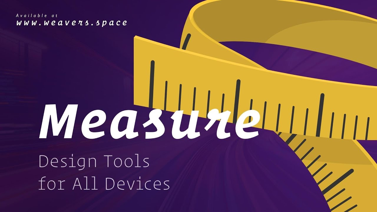
Measure Stack Overview
10/19/2023
Transcript
00:10 hey everybody Joe Workman here and today00:12 I'm really excited to introduce you to
00:15 the new measure stack now this is a new
00:17 suite of design tools that allow us to
00:20 ensure that our website layouts look
00:22 great on all devices let's check it out
00:26 now the first tool that we're going to
00:27 look at is the measure stack and as you
00:30 see on this page I have two examples of
00:32 them uh this first example is going to
00:34 be measuring the actual container size
00:37 and the second one's actually going to
00:38 be measuring the entire browser window
00:41 so as you see these are great tools to
00:43 use within preview and as I resize my
00:47 browser window you'll notice that the
00:49 values of the actual rulers change to be
00:53 the actual live dimensions of that
00:56 particular component whether or not it's
00:58 this particular box or or it's the
01:00 browser window now you will notice that
01:02 these actual rulers change colors they
01:05 change colors based off predefined rule
01:08 sets Now by default the rule sets are
01:11 from Foundation 6 breakpoints but
01:12 there's a lot of really great bakedin
01:15 rule sets for all Frameworks as well as
01:18 some popular devices now these work
01:21 really great inside responsive design
01:23 mode cuz as you see I can take my
01:25 browser window down really small to what
01:28 the smallest mobile device could be and
01:30 I can see exactly what the dimensions of
01:33 my objects on the page are also if
01:35 they're in the way just simply double
01:36 click to
01:38 hide now the next tool in our toolbox is
01:40 the measure Swatch now this behaves
01:43 exactly like the measure stack does but
01:45 it gives us that amazing Swatch feature
01:47 where we can just add a class to
01:49 anything we want in order to measure it
01:51 so here I created a Swatch that just
01:54 simply ties to the measure class all you
01:57 need to do is add that class to whatever
01:59 container we want
02:01 and it just does it so when we preview
02:03 this we'll see that I'm actually showing
02:05 you the iOS device rule set now here
02:09 because there's no iOS device this large
02:11 it's displaying
02:13 desktop but as we resize the the window
02:16 down we'll see that we'll start getting
02:18 to actual break points for iOS devices
02:22 so here we have an iPad Pro
02:24 12.9 so if we look at responsive design
02:27 mode we'll see that the actual break
02:29 point points for every single different
02:31 iPhone are available directly right here
02:35 within
02:36 measure now the measure stack bases all
02:39 of its actual break points on the device
02:41 width so in responsive design mode when
02:44 we change the height it doesn't really
02:46 affect the actual break points for that
02:49 let's look at our next
02:51 tool so here we have the device viewer
02:55 and when we preview this we'll notice
02:57 that we get a drop down of every single
03:01 iOS iPad and many different popular
03:04 Android and surface
03:07 devices and let's go ahead and pick
03:10 one that will then open up a popup
03:12 window of the exact dimensions of the
03:15 iOS device that we have chosen want to
03:17 turn it landscape mode go ahead and
03:19 click this button and you now get this
03:22 device directly in landscape mode and
03:25 you can scroll down and view your
03:26 designs on that particular device want
03:29 to try a different device let's go ahead
03:31 and select a new
03:32 one let's go ahead and pick an iPad 1
03:36 and there we go here's the exact
03:38 dimensions of what our website will look
03:41 like on a on this particular device so I
03:45 hope you can see how useful the measure
03:47 Suite of design tools can be it really
03:50 allows you to fine-tune your layout so
03:52 we can measure things and really preview
03:55 them on tons of different mobile devices
03:58 directly from preview it's really cool I
04:00 hope you enjoy it and go forth and make
04:03 your websites great
04:13 bye
Search the page
0
