About Stacks Guru
Stacks Guru is born from the need to search the vast number of videos out there on stacks built for Stacks Pro and the Stacks 5 plugin for Rapidweaver.
We have scraped over 500 videos to get the transcripts for each in order to make the spoken word searchable.
Please use this free tool to help you learn and discover the awesome power that Stacks and the stacks made for Stacks have to offer.
Stacks Guru
Video Reference
Leave a Tip!
Every little bit helps to keep this going. I'll be doing my very best to keep up with the likes of Joe when it comes all the videos he posts!
MovingBox 3 Stacks - Nav Arrows and Dots
For more information about MovingBox, head over to https://www.weavers.space/stacks/movingbox
Transcript
come on
[Music]
okay so in this video we're going to be
talking about the nav arrows and the nav
dots for moving box 3.
so here I have a very simple slider uh
let's have a look at what it is and this
just a simple slider that has both
arrows and navigation dots now let's
play with the actual arrows right now to
kind of show you uh what we can do with
our arrows
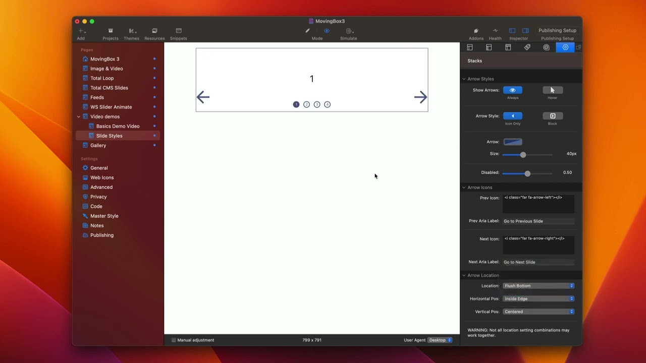
so right now uh by default we can always
show the arrows but we can also show
them just on Hover
and when we turn on just on Hover when
we hover over our slider then the arrows
will be displayed
we can do if you notice here we can have
the arrows shown as blocks or just show
the arrows only
you'll notice when we turn on the Block
arrows we actually have a couple more
options for settings for colors and
sizing
so the arrow color and size should be
pretty obvious allows us to customize
the color as well as the size of our
arrows
so we can adjust the size of these
arrows
the background for our block is pretty
apparent as well it allows us to
customize the color and the background
that we have for our arrows
next is the block size
which allows us to configure the actual
kind of the width of our block sizes so
how bulky do we want those blocks to be
next after we get our color and sizing
all situated you'll notice that we can
actually Define the actual arrows
themselves
now what you'll notice is here by
default we have some SVG icons
and this is a great really powerful way
to define things because you can really
customize these to be whatever you want
because there are a billion different
svgs out there I'll show you a couple of
the ways that I like to insert these and
where I find them
um but if you just Google there's a ton
of SVG resources online that allow you
to get some really great arrows and
navigation svgs so I have a Mac app
called nucleo
um it is a kind of a one-time purchase
uh and it just has a ton uh we just
search for arrows in here
um and it just has a ton like thousands
and thousands of different svgs that you
can then say Hey you know I want this
one you just right click copy SVG paste
it into Stacks done
now if you are a font awesome user uh
whether that be through my font awesome
Stacks or through a foundation six uh it
has font awesome 5 Pro built in
um you can actually use Font awesome
icons here
so here I've gone and just copied a
couple font awesome Snippets for the
generic arrows off font awesome five
directly inside of here and you'll
notice that we have the ability to still
size them and color them just like we
did with svgs
all right so last up is let's look at
playing around with the arrow locations
now these settings are very flexible it
works great for either a horizontal or
vertical and there are going to be a lot
of situations where some of the setting
combinations here won't make sense for a
vertical slider but they do work great
for horizontal slider so what I
recommend is just working from your way
top down okay so for example by default
we're going to have our
um
arrows centered they're centered within
our slide okay and we can also do flush
left which means they're both on the
left side
we can do them both flush right which
means they're on the right side
and then we could also do flush top and
we can do flush Bottom now you'll notice
that some of those settings were a
little bit funky so that's kind of like
get the location to where you want your
arrows to be for example let's say I
wanted it to be flush right
that obviously doesn't look good but we
need to tweak it so we have them both on
the right side now so we want our
horizontal position to be on the Inside
Edge because I do but then we want our
vertical position to be on the Inside
Edge as well
so there we go so now I have
um vertically there on the Inside Edge I
can also put them on the outside edge
okay
um but I think let's say I wanted them
on the Inside Edge now this works great
probably for a vertical slider if these
arrows were up and down rather than uh
top or left and right
so you'll see if I change these arrows
to be up and down these positions now
make perfect sense I wanted them flush
right I wanted them horizontally on the
Inside Edge not on the outside edge and
vertically I wanted them on the Inside
Edge of the vertical line rather than
the outside edge
so again always start from your location
and then work your way down to fine-tune
the horizontal and vertical positions
so for example let's say I wanted to be
flush bottom
and then actually I think inside it
that's maybe perfect maybe that's
exactly what I want right or flush top
right so you see there's a lot of really
uh good flexibility here there's also a
lot of custom options here as well if
you want to do exactly put the exact
pixel percentage or the pixel width from
The Edge you can do that as well
now if you want this pixel to be outside
you just do a negative number so for
example I could do negative
um 20 and these arrows then kind of leak
outside of that right if I did negative
let's keep going that that way that's
how we can kind of go outside
now let's dive into our navigation dots
just like our arrows we can actually
always show them or only show them on
Hover
we have the ability to show just the
dots
dots and numbers
or just the numbers
as you see some of our color options
change as we go down uh depending on if
we want dots and numbers we can color
both the dots and the numbers
you'll notice that there are two columns
because that allows us to define the
default dot color as well as the current
active dot color
so as you see for my icons here um when
the dot is active I have a filled in
circle
but for my inactive dots it is a Hollow
Circle therefore I want my number color
to be different
next as you'll see uh with our DOT icons
just like the arrows we can use svgs
from wherever you like as well as you
can put in font awesome or really any
icon font snippet that you want directly
in there and it should work great
now the dot location is very simple a
little simpler than the arrows because
essentially what you would do is you set
your alignment whether or not you want
Center left or right so where do you
want your icons located and then you can
go ahead and configure the position so
do you want the inside bottom inside top
maybe you want the outside bottom which
would be outside of the slider right if
you want it inside right so earlier when
we had those vertical arrows this could
look great where we have our top Arrow
our bottom arrow and then the mid the
icons are all centered within those
arrows as well so we have inside right
we have outside right outside left so we
have basically all possible locations of
your dots and then this little uh check
box for centering with the arrows
essentially what it'll do is if you are
using
um the nav dots between those arrows
this guarantees it'll be really
centralized to those arrows and if
you're not centrally centralizing with
the arrows it actually just adds a nice
little kind of buffer around so it's
kind of like adding a little bit of
padding around your navigation so that
it just positioned and looks a little
bit nicer
[Music]
[Music]
okay so in this video we're going to be
talking about the nav arrows and the nav
dots for moving box 3.
so here I have a very simple slider uh
let's have a look at what it is and this
just a simple slider that has both
arrows and navigation dots now let's
play with the actual arrows right now to
kind of show you uh what we can do with
our arrows
so right now uh by default we can always
show the arrows but we can also show
them just on Hover
and when we turn on just on Hover when
we hover over our slider then the arrows
will be displayed
we can do if you notice here we can have
the arrows shown as blocks or just show
the arrows only
you'll notice when we turn on the Block
arrows we actually have a couple more
options for settings for colors and
sizing
so the arrow color and size should be
pretty obvious allows us to customize
the color as well as the size of our
arrows
so we can adjust the size of these
arrows
the background for our block is pretty
apparent as well it allows us to
customize the color and the background
that we have for our arrows
next is the block size
which allows us to configure the actual
kind of the width of our block sizes so
how bulky do we want those blocks to be
next after we get our color and sizing
all situated you'll notice that we can
actually Define the actual arrows
themselves
now what you'll notice is here by
default we have some SVG icons
and this is a great really powerful way
to define things because you can really
customize these to be whatever you want
because there are a billion different
svgs out there I'll show you a couple of
the ways that I like to insert these and
where I find them
um but if you just Google there's a ton
of SVG resources online that allow you
to get some really great arrows and
navigation svgs so I have a Mac app
called nucleo
um it is a kind of a one-time purchase
uh and it just has a ton uh we just
search for arrows in here
um and it just has a ton like thousands
and thousands of different svgs that you
can then say Hey you know I want this
one you just right click copy SVG paste
it into Stacks done
now if you are a font awesome user uh
whether that be through my font awesome
Stacks or through a foundation six uh it
has font awesome 5 Pro built in
um you can actually use Font awesome
icons here
so here I've gone and just copied a
couple font awesome Snippets for the
generic arrows off font awesome five
directly inside of here and you'll
notice that we have the ability to still
size them and color them just like we
did with svgs
all right so last up is let's look at
playing around with the arrow locations
now these settings are very flexible it
works great for either a horizontal or
vertical and there are going to be a lot
of situations where some of the setting
combinations here won't make sense for a
vertical slider but they do work great
for horizontal slider so what I
recommend is just working from your way
top down okay so for example by default
we're going to have our
um
arrows centered they're centered within
our slide okay and we can also do flush
left which means they're both on the
left side
we can do them both flush right which
means they're on the right side
and then we could also do flush top and
we can do flush Bottom now you'll notice
that some of those settings were a
little bit funky so that's kind of like
get the location to where you want your
arrows to be for example let's say I
wanted it to be flush right
that obviously doesn't look good but we
need to tweak it so we have them both on
the right side now so we want our
horizontal position to be on the Inside
Edge because I do but then we want our
vertical position to be on the Inside
Edge as well
so there we go so now I have
um vertically there on the Inside Edge I
can also put them on the outside edge
okay
um but I think let's say I wanted them
on the Inside Edge now this works great
probably for a vertical slider if these
arrows were up and down rather than uh
top or left and right
so you'll see if I change these arrows
to be up and down these positions now
make perfect sense I wanted them flush
right I wanted them horizontally on the
Inside Edge not on the outside edge and
vertically I wanted them on the Inside
Edge of the vertical line rather than
the outside edge
so again always start from your location
and then work your way down to fine-tune
the horizontal and vertical positions
so for example let's say I wanted to be
flush bottom
and then actually I think inside it
that's maybe perfect maybe that's
exactly what I want right or flush top
right so you see there's a lot of really
uh good flexibility here there's also a
lot of custom options here as well if
you want to do exactly put the exact
pixel percentage or the pixel width from
The Edge you can do that as well
now if you want this pixel to be outside
you just do a negative number so for
example I could do negative
um 20 and these arrows then kind of leak
outside of that right if I did negative
let's keep going that that way that's
how we can kind of go outside
now let's dive into our navigation dots
just like our arrows we can actually
always show them or only show them on
Hover
we have the ability to show just the
dots
dots and numbers
or just the numbers
as you see some of our color options
change as we go down uh depending on if
we want dots and numbers we can color
both the dots and the numbers
you'll notice that there are two columns
because that allows us to define the
default dot color as well as the current
active dot color
so as you see for my icons here um when
the dot is active I have a filled in
circle
but for my inactive dots it is a Hollow
Circle therefore I want my number color
to be different
next as you'll see uh with our DOT icons
just like the arrows we can use svgs
from wherever you like as well as you
can put in font awesome or really any
icon font snippet that you want directly
in there and it should work great
now the dot location is very simple a
little simpler than the arrows because
essentially what you would do is you set
your alignment whether or not you want
Center left or right so where do you
want your icons located and then you can
go ahead and configure the position so
do you want the inside bottom inside top
maybe you want the outside bottom which
would be outside of the slider right if
you want it inside right so earlier when
we had those vertical arrows this could
look great where we have our top Arrow
our bottom arrow and then the mid the
icons are all centered within those
arrows as well so we have inside right
we have outside right outside left so we
have basically all possible locations of
your dots and then this little uh check
box for centering with the arrows
essentially what it'll do is if you are
using
um the nav dots between those arrows
this guarantees it'll be really
centralized to those arrows and if
you're not centrally centralizing with
the arrows it actually just adds a nice
little kind of buffer around so it's
kind of like adding a little bit of
padding around your navigation so that
it just positioned and looks a little
bit nicer
[Music]
Search the page
0
{name}
{rating}
{comment}
