About Stacks Guru
Stacks Guru is born from the need to search the vast number of videos out there on stacks built for Stacks Pro and the Stacks 5 plugin for Rapidweaver.
We have scraped over 500 videos to get the transcripts for each in order to make the spoken word searchable.
Please use this free tool to help you learn and discover the awesome power that Stacks and the stacks made for Stacks have to offer.
Stacks Guru
Video Reference
Power Responsive Layouts with Jack stack for RapidWeaver
01/27/2015
Jack Product Page: http://joeworkman.net/rapidweaver/sta... Jack is a very powerful tool to have inside your RapidWeaver toolbox. This video reviews all of the way that you can use Jack to help you build powerful responsive layouts. Be sure to check out the other video tutorials on all the other things that we can do with Jack.Jack Product Page: http://joeworkman.net/rapidweaver/sta... Jack is a very powerful tool to have inside your RapidWeaver toolbox.
Transcript
00:05 hey everybody so by now you've probably00:08 watched the Jacke overview video and
00:10 you're overwhelmed with all the amazing
00:12 things that Jack can do right now in
00:15 that video I didn't really go over the
00:16 nitty gritty so in this particular video
00:19 we're gonna be going over all of the
00:21 Jack layout settings so all the awesome
00:25 layout things that you can do with Jack
00:26 so this is gonna be probably a long one
00:29 so without further ado let's jump on
00:30 into it really quick so here we are in
00:34 the demo file that actually ships with
00:36 Jack and you can always down download
00:38 this from our dock portal as well now
00:41 Before we jump into the advanced height
00:43 controls let's go over just some general
00:46 layout ish settings with Jack first
00:50 we'll notice that there's a note inside
00:51 Jack that instead of using the normal
00:54 default background border and layout for
00:57 the stack you should not be using those
00:59 with a jack you should use Jack's actual
01:01 controls this is because Jack has its
01:04 own way of doing things and a lot more
01:06 advanced controls than what the default
01:08 stack settings are for layout border and
01:12 background so you should just ignore all
01:14 of those now Jack also has the obvious
01:20 layout options like most of the stacks
01:23 have you know alignment center left and
01:26 right fill flexible with static width
01:30 right
01:31 all of those are options within stack so
01:36 now let's go and do what aren't in most
01:39 stacks and that starts off with the
01:41 advanced height controls and let's look
01:44 at these three examples that we have
01:46 here we have this blue box that is going
01:49 to be kept proportionally from I had a
01:52 16 point 9 16 to 9 ratio so inside Jack
01:58 I set my height to proportional and then
02:01 I set my width and height ratio to 16 by
02:03 9 that's going to keep that Jack to be
02:09 exactly 16 by 9 ratio even if you resize
02:12 the browser okay let's look at this
02:16 second example here now in this second
02:19 example I've done a couple things hey I
02:21 wanted to make a big box okay so I
02:23 created a proportional box that has a
02:26 width of one to one and I did that so
02:29 that I have a Jack inside of it that is
02:32 that gonna take a 50% height of the
02:35 parent which is our square Jack that we
02:38 created so let's look at what this looks
02:40 like in preview here we have our two
02:43 boxes we have our blue box that is going
02:47 to stay proportionally at a 16 to
92:50 ratio and then we have a Jack box here
02:54 that has the striped background that is
02:56 set proportional one to one so that we
02:59 always have a perfect square then there
03:02 is a Jack stack inside of that that has
03:05 set the flexible height relative to the
03:10 parent of 50% this way if I now have
03:14 item now if I were to resize the browser
03:18 down we'll notice that all of these are
03:22 going to react and stay exactly what we
03:26 need right this blue box is staying
03:28 exactly 16 to 9 our square box remains a
03:32 square and our Jack inside of it is
03:34 always 50% height of the square now I
03:39 notice I didn't really show the flexible
03:41 height options so let's look at that so
03:44 we have a flexible way we set our height
03:46 to flexible
03:47 we now have relative to what parent and
03:50 browser now we'll look at browser in a
03:53 second
03:53 but in this instance we want it to be
03:55 relative to parent and the height is
03:58 going to be 50% height now let's look at
04:02 an option when we're actually doing
04:03 relative to the browser size so on this
04:08 demo page this actually is using Jack at
04:12 a 100% hype relative to the browser this
04:17 is really easy to configure so inside
04:20 Jack you just simply set your height to
04:23 be flexible
04:24 your relative to brow
04:26 and the sizes can be 100% making changes
04:31 to be 50% or whatever percentage height
04:34 of the browser that you'd like and
04:36 what's wonderful is it's fully
04:37 responsive so it doesn't matter how high
04:40 or wide your browser is Jack is always
04:44 gonna take up 100% height and what's
04:47 great is all the content is below it so
04:50 as you just scroll down the content will
04:53 display just as you're scrolling down a
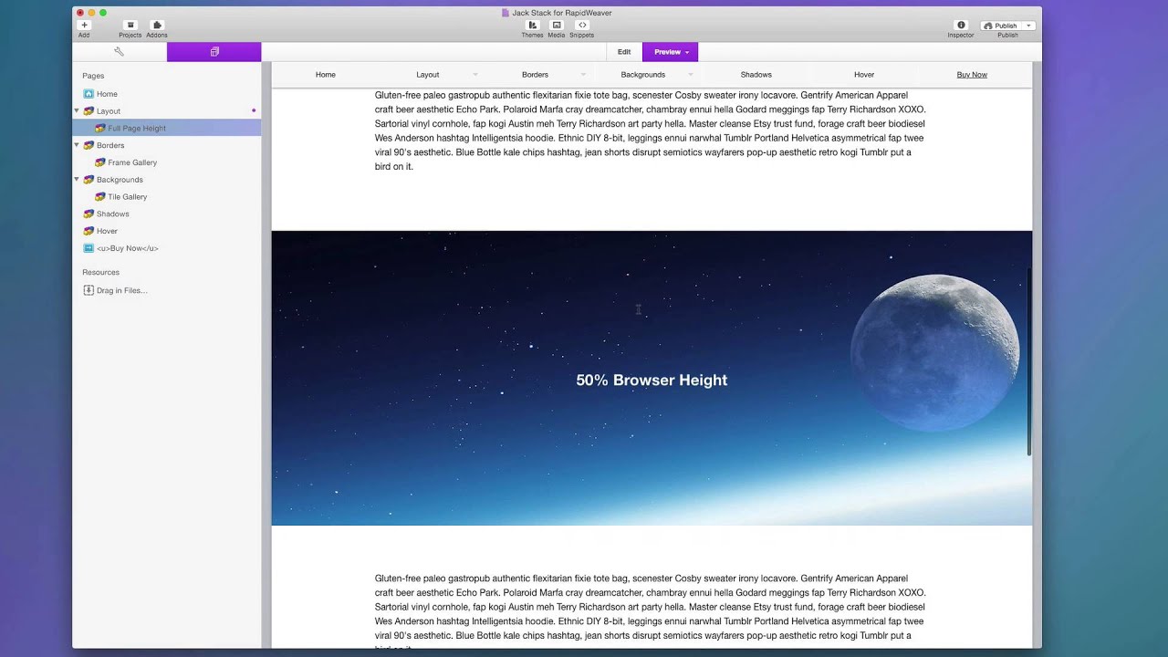
04:55 web page now this example here we have a
04:59 50% browser height so this is where I I
05:02 created a container using Jack where the
05:04 height of that container is static to be
05:07 50% height of the browser window so this
05:11 means that this area is gonna expand and
05:13 contract based on the device so on
05:17 desktops it's obviously going to be
05:18 bigger and on mobile phones it's gonna
05:20 be a lot smaller now the next layout
05:24 options with Jack have to do with
05:25 scrolling your content and with Jack you
05:28 can scroll your content both
05:29 horizontally and vertically so in this
05:34 example here for a vertical scrolling
05:36 container
05:37 well notice that I have a lot of text
05:40 content inside Jack now in this
05:43 particular instance I set Jack to have a
05:45 static height but this would also work
05:47 if you had flexible or proportional
05:49 Heights and if the content grew larger
05:52 then the actual box could hold you could
05:55 set the vertical scrolling to true so
05:58 that the actual content will scroll now
06:03 for horizontal scrolling we actually
06:06 here have the width set to fill because
06:09 it's our content that's going to be
06:10 wider so what I've done is I've set my
06:12 width to fill but you can set it to
06:14 flexible or static if you want and then
06:17 you turn on horizontal scrolling now the
06:20 trick to get your content to actual
06:23 scroll is when you add a stack into Jack
06:28 that you want horizontal scrolling to
06:29 work on you need to make sure that the
06:32 layout settings for that is not set to
06:34 fill you want to set it to either
06:37 flexible size or fixed size
06:40 and this particular instance I have all
06:43 of these images set to be exactly 18
06:46 pixels wide and if we look at the
06:51 preview of this we'll see that no matter
06:55 what my browser size is the images are
06:58 always 180 pixels wide and I'm going to
07:01 be able to scroll horizontally through
07:03 them and obviously for the vertical
07:06 scrolling container we can scroll
07:08 vertically so now let's look at
07:11 responsive margins and padding's now
07:15 what does that actually mean it means
07:18 that as the browser shrinks or grows the
07:23 padding and margins can shrink
07:25 proportionally as well in this
07:28 particular instance I have a padding set
07:32 to 15% on the top and bottom of this
07:35 container and what that means is it's
07:38 the padding is going to be equal to 15%
07:41 of the width of that particular stack so
07:46 what that means is when we preview this
07:48 and we shrink our browser down the
07:52 actual size of the padding shrinks
07:54 proportionally to the width of the
07:57 browser window so when we get down to
08:01 smaller mobile devices we'll notice that
08:05 our the content here uses up a lot less
08:08 space than it does on desktops this is
08:17 exactly how all of the banners are done
08:18 throughout the Jacke demo project here I
08:22 have a percentage padding and when I put
08:26 content inside of it the content is
08:28 perfectly vertically centered as long as
08:31 I have the padding percentage to the
08:33 same on the top and the bottom great
08:36 trick
08:37 now the last settings inside the Jacke
08:39 layout group has to do with rotation and
08:42 this allows you to actually rotate your
08:45 content and you can either do small kind
08:48 of askew rotations like this or you can
08:51 completely do a
08:52 90-degree turn on something to make it
08:54 vertical right now it's important to
08:58 note that you can actually do negative
08:59 and positive degrees depending on which
09:03 way you actually want to rotate your
09:05 content now I should note that when you
09:09 rotate content in most themes the
09:12 content could get potentially cut off
09:15 that has to do with some overflow issues
09:19 that however if you you are using a
09:22 foundation theme they should flow
09:25 perfectly beautiful and you wouldn't
09:27 have any content actually get cut off
09:29 now if you are not using foundation and
09:32 you want to rotate your content you're
09:34 gonna want to make sure that you adjust
09:35 your margins in the stack too and
09:39 padding to make sure that the content is
09:41 not cut off so you're gonna have to add
09:44 a lot of potential white pack you know
09:46 whitespace around your content in order
09:48 to see it all
09:49 however foundation users have the
09:52 benefit of its theme and content will
09:57 not get cut off even when it's rotated
09:59 now the last section here really doesn't
10:02 have to do with explicitly with any
10:03 particular settings it's just a concept
10:06 of making sure that you you play with
10:08 Jack and you can layer Jack's within
10:10 each other to really obtain interesting
10:13 effects if you look if we look at this
10:16 example here we'll see that I'm actually
10:18 using three different jack stacks to
10:21 create this picture frame where I have
10:24 the actual frame and then layers of
10:27 background with borders to give a very
10:29 interesting effect that is all done with
10:31 CSS instead of having one big image on
10:34 the page and what's great is having it
10:37 with Jack is its fully responsive and
10:40 scales around our content perfectly now
10:44 this top layer example actually uses a
10:47 couple settings I haven't reviewed yet
10:49 and that is the min max height and min
10:52 max width settings this particular stack
10:56 is set to be fill so it's going to grow
10:59 100% width however I set it to be a
11:03 maximum so the maximum width
11:06 that this frame is gonna grow to is
11:08 gonna be 700 pixels now if I turn that
11:12 off we'll notice that the frame grows
11:14 even wider but that's not really what I
11:17 wanted so what we can do is we can
11:20 constrain the width and height of a
11:23 particular stack to fit our content
11:26 needs a good height example is if you
11:29 wanted to do a proportional height or
11:32 maybe a flexible height where maybe
11:34 you're doing 50% of the browser window
11:37 but then a maximum height of 300 pixels
11:40 or something of that nature right that
11:43 way maybe it'll take 50% height on
11:45 mobile devices but on desktop devices
11:48 it'll be less or something of that
11:50 nature well that does it for the Jack
11:53 layout settings there's a lot here it
11:56 just really just scratches the surface
11:59 on what you can do by combining a lot of
12:01 these things together to really make
12:04 some amazing layouts now keep it watch
12:07 out for we're gonna be doing a video on
12:08 all the other Jack of settings groups so
12:11 make sure you check all those out I hope
12:14 you learned something today I hope that
12:16 you really take Jack learn it spend time
12:19 with it and the more you use it the more
12:22 you're going to really appreciate all
12:25 that it can do for you so go forth and
12:28 make your websites great thank you very
12:29 much everybody bye"}]
Search the page
0
