About Stacks Guru
Stacks Guru is born from the need to search the vast number of videos out there on stacks built for Stacks Pro and the Stacks 5 plugin for Rapidweaver.
We have scraped over 500 videos to get the transcripts for each in order to make the spoken word searchable.
Please use this free tool to help you learn and discover the awesome power that Stacks and the stacks made for Stacks have to offer.
Stacks Guru
Video Reference
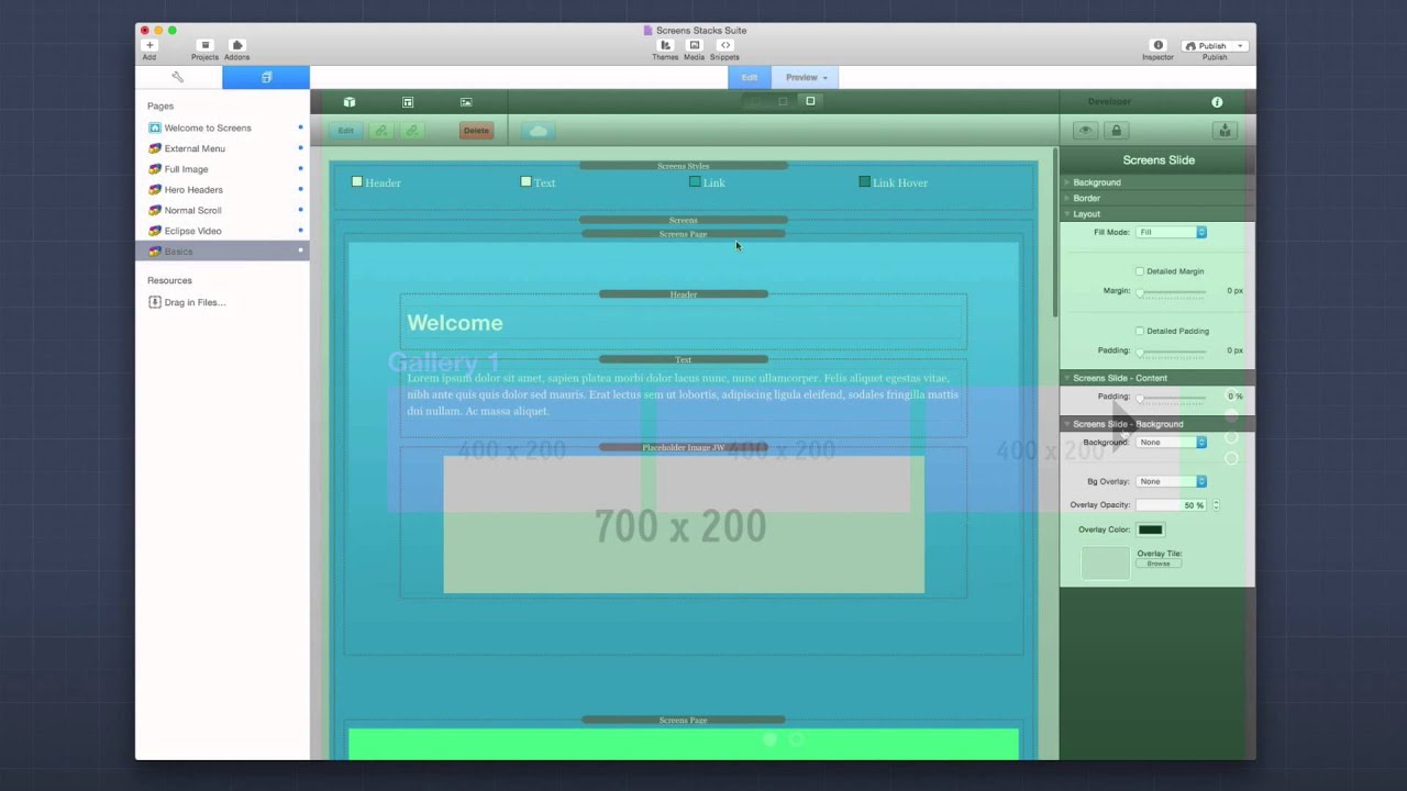
Screens Basics - Building a simple website from scratch
04/24/2015
More Info on Screens: http://preview.joeworkman.net/screens In this tutorial, we are going to build a webpage from scratch using the Screens Stacks Suite.More Info on Screens: http://preview.joeworkman.net/screens In this tutorial, we are going to build a webpage from scratch using the Screens Stacks
Transcript
00:06 hello everybody this is joe workman00:08 and in this video we're going to be
00:09 going over this basics of using the
00:11 screen stack suite
00:13 we're going to take a web page and build
00:15 it from scratch
00:16 using screen stacks and we're going to
00:19 go step by step and then keep on
00:21 improving the page
00:22 using just the screen stacks so without
00:25 further ado
00:26 let's jump in and see how awesome it is
00:28 to build our web pages using screens
00:32 so as i mentioned we're going to start
00:34 off with a completely blank project file
00:37 and we're going to build an entire
00:38 screen's web page
00:40 right now actually before we get started
00:43 in throwing stacks on the pages
00:45 i want to make sure that we set the
00:46 theme properly and screens works best
00:49 with
00:50 our free foundation theme now you don't
00:53 need the foundation stacks but you at
00:55 least need the foundation
00:56 theme and is available for a free
00:58 download from our website
01:01 now the next step is the first stack we
01:03 want to add to a page
01:04 is going to be the screen style stack
01:09 now the screen style stack allows us to
01:11 do some basic
01:12 styles for our web page a lot of times
01:15 this is
01:15 things that are handled in a theme
01:18 and such as page background
01:22 the fonts used for headers and texts
01:25 the font weight the font colors and font
01:28 sizes
01:32 now next what we're going to want to add
01:33 to a page is the
01:35 screens stack now the screen stack is a
01:38 general wrapper
01:40 that will contain all of our
01:44 screens pages and slides and other
01:46 content
01:47 so it's basically like it's going to be
01:48 a wrapper around our entire page
01:53 so next we're going to want to add our
01:54 first screens page
01:57 so i'm going to go ahead and add a
01:59 screens page
02:00 now i kind of have a outline of what i
02:03 want this
02:04 web page to be we're going to create a
02:06 simple like home page
02:08 a gallery an about page and probably a
02:11 contact us page
02:13 so let's go ahead and start that
02:19 now next what we're going to want to do
02:20 is we're going to want to make sure
02:22 inside the screens page that we define
02:25 the proper page
02:26 title and page anchor so for this since
02:29 this is our welcome page let's go ahead
02:30 and say
02:31 welcome and for our anchor link we want
02:34 that to be welcome as well
02:36 now the anchor link is what is the
02:38 anchor that's added to the url
02:40 for this particular screens page
02:46 now we have a basics screens page right
02:50 and what we're going to do is i'm going
02:51 to replicate that a few times
02:53 so that we have all the pages that we
02:56 want
02:58 so there we go i've added a bunch of new
03:00 screens pages to the
03:03 project and i've just added some basic
03:06 content in there
03:07 right and if we preview this page right
03:10 now
03:11 we'll see that we actually have you know
03:14 all of our
03:15 relative pages and let's see what else
03:18 we've done
03:19 so i've added each screens page and then
03:22 i've made sure that the screens page has
03:24 its own unique page title
03:26 as well as in a unique anchor link
03:30 so the gallery has gallery and gallery
03:32 anchor tag
03:34 about us has a page title of about could
03:36 be about us
03:38 and then about is the anchor link and
03:41 then the contact
03:43 us page has contact
03:46 us and the anchor link is contact
03:50 so this works well but it's rather
03:53 boring right now because
03:55 a all the screens are white
03:58 right um so let's jazz it up a little
04:01 bit
04:02 so what i'm going to do is i'm going to
04:03 go into each screens page
04:06 and i'm going to go ahead and add a
04:07 background for it
04:09 and what i'm going to do is i'm just
04:10 going to go ahead and do a simple color
04:11 background
04:13 so i've gone ahead and added some nice
04:15 colors uh
04:16 to our background pages and actually i
04:19 decided to jazz it up a little bit
04:21 instead of using a solid color actually
04:23 i went to a gradient background
04:26 and did a gradient theme of simple one
04:28 color
04:30 and what that does is it's a nice option
04:32 and it takes
04:33 color number one it ignores your color
04:35 number two and your gradients
04:37 and based on that one color it creates a
04:39 nice
04:40 very simple flat looking gradient um
04:43 so that when we preview this we'll see
04:46 that you know
04:47 the page is very close to a solid color
04:50 but it's just a faint gradient across
04:53 the page and it gives a very lovely
04:55 design
04:56 so i'm i really like that now if we look
04:59 at these pages
05:01 there's a couple things right a we have
05:03 black text
05:04 and it doesn't might not look the best
05:07 when we have colored backgrounds
05:09 as well as our content is going straight
05:11 to the sides right
05:13 it's going edge to edge across the
05:15 browser
05:16 and we might not want that right so
05:18 let's fix those things
05:21 so for the color and size of our text we
05:24 can go ahead and let's go into screen
05:25 styles
05:27 and i'm going to go ahead and i'm just
05:28 going to make the header and fonts
05:30 white a little off-white let's do f
15:33 right
05:34 and same thing for our text we'll just
05:35 do f1 as well
05:44 and then for our header size let's make
05:47 our headers a little bit bigger
05:49 let's go ahead and these these were h3s
05:51 that we're using
05:53 and uh for desktop uh let's make it go
05:56 ahead and do like a
05:58 2.
56:01 rem and then for mobile maybe we'll do
06:03 two rem
06:04 okay and then our text we're fine with
06:08 the text
06:09 size and let's preview that
06:14 and that looks a lot nicer right we have
06:17 a little bit bigger headers
06:19 it's just looking starting to look a lot
06:20 nicer right
06:24 so let's let's deal with the edges here
06:27 so on the edges basically we want to add
06:29 padding to all of our pages
06:32 now you may want to go into each screen
06:35 page and go ahead and add a custom
06:38 padding
06:38 for each one however for simplicity's
06:41 sake
06:42 i'm just going to go ahead and go into
06:43 the screens
06:45 and add a unique or a global padding to
06:48 all the pages
06:50 and i'm going to add let's say seven
06:52 percent let's go ahead and have a look
06:53 at that
06:55 and now that kind of it brings all of
06:56 our content in
06:58 and i think that's nice that gives us
06:59 kind of what we're looking for for right
07:01 now
07:03 now another thing i recommend is you
07:05 actually go into your screen style stack
07:08 and set the site background color to be
07:11 the same color that your
07:12 first screens page is going to be this
07:16 way when the
07:17 the page is starting to download you'll
07:19 get immediate feedback in terms of the
07:21 body background color loading
07:24 you know split second before the screens
07:27 page loads
07:28 now the next thing we might want to do
07:30 is let's go ahead and style our dots
07:35 so to style your navigation dots go
07:38 ahead and go into the main screens
07:40 stack and go to the navigation dots
07:43 settings section
07:44 and you'll see here that we can change
07:46 the location of the dots such as we want
07:48 them on the right or the left or we want
07:50 to completely hide them
07:52 and then in terms of position do we want
07:54 them in the top the center of the bottom
07:56 okay and then offset is the amount of
07:59 space that they're offset from the edge
08:01 of the browser window
08:03 now you can also have position for the
08:05 slide dots which right now we don't have
08:07 any slides
08:10 next if we wanted maybe we want slide
08:12 numbers or we want to show
08:13 tool tips in terms of showing the actual
08:16 page names when we hover over the dots
08:18 let's go and add tool tips i like that
08:20 idea
08:22 and then from icons we can you know
08:24 customize in terms of what icons we want
08:27 to show
08:28 you know we can show squares circles
08:31 bullseyes you know get cute with hearts
08:34 and things of that nature
08:37 let's stay simple let's just keep it
08:39 with the circles
08:41 or you know we can also go custom
08:43 advanced and if you choose custom
08:44 advanced
08:45 this instead of using font awesome icons
08:48 what it will do is it will actually
08:50 allow you to build your own dots
08:52 using css and you know you can actually
08:55 make them squares or dots
08:57 you can give them a border to make them
08:59 look like you know bullets and things of
09:01 that nature
09:02 so there's a lot of advanced
09:04 customizations here if you
09:06 choose a custom icon but for right now
09:09 we're just going to
09:10 stick with circle o for our normal dots
09:14 and then a solid circle for our active
09:16 dots
09:18 now i i want to change the color i
09:20 didn't really like the black look
09:22 right so let's go ahead and change those
09:24 to just simple white
09:31 and the opacity 25 for regular
09:35 and you know 75 for the active i'm i'm
09:38 fine with that let's see how that looks
09:41 right i think that looks nice right you
09:44 notice if we hover we
09:45 get our tool tips now the tooltips are a
09:47 little a little light we might want to
09:48 tweak those a bit
09:51 now the tooltips use the actual icon
09:53 opacity
09:54 so let's just increase that a little bit
09:55 maybe we'll just do 7
59:57 like we did for the active and then
10:00 let's change the text color to be
10:02 now if we hover over we'll see that we
10:04 have nicer tool tips they're definitely
10:06 readable
10:07 when you hover over each page and if you
10:09 click on them it'll take you directly to
10:11 that particular page
10:15 now next i think what we're going to do
10:16 is we're going to instead of having a
10:18 single gallery page
10:19 let's create multiple galleries so maybe
10:23 we turn this gallery page
10:24 into a slide so we can actually have
10:27 slides of multiple different galleries
10:30 so to do that i'm just going to simply
10:32 go ahead and find the screen
10:34 slide stack and i'm going to add that
10:36 inside the screens page
10:40 and for this first content i'm going to
10:42 go ahead and drag that
10:44 into our screen slide
10:48 now to add multiple slides basically
10:51 it's just like any normal cycler stack
10:53 or slider stack you have out there
10:55 you just add another screen slide into
10:58 the screens page
11:00 so i'm just going to copy and paste this
11:02 screen slide
11:04 in here and maybe we have um
11:07 you know gallery one
11:11 and let's just make this one gallery too
11:15 so now i have my screens page and i have
11:18 two different slides
11:19 let's go ahead and preview that so here
11:22 i have my welcome page and if i scroll
11:24 down
11:25 we'll notice that i have gallery one and
11:28 gallery 2.
11:31 now in this instance we'll notice that
11:33 we we do have slide arrows but it's kind
11:35 of going on top of our content
11:37 and we we might not really want that so
11:39 let's tweak these slide arrows just a
11:41 little bit
11:43 now to tweak these slide arrows we're
11:45 going to go back
11:46 into the screens stack
11:50 and what we're going to do is we can
11:52 actually change
11:53 all the way down to the bottom customize
11:55 our slide arrows
11:57 and what we can do is we can position
11:58 them do we want to hide them do we want
12:00 to have them on the top
12:01 on the center or the bottom and we can
12:04 also do a custom position which allows
12:05 you to define
12:06 x and y positions
12:10 let's say we want them on the bottom and
12:12 then uh let's change
12:13 while we're here we're just going to go
12:14 ahead and make them white similar to our
12:16 other navigation
12:18 um and they were quite large let's go
12:19 ahead and reduce those a little bit
12:23 let's preview that so you see here where
12:27 i i have you know different arrows
12:29 and if you notice they're they're quite
12:32 far inside
12:33 and the reason for that is because i've
12:36 added padding
12:38 to our page content here
12:41 so what what can we do to
12:44 have different sort of navigation
12:50 so let's say for this particular
12:51 instance slide arrows don't really work
12:53 out
12:54 now if i wanted to i could reduce the uh
12:57 padding that we've done on that we've
12:59 added to all the screens pages
13:01 so that these slide arrows go ahead and
13:03 go to the edge
13:04 and then i can add actual padding
13:06 individually to each page
13:08 to the way i see fit but there's another
13:11 option that we have available
13:12 and that's going to be to use the
13:14 screen's navigator stack
13:16 so what i'm going to do here is in the
13:17 screens page or in the screen stack i'm
13:19 going to go ahead
13:20 and hide the default slide arrows
13:23 so what i'm going to do is i'm going to
13:24 add a screens navigator stack to this
13:27 page
13:29 and what that gives us is it gives us a
13:31 nice little navigation widget
13:34 now the screen's navigator can be a
13:36 couple different things
13:38 firstly by default it's a group of
13:40 buttons that allows you to navigate up
13:42 down
13:42 left and right now you can also do a
13:46 single button
13:47 so if you want to make sure that you
13:48 only want to position a single button on
13:50 your page
13:51 you can do that as well for this
13:53 instance we're going to stick with a
13:54 group of buttons
13:57 and what you can do is you can customize
13:59 the actual position
14:00 by default it's going to be at the
14:02 bottom right hand side
14:04 of your page and let's leave it there
14:08 now we have a few different button
14:10 styles we have built-in arrows
14:12 and you can have custom drop downs now
14:14 when you choose custom drop downs
14:16 you can actually define your own custom
14:18 buttons for every single up down left
14:20 and right
14:22 for this instance we're just going to
14:23 stick with the built-in arrows
14:26 for button groups we have a few
14:29 different layouts
14:30 and one that i really particularly like
14:31 is the d-pad
14:34 so let's stick with that um and you have
14:36 various sizing controls here
14:38 i'm going to go ahead and play with a
14:39 few settings we're going to change our
14:41 our
14:41 color to to be white um and maybe make
14:45 the uh the opacity a little bit
14:46 less um we're gonna do like 20
14:50 so that's it's just really vague um
14:53 maybe 30
14:57 and you can change all the sizes and the
14:59 rounding of it if you wanted
15:01 um you know to scale the buttons really
15:03 large
15:04 okay or you wanted to increase the round
15:06 corners that they were circles
15:08 okay um i'm going to quite i like quite
15:10 like them like that
15:14 and let's preview the page
15:18 and we'll notice here that i have this
15:21 d-pad and it showed up on my preview
15:23 page
15:24 and it knew intelligently that i that i
15:26 can go
15:27 up down or to the right the left arrow
15:31 is disabled
15:31 because i'm already at slide one but i
15:34 can go ahead and click
15:35 next and if you notice the left arrow is
15:39 now enabled
15:40 because it knows i can actually go that
15:41 direction okay
15:43 and then i can obviously go left or up
15:45 and down okay
15:47 now this is great if i wanted this on a
15:49 single page but what if i wanted to have
15:51 this d-pad across all my pages
15:55 while the screen's navigator is
15:56 intelligent it knows that if you add
15:59 it to a screen's page it will only
16:01 display itself
16:02 on that page however
16:05 if we actually take a screens navigator
16:08 and add it to the very
16:09 top of the page outside of the screen
16:12 stack
16:13 it will display on all pages
16:17 so now if we go here we'll see that we
16:20 actually have
16:21 the ability to show
16:24 the navigator across all of our pages
16:27 and as you notice as we go ahead and
16:29 navigate through our site
16:31 the arrows will enable and disable based
16:34 on the direction that we're allowed to
16:35 go
16:37 that's really great now if we were to
16:39 try a different layout such as t
16:42 we'll notice that this particular layout
16:44 behaves a little bit differently
16:47 when we have just a screens page that
16:49 doesn't have any possible slides
16:51 it only shows the up and down arrows but
16:54 when we go to a slides page
16:56 it actually shows our left and right
16:58 arrows are available as well
17:00 to give us the users a hint that we can
17:02 actually navigate in a different
17:04 direction
17:07 i think this is exactly what i want for
17:09 this particular design
17:14 now one thing that you noticed is that
17:16 when i was on the gallery page
17:18 and i navigated to gallery number two
17:21 maybe i'd want to have a different
17:23 color on this particular page
17:26 that's pretty pretty easy to do as well
17:30 if you'd like to have different colors
17:32 across different slides
17:34 instead of setting the page background
17:37 on the screens page
17:38 you're going to set the background
17:40 settings at the slide level
17:42 so here i've gone and added a specific
17:46 gradient background to each screen slide
17:49 and we'll notice is if i navigate here
17:52 up we we've
17:52 now gone into another problem where the
17:55 padding that i've added to all my pages
17:58 is now getting in our way so maybe we
18:00 need to rethink that
18:03 so what i'm going to go ahead and do is
18:04 i'm going to go back up to our screens
18:05 page
18:06 and i'm going to change that patty and
18:08 make it all the way down to zero
18:10 then i'm going to go to each individual
18:12 screens page
18:13 and then go ahead and change those
18:16 settings
18:18 now for our slides we don't want to add
18:21 the padding to our screens page but we
18:22 want to add it to the screens
18:24 slide so in this instance i want to make
18:27 sure the slide is seven percent
18:28 just like everything else
18:32 so now now that i've added all the
18:33 padding if we navigate down we'll see
18:35 that we have
18:36 our nice gallery one and if we scroll
18:39 over we see gallery two
18:40 has a a different color background and
18:43 we can still navigate down
18:45 and see all of our other pages so now i
18:47 think our page needs a menu
18:49 right we need a way of visualizing where
18:52 we're at within the web page
18:54 in terms of menus and giving our users a
18:56 nice way of
18:58 quickly going between pages so i've
19:01 added a screens menu stack to the page
19:04 and if we preview this really quick
19:06 we'll notice that it
19:07 dynamically built out the menu based on
19:09 our page names
19:11 and obviously the the colors don't mesh
19:13 with the uh with the site
19:15 but it works out of the box and
19:17 navigates individually
19:18 to each of our screens pages so the
19:21 screens menu stack uh supports both
19:23 desktop and mobile menu styles
19:25 and by default it will go to full menu
19:28 at tablet
19:29 and on mobile devices it will turn into
19:32 a mobile menu
19:33 you can customize all of that let's keep
19:35 it at the default for now
19:37 now the menu type we have types of
19:39 horizontal
19:41 vertical which is gives us a vertical
19:43 menu that could look nice along the side
19:45 of our site
19:47 or we also have simple links which is
19:49 just a
19:50 simple list of links that really don't
19:53 have any
19:54 kind of blocky look to it it's just a
19:56 simple list
19:57 of links to our individual pages
20:00 and lastly is an off canvas drop zone
20:03 which we're not going to review in this
20:04 but
20:05 take a look at our more advanced
20:06 tutorials on how to use that
20:08 for this example let's go ahead and
20:10 stick with the horizontal menu
20:12 and let's go ahead and look at some of
20:14 the style options here
20:18 so here we go i've tweaked the styles
20:19 just a little bit
20:21 um so that you know the menu looks nice
20:23 and if we preview it
20:25 we'll see that we have a nice menu um
20:27 looks pretty decent
20:28 across all the pages um and it's fully
20:32 functional
20:34 so our site's starting to look pretty
20:35 nice um if we wanted to add a little bit
20:37 of pizzazz
20:38 to it let's go ahead and animate some
20:40 things in maybe the headers
20:43 so you can add the screens animate stack
20:46 to
20:47 anything you want and basically on let's
20:49 add our headers into it
20:51 and basically what it will do is it will
20:55 animate that particular element when the
20:58 screens
20:58 become active so
21:02 if we notice there the welcome uh header
21:05 kind of faded down when the screen was
21:07 loaded
21:08 let's go ahead let's go ahead and add
21:11 that to all of our headers
21:13 so i've gone ahead and added that
21:14 animate stack to all the editors
21:16 and as you notice as as i'm scrolling
21:19 through the site
21:20 all of the headers are animating down
21:24 now what you may have noticed is when i
21:26 go back to a page that is already
21:27 animated
21:28 that particular header isn't animating
21:30 again
21:32 and the reason for that is that by
21:34 default the
21:35 animate first time only is checked in
21:38 the animation stack
21:40 if you'd like a particular component to
21:42 animate every time a screen
21:44 is become active you can uncheck this
21:47 box
21:49 now before we call our site done let's
21:52 go ahead and check it that it works
21:54 nicely we've kind of seen that it works
21:56 nicely across
21:58 desktop you know size browsers let's go
22:00 ahead and shrink it down
22:02 and look to see exactly what it might
22:04 look like if we were on
22:05 iphone with i'll notice that
22:08 you know our welcome screen kind of fits
22:10 it looks nicely now the first thing
22:12 we'll notice is actually that
22:13 snap scrolling has been disabled it's
22:15 turned off
22:16 and that's by default by default the on
22:20 mobile devices
22:21 your screen site will turn into a normal
22:24 scrolling website
22:26 and that's actually completely
22:28 configurable
22:34 if we go into the screens stack
22:37 we'll notice that we have normal scroll
22:39 on mobile only
22:41 and that's probably smart because most
22:43 of the time
22:44 the content that we add to our pages may
22:47 not
22:47 really fit within a full screen
22:51 on just an iphone right so our content
22:55 we want to allow our content to actually
22:56 grow
22:57 a little bit larger than what the phone
23:00 or mobile screen
23:01 allows us to see and that's exactly what
23:04 this normal
23:05 scroll allows us to do and you can
23:08 increase that so it's
23:09 also on tablet down or you can choose a
23:11 custom break point for that
23:14 now if you know that your site is going
23:17 to be
23:18 have minimal content and you want that
23:20 snap scrolling even on mobile
23:22 you can go ahead and say normal scroll
23:24 never
23:26 let's go ahead and leave it on mobile
23:27 for now
23:31 now one thing if you noticed this about
23:33 us page
23:35 has a lot of text and chances are
23:38 this text isn't going to be great it's
23:40 not going to fit perfectly
23:42 maybe not even on a tablet let alone a
23:45 mobile device
23:47 now right now i'm using a default
23:48 two-column stack and chances are you're
23:50 really going to want to use
23:51 a responsive layout tool here such as
23:54 maybe my foundation stacks or my
23:56 responsive layout stacks
23:59 but screens has a feature that we can
24:02 add
24:02 to a specific screens page
24:06 and that's called auto scale so on this
24:09 page on this about us page
24:11 let's go ahead and turn on auto scale
24:14 inside the screens page
24:16 and what this allows us to do is it
24:18 allows us to auto
24:20 scale our content and we can
24:23 define a minimum and maximum font size
24:26 for our particular text so that we can
24:30 ensure that it
24:31 looks great across all devices
24:35 so in this instance i want to make sure
24:36 our max font size
24:38 doesn't grow above 16. um our
24:41 our header is pretty small in this
24:42 instance so i actually don't want to
24:44 apply
24:45 this auto scaling to the header so i'm
24:47 going to uncheck this
24:49 and the minimum font let's go
24:52 let's do 8 just for so we can see the
24:55 effect here
24:56 so if we go ahead and preview this if we
24:59 and we look at the about page
25:01 we'll notice that as i shrink the
25:02 browser down on the about page
25:05 you'll notice that the actual size of
25:07 the text
25:08 is changing dynamically so that it looks
25:12 best within that browser width
25:18 this is pretty cool now the auto scale
25:22 is really awesome
25:23 however it doesn't perform magic right
25:26 it's not going to take
25:27 10 pages of content and shrink it down
25:30 to fit
25:31 and actually be legible for your users
25:33 to
25:35 consume
25:38 now another thing you're going to want
25:39 to make sure is if you're using text
25:40 stacks
25:41 you'll need to make sure that you select
25:43 the text and properly format it
25:46 as a paragraph so in this instance you
25:49 select your text
25:50 and you go up and say format this as a
25:53 paragraph
25:55 this will ensure that the auto scale
25:57 will will actually properly
25:59 scale that text down for you
26:02 so there we have it a very basic screens
26:05 web page
26:06 that is fully functional we've utilized
26:10 all of the screen stacks from our menu
26:13 stacks to our animate stacks
26:15 we have slides right i mean we're using
26:19 every aspect of screens here
26:22 and you see how easy it is to build and
26:24 how easy it is to use
26:27 and it really produces a pretty lovely
26:30 while the content here is
26:32 obviously basic and very boilerplate
26:35 it's a very nice and attractive website
26:39 so as you see it's very powerful and
26:42 very simple to build
26:43 uh nice web pages using screens
26:46 now obviously we didn't go into every
26:49 nook and cranny of every screen stack
26:51 right
26:51 so go ahead and make sure that you check
26:53 out our next videos that we have
26:55 that go a little bit more in depth uh
26:58 into some maybe more the advanced
27:00 uh features of screens where we actually
27:02 review
27:03 how we built our demo web page right
27:06 but i hope you you learned a lot on how
27:08 to use screens in this video
27:10 and that you use this information to go
27:12 build beautiful web pages
27:14 i can't wait to see with what you do
27:16 with screens and what websites you build
27:18 with it
27:19 so make sure that you share those with
27:20 us and have a great day thanks everybody
27:32 bye
27:38 you"}]
Search the page
0
