About Stacks Guru
Stacks Guru is born from the need to search the vast number of videos out there on stacks built for Stacks Pro and the Stacks 5 plugin for Rapidweaver.
We have scraped over 500 videos to get the transcripts for each in order to make the spoken word searchable.
Please use this free tool to help you learn and discover the awesome power that Stacks and the stacks made for Stacks have to offer.
Stacks Guru
Video Reference
Leave a Tip!
Every little bit helps to keep this going. I'll be doing my very best to keep up with the likes of Joe when it comes all the videos he posts!
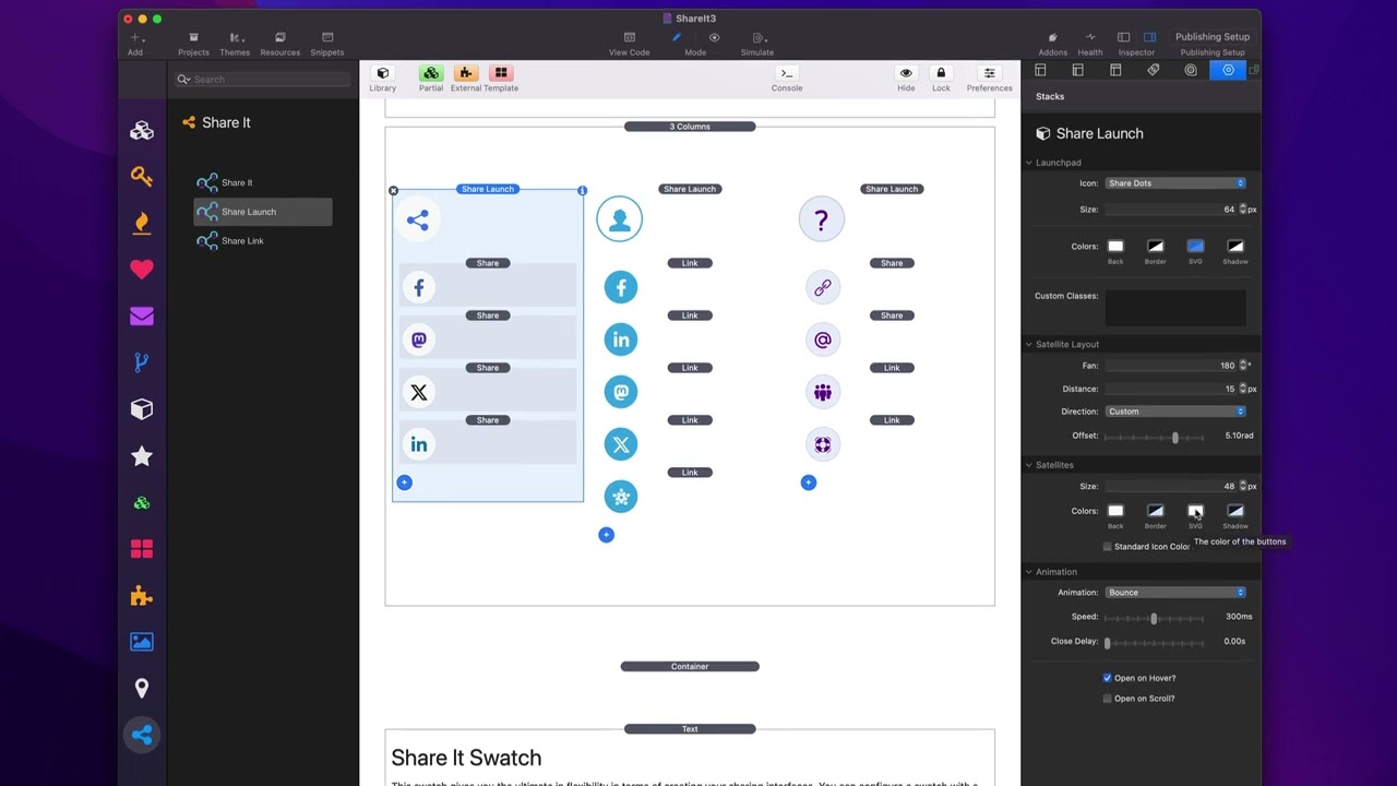
Share It - LaunchPad Overview
Share it makes it easy for your visitors to share your website on their favorite social networks. You can also use it to easily link to all of your social media profiles. Share it has been rigorously developed to bypass content blockers so your visitors will always be able to see and share your sites. Check out Share It at https://www.weavers.space/stacks/share-it
Transcript
[Music]
so in this video we're going to be
looking at the share launch or the share
Launchpad stack um within sheret so here
we have three examples here and let's
have a look at what sherit Launchpad
does right so as you see we can have it
open on scroll um and then it will when
we hover over basically all of these
actions um can be configured okay so
let's look at this existing
implementations that we have inside this
demo project that ships with the
stack when we look at share launch um
the top section allows us to configure
the Launchpad okay that is the main icon
that triggers the actual action so here
we can customize the icon so we have
four different icons that we can use uh
three different types of share icons
link as well as a custom SVG that you
can Define so like here is example here
in this demo I used a custom SVG that
has the question mark I just pasted that
directly into um the custom setting so
here for the Launchpad you can then
Define the size of that icon okay it's
actually the size the the total size of
the actual button so the icon size
itself will actually be half the size of
this because we need a little bit of
padding for everything to look good then
you can configure your colors so your
background your border options your SVG
color as well as Shadow now if you don't
want a border or a shadow it's simply
just go into the color settings and set
the opacity all the way to zero that
will effectively remove the border and
the shadow then if you're a foundation
user or a CSS Guru you can go ahead and
create your own custom classes and then
style this button even farther okay with
swatches and your own
CSS then the next setting has to do with
the direction or the layouts of the
satellites this has to do with the the
actual positions of the share it and
share link Stacks that can be added
around your
Launchpad fan option defines the scope
at which how far around the circle are
we going to evenly distribute our
satellites so in case one and case three
here I have actually the set to 180 okay
whereas this middle example here is set
to 360° because the limitation it they
will be spread all around the circle
okay um and then we the distance is how
far away from the Launchpad do you want
them to go and then the direction here
the direction allows us to Define where
do we want this makes most sense if we
have it less than 360 so for these
particular 180° implement ations where
do we want that to be to Fan out from
right so do we want it to be up down
left right or a custom value now if you
notice when you choose a direction up
down left or right I give you a value in
radians that is being used um I do this
to kind of help you out to if you want
to define a custom you can kind of get
an idea of what the radian values Define
right there's a lot of tricky
trigonometry going on here and depending
on your distance um sometimes these
default values might not be exactly what
you want so this is why um you know
depending on what distance and sizes
values you have set um you might need to
go to custom and then tweak the value
till you get the alignment of your
satellites just right the next settings
have to do with our satellites
themselves so these allow us to define
the size and the colors of all the
satellites so in this first example here
um I have the size of my satellites to
be 48 pixels and then here's the colors
that are going to be used for every
satellite Now by default the SVG color
here is not used if we want the
standardized if we want the svgs to have
a standard color we go ahead and check
this and what you'll notice is those
icon colors are now all the same okay
let's have a look at this SE second
example here if I were to turn off
standard color you'll see that we
actually get the the native colors of
each icon rather than um you know having
one uniform color so depending on what
layout you want um you might want them
to have different colors or the same
color and lastly we can customize the
animations so there's several different
animations that we can utilize here um
my favorite is Bounce I think it just is
a really nice elegant animation you can
customize the speed of the animation now
you can also Define a Clos delay and
what that is is let's say I scroll down
the page or click on something else on
the page this will cause the actual
satellites to automatically close you
can add a delay to that close instead of
them actually going
immediately next is we can open on Hover
which uh you know I think is a great way
to actually trigger it but you can
always click on the Launchpad to open
and close the Launchpad so I I think
open on Hover is great because it gives
a lot of you know discoverability um as
well as you can open on scroll so as we
see here on this page if I go ahead and
do preview if I scroll down the page
this particular one will actually load
on
scroll now in terms of the Launchpad
satellites I have already talked about
how share it and the share link Stacks
work and the share and Link satellite
Stacks work exactly the same however I
should note that when you can override
the styles that are defined globally in
the share launch stack so in the share
launch you can go ahead and customize
the default color of all your satellites
however you can override that at the
individual satellite level as
well
now lastly we can actually add a Content
stack to share launches well and what
this allows us to do is you can add
whatever content you want as a
standalone satellite as well now granted
our satellites are tiny so you can't add
a lot of content into here but I wanted
to give you the flexibility to add your
own stack content inside of an
individual
satellite
[Music]
oh
Search the page
0
{name}
{rating}
{comment}
