About Stacks Guru
Stacks Guru is born from the need to search the vast number of videos out there on stacks built for Stacks Pro and the Stacks 5 plugin for Rapidweaver.
We have scraped over 500 videos to get the transcripts for each in order to make the spoken word searchable.
Please use this free tool to help you learn and discover the awesome power that Stacks and the stacks made for Stacks have to offer.
Stacks Guru
Video Reference
Site Styles - Foundation for RapidWeaver
02/03/2015
This video give an overview of how to use the new Site Styles stack and global template to style your Foundation websites built with RapidWeaver. For more information check out foundation.joeworkman.net/learn/site-stylesThis video give an overview of how to use the new Site Styles stack and global template to style your Foundation websites built with RapidWeaver.
Transcript
00:07 hello everyone this is joe werkman and00:09 in this video we are going to go over
00:11 how we style themes
00:14 uh with foundation
00:16 now traditionally when you're building a
00:19 website in rapidweaver
00:21 all of the theme styles are inside the
00:23 page inspector
00:25 however if you notice this
00:27 for foundation
00:29 it's completely empty
00:31 that's because all of the theme styling
00:33 is handled with the site styles stack
00:38 and
00:39 i always recommend that we add the site
00:41 style stack to the top of your page so
00:44 make sure it's always at the top
00:46 that's the best place to have it
00:49 and you'll notice in edit mode that we
00:51 have all of the colors that we have
00:53 defined in the stack
00:55 however there's a lot more that the
00:57 stack can do and let's start jumping
00:59 into some of the settings and review
01:01 those
01:02 so the very first setting in this stack
01:05 is to deal with legacy browsers
01:08 uh internet explorer
01:10 six through eight these are all based on
01:13 really old web technology and none of
01:16 these browsers are actually supported by
01:18 microsoft any longer
01:21 therefore
01:22 foundation actually isn't supported on
01:24 those older browsers
01:27 now the styles will nicely fall back to
01:29 very basic styles it's not going to you
01:32 know your columns aren't going to line
01:34 up great
01:35 everything is basically going to kind of
01:36 look like a mobile
01:39 site where it's just an all one big
01:40 column your content will still be there
01:43 most of your styles and things are are
01:45 gonna stay intact
01:47 um but
01:49 what we recommend
01:50 is that because not everything in your
01:53 site is going to be
01:55 properly displayed in internet explorer
01:57 8 or below
02:00 we recommend that you redirect those
02:01 users to a static web page or maybe even
02:05 a new website or different website just
02:08 for those old browsers if you really
02:09 want to go that far
02:11 okay
02:12 however we just suggest you redirect to
02:15 a simple web page that says hey you know
02:18 for the best viewing experience on our
02:19 website maybe have some key information
02:23 and then maybe suggest that they
02:25 download a more modern browser such as
02:27 firefox or chrome that will still run
02:30 on the machine that they have
02:33 for example if you were to go to the
02:35 foundation.joeworkman.net website within
02:38 internet explorer 8 this is the web page
02:40 you will get
02:41 a very nice web page saying we love you
02:45 but your browser belongs in a museum and
02:47 i provide a link where they can actually
02:49 go and download a more modern web
02:50 browser
02:52 now from a business standpoint maybe you
02:54 want to put some more information about
02:56 your business and things of that nature
02:58 i obviously did something more fun
03:01 but
03:02 really you got to get the idea where you
03:03 kind of redirect all your users to a
03:06 single web page
03:07 or if you want to redirect them to a
03:09 dedicated you know website that will
03:11 work better
03:12 within old browsers be my guest so that
03:15 does it with legacy browser support
03:18 now the next settings are for some
03:20 customizations in edit mode
03:22 and first is preview all grids now if
03:24 you've watched our video on the grid
03:27 okay and how to use the stacks for
03:29 foundation or the column stacks that is
03:32 you know that you can preview the grid
03:34 within the stacks
03:35 within each column stack however in site
03:38 styles if you turn this on this will
03:39 enable the background grid for all
03:42 column stacks on the entire page
03:46 so it's just a little shortcut if you
03:47 want to turn everything on and off
03:50 now this next setting is for to define
03:52 the width that you're going to edit your
03:54 site in now i'm not going to really go
03:56 into detailed use cases for this i
03:59 suggest that you look at our video on
04:01 mobile first web design but essentially
04:03 you can customize the width so if you
04:05 wanted to um say edit your web page as
04:08 if it was on a larger wider mobile
04:10 device you can do that okay and it's set
04:13 to 640 pixels right now
04:15 and so on and so forth
04:17 for more information on use cases and
04:19 how to properly use this in mobile first
04:22 web design go ahead and watch the video
04:24 on mobile first assignment
04:26 so the remainder of the settings inside
04:28 site styles
04:30 really uh is for configuring your theme
04:32 and the style of your website
04:35 okay
04:36 now the first option here is site
04:38 background
04:39 and here we have options for solid color
04:42 tiled images tiled image warehoused
04:46 cover image which should basically take
04:47 one image and expand it across the
04:49 entire background of your site
04:52 and finally covered image warehouse okay
04:54 so if you want to actually use a
04:55 warehouse image
04:57 um and what's great
05:00 is that once you uh add in let's say a
05:03 tiled image you're actually going to see
05:06 that tiled image happen live inside edit
05:09 mode as a really quick example i'm just
05:12 going to drag in this small tiled image
05:14 into the tile and what we noticed is the
05:17 that tiled image was applied to the
05:20 background of our website
05:22 now why this is powerful is that you can
05:24 actually while you edit your site kind
05:27 of see how things mix with each other
05:30 actually as if you were editing directly
05:32 inside preview mode
05:34 and on a similar note while we're
05:36 talking about previewing your site
05:38 foundation offers a really great quick
05:40 preview mode
05:42 all within edit mode in rapidweaver
05:45 so at this top notch here we know staxx
05:47 has three different view modes
05:49 and we'll notice as as we get down to
05:52 the very first view mode foundation will
05:54 customize itself so you get a extremely
05:57 close approximation of what your
06:00 website's going to look like when you
06:02 preview or publish your web page this is
06:04 going to save you lots of time
06:06 now there are cases depending on the
06:08 background image or your site setup
06:10 you're not going to want to preview the
06:12 background image inside edit mode so you
06:14 can quickly check the preview background
06:17 option off
06:18 and everything will go back to the
06:19 default view
06:21 so you can go ahead and edit stacks just
06:23 as you did before
06:24 so i'm not going to go over every
06:25 background option here
06:27 please play around with it it's kind of
06:29 very similar to a lot of other
06:30 background options that you've seen
06:32 throughout many other stacks
06:34 now the next section for site styles is
06:37 the site sizing
06:39 now by default the content area of your
06:42 website will have a max width of a
06:43 thousand pixels
06:45 you can ultimately change that to be
06:47 whatever value you like or if you'd like
06:50 to be unlimited with basically having
06:52 your content always just growing with
06:54 the web browser no matter how large you
06:57 can go ahead and check this unlimited
06:58 with option now throughout foundation
07:00 you have various options to have
07:02 elements such as buttons and panels and
07:05 tabs have round corners
07:08 this option here allows you to define a
07:10 global setting for all rounded corners
07:13 throughout your entire theme this will
07:15 save you a lot of time because you can
07:17 now simply round the corners in one
07:19 location and make sure you have
07:21 uniformity across all your elements
07:24 throughout your entire site
07:26 to see this in action as i change this
07:29 watch the round corners on the panel and
07:32 all three buttons here on this web page
07:37 as we notice as i change the round
07:39 corners in this one setting it adjusted
07:42 the roundness of all of the elements on
07:45 my page
07:46 now the next section of settings allows
07:49 us to customize the text styles within
07:52 our websites this has to do with headers
07:55 and the actual fonts and text used
07:57 throughout all the components
08:00 now we've actually broken up so you can
08:02 actually have two different styles of
08:04 headers
08:05 normally you have your h1 and then h
28:08 through h6 can actually have its own set
08:11 of font and font weights
08:14 and then obviously we can change the
08:16 text or the body
08:18 font as well as the font weight
08:21 now let's look at some of these options
08:24 as you notice you can choose a lot of
08:25 boilerplate kind of web safe fonts
08:29 however if you choose custom definition
08:32 you can actually type in
08:34 a font name that you would like
08:36 for example let's say open sans
08:40 even though that is an option
08:42 if you type in your font name and then
08:45 check use google font
08:47 that will actually automatically bring
08:49 in the google font css for you you do
08:53 not need to put anything inside of your
08:56 page headers so that you import that
08:58 font from google the site style stack
09:01 will do this all for you automatically
09:04 now if you have your own font files or
09:06 maybe you're using another service such
09:07 as font squirrel or things of that
09:09 nature
09:10 you can uncheck use google font at that
09:13 point you will then need to add your own
09:15 font family import into these page
09:17 header
09:18 and then you can define what the font
09:21 family name is for that particular font
09:24 now for all of the advanced users out
09:26 there if you really would like to
09:28 customize exactly what css selectors are
09:32 used for each font family definition
09:36 check this custom font selectors option
09:39 and you can actually choose the tag
09:41 elements and this is just a generic css
09:43 selector so be careful but this allows
09:46 you full customization to apply the font
09:49 family that you desire to the exact
09:51 element selectors
09:53 the next option allows us to if we want
09:55 to underline links
09:56 throughout our website we can then
09:58 underline those links
10:00 then header small this is basically
10:02 every header can actually have a small
10:04 segment added to it
10:06 this is the percentage size of that
10:09 small element compared to the size of
10:11 the header that it's within
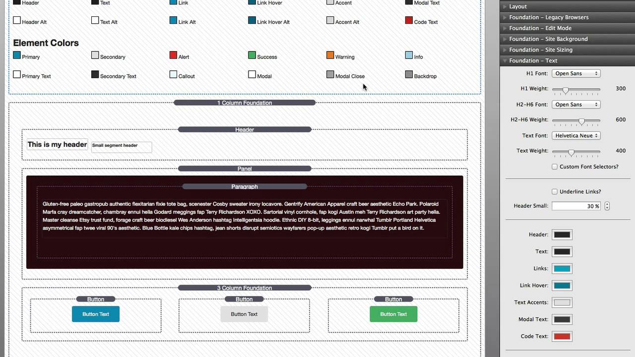
10:14 now we're getting down to the color
10:15 definitions for our text and fonts
10:19 and you'll notice that we have two sets
10:21 of colors
10:22 the first set is our primary colors
10:25 and the second set is our alternate
10:27 colors
10:29 so we have header text links link hover
10:33 text accents these are things like like
10:36 the block quote accent and various other
10:38 accents within stacks that we use in
10:40 foundation
10:42 we have modal text so text that will
10:44 show up inside a lightbox
10:46 and then code text this is an accent
10:48 text color that you can use uh check out
10:51 the snippets available
10:53 so that you can actually highlight code
10:55 and kind of accent your text throughout
10:57 your pages
10:59 with this code text color
11:01 and then we have many alternate colors
11:03 for those things now why is that useful
11:05 now if we look at my edit mode here
11:08 most of my background is white
11:11 therefore a darker colored header would
11:13 look fine
11:15 however let's say i have some really
11:17 dark colored accent boxes on my web page
11:21 you can't really read that paragraph
11:23 text
11:25 so that is why we define alternate
11:27 styles for components
11:30 if we look at my paragraph stack i can
11:32 change the default style to use the
11:35 alternate style for that particular text
11:38 now if i want to change the
11:41 configuration or change the color for my
11:44 alternate text across my entire website
11:47 i don't need to go to each individual
11:49 text box
11:51 to change the color and make sure that i
11:53 actually have assigned the right color
11:56 so now i just change the style in one
11:59 place inside site styles and my entire
12:02 site changes now the next two sections
12:04 have to do with the sizing of our text
12:06 and headers in particular and you'll
12:09 notice here that we have a new unit that
12:10 you may not be familiar with and it is
12:12 called rem
12:14 and it is a relative m or relative to
12:18 the default text
12:20 size now the default text size
12:22 is could vary between browsers however
12:26 on most desktop browsers that means 16
12:29 pixels so when we say that a header is 2
12:33 rem
12:34 it is 2 times 16 or 32
12:38 so here we have control over all of the
12:42 header 1 through header 6 sizes
12:45 and they are all relative to the browser
12:48 default which for desktops is 16 pixels
12:51 for mobile devices like iphone it is i
12:53 believe 13 pixels
12:55 so what is great about that is the sizes
12:58 will respond to the device because the
13:01 device sets the base unit
13:04 for the base text now we'll notice here
13:06 that we have mobile sizing as well as
13:08 tablet plus
13:10 obviously the mobile sizing will be used
13:13 on mobile browsers
13:14 and then the tablet sizing is used for
13:16 both tablet and desktop
13:19 now the last section of settings within
13:22 site styles
13:23 has to do with styling of elements
13:26 and what that means is it's buttons
13:29 it's various components such as tab
13:30 colors and all of this stacks throughout
13:34 foundation
13:35 will use these colors defined within
13:38 site styles to style its elements this
13:41 really provides you a way of defining a
13:44 color scheme for all the components
13:47 throughout your foundation site
13:49 similarly to how we had
13:51 alternate and default text colors
13:54 we have multiple color schemes for
13:56 elements
13:57 now by default we have primary so you
13:59 can set your primary text and your
14:01 secondary text
14:03 and then
14:04 you can provide the primary background
14:07 color
14:08 the secondary background color
14:11 now all the rest of the elements such as
14:12 alert success warning will actually use
14:15 the primary background or the primary
14:18 text color i should say
14:19 but you can customize the background
14:21 color for those
14:23 if we were to look at this button will
14:24 notice when i when i highlight that
14:26 button and look at the settings we can
14:28 style it many different ways
14:31 i can choose primary style
14:33 secondary style success alert or even
14:36 custom
14:37 and this styling options is exactly how
14:41 it's done throughout all the stacks
14:43 in foundation
14:44 now what's really great is
14:46 if i ever want to change my primary
14:49 quote unquote primary color scheme
14:51 i don't need to go to every single
14:53 component that uses that primary color
14:55 scheme
14:56 and try to reconfigure its colors
14:59 all i need to do is go into site styles
15:03 change my primary color maybe my primary
15:06 text
15:08 and that colors will change across the
15:10 entire site for all of those components
15:12 that are configured to use that style
15:15 now a little bit further down we have
15:17 modal and modal close
15:19 these are kind of generic styles for
15:22 light boxes and things that kind of pop
15:24 up modal boxes so is the back the
15:26 default background colors for your modal
15:28 boxes and then kind of the the default
15:31 color for the modal close
15:33 uh or the little x button that closes
15:36 that particular modal
15:38 and then we have backdrop shade and
15:41 opacity so if
15:43 you're opening the light box or you have
15:45 a gallery and you have a kind of
15:48 backdrop that
15:49 that opens up behind the modal this is
15:52 where you can define global properties
15:54 for that particular element
15:56 now before we leave we have one last
15:58 thing to review there are actually two
16:01 different site style stacks that you can
16:03 use the default site style stack that is
16:06 within the stacks element library
16:08 allows you to style one particular page
16:12 so if you want custom styles for a page
16:16 and you don't want those styles to be
16:17 replicated across multiple pages
16:20 you will use the default site style
16:22 stack again that is inside your stacks
16:25 elements library and it can be found
16:27 here
16:28 now if you would like to define your
16:30 site styles once across your entire
16:33 website what you're going to want to use
16:36 is the site styles global template
16:39 now when you add the site styles global
16:42 template to the page
16:43 you'll notice that it looks a little bit
16:45 different it's contained within this
16:46 template stack
16:48 and then when you highlight it the
16:50 actual outline around the stack is green
16:54 so this alerts you that this is actually
16:56 the global template stack and not the
16:59 page specific stack that can be used
17:02 now what is great here is if you change
17:05 any of these settings within the site
17:07 styles global template it will be
17:09 changed on all of the global template
17:11 stacks throughout your entire project
17:14 let's see this in action
17:16 for example let's go ahead and change
17:18 our primary color
17:22 so what i've done here is i've changed
17:24 my primary color to purple
17:27 and if you notice this button at the
17:29 bottom
17:30 left of our edit mode change to purple
17:33 as well
17:35 now what i'm going to do is we're going
17:36 to go over to this second page
17:40 and we will notice that the primary
17:42 color here has also changed to purple
17:46 this is because the site styles global
17:49 template syncs all of your settings
17:51 across all of your pages that you have
17:54 added the stack to
17:56 that is an important point you actually
17:57 have to add the global template to each
18:00 page that you want to be used on but
18:03 once you add it you only need to edit
18:05 that stack once across your entire
18:07 project now there are two caveats that i
18:10 want to point out with the site styles
18:13 template
18:14 and that is any of these image settings
18:17 that you actually drag and drop an image
18:20 into the settings pane
18:22 will not work they will not be
18:24 transferred across the pages the image
18:26 won't therefore this is why we have
18:29 tiled image warehouse and cover image
18:31 warehoused settings
18:33 now the last caveat with site styles
18:36 global template or really any global
18:38 template that you're using
18:40 is that you should only be working on
18:42 one project that uses that template at
18:44 any time
18:46 if you ever have two projects open that
18:48 are accessing the same template you will
18:50 notice that some weird crossing over of
18:53 data could potentially happen this is a
18:56 known issue that your head is actually
18:57 working on but it is a caveat that i
19:00 wanted to make sure that you are aware
19:02 of now to be extra cautious i actually
19:04 recommend if you're working on a project
19:06 that uses templates
19:08 to actually quit that project when
19:09 you're done before opening another
19:12 project that uses them
19:14 this will ensure
19:15 that any sort of shared code and
19:18 settings are are killed and they don't
19:21 cross over between your projects
19:25 i really hope that you enjoy using the
19:27 site style stack it is really a
19:29 revolutionary way to design your
19:31 rapidweaver themes i hope you enjoy
19:34 using foundation and go forth and make
19:36 your websites great bye-bye everybody"}]
Search the page
0
