About Stacks Guru
Stacks Guru is born from the need to search the vast number of videos out there on stacks built for Stacks Pro and the Stacks 5 plugin for Rapidweaver.
We have scraped over 500 videos to get the transcripts for each in order to make the spoken word searchable.
Please use this free tool to help you learn and discover the awesome power that Stacks and the stacks made for Stacks have to offer.
Stacks Guru
Video Reference
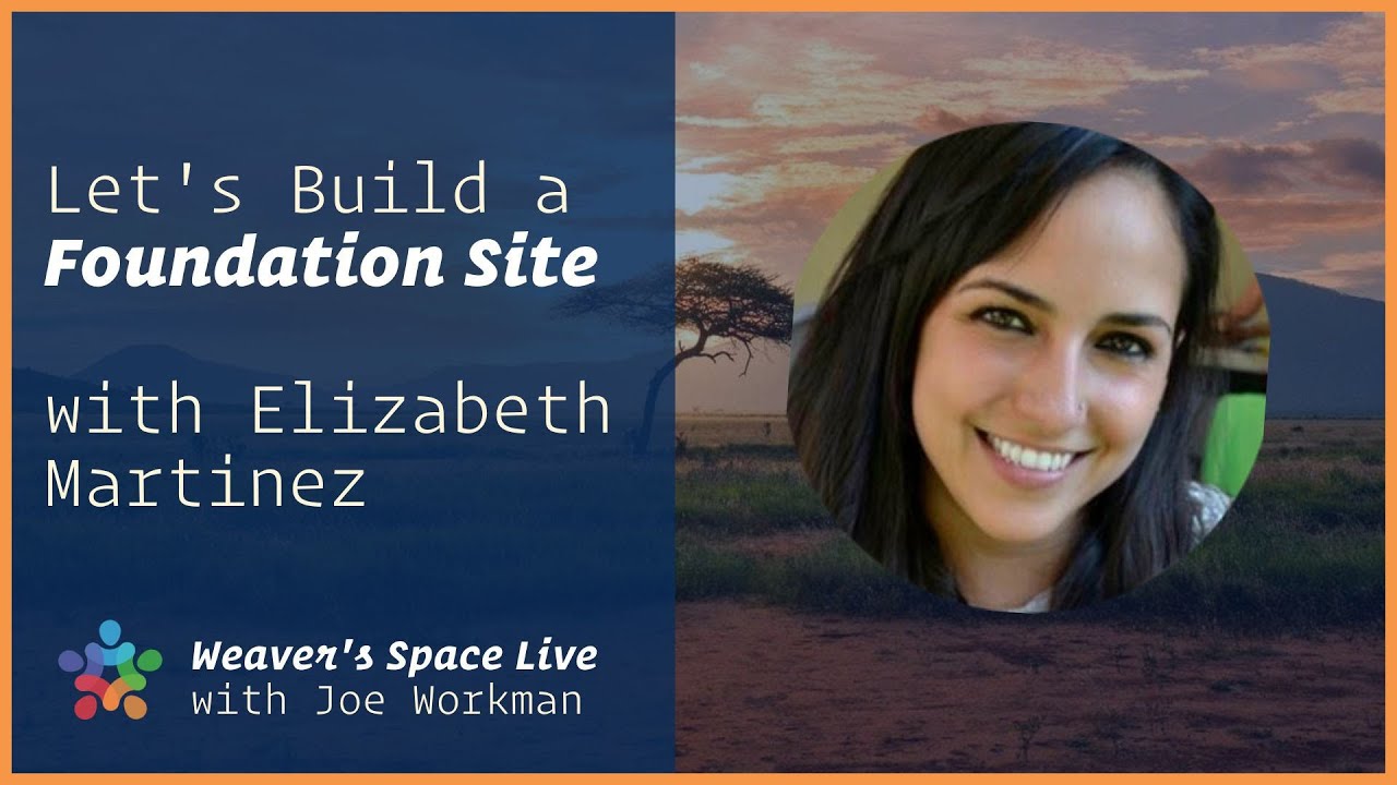
Special guest Elizabeth Martinez designs with Foundation 6
08/12/2020
On today’s live stream, I asked a long time Rapidweaver / Stacks / Foundation user, Elizabeth Martinez, to join me. She will try to replicate NAT GEO’s Website, live, using only Foundation 6 stacks (and maybe a few extra stacks), as I assist her with the elements she could struggle with. Elizabeth is not a stack developer or a coder, so you can probably relate to common issues she might run into, and this could be a learning opportunity for us all.
Transcript
00:01 oh let me get the chat going okay hey everybody uh joe workman here
00:09 and we got a special guest today um and hopefully let me get the chat room
00:15 going so there's any issues i can see it in the chat
00:34 what amateur hour here i can't believe you have this open before
00:40 okay um so yeah just a couple quick notes in the in the chat if hopefully everyone is um
00:46 can see this and i see we have um about 60 some odd people hello from australia we got david paul
00:52 watts thank you for coming on today we have a special guest and let me bring her on now we have
01:00 elizabeth martinez and um she is the mastermind if you guys have
01:05 been enjoying um the amazing amazing content that she's been putting out
01:11 um on our instagram account on the weaver space instagram on the weaver space instagram account
01:17 then uh she is the mastermind oops she is the mastermind right there and um man she just has been
01:24 killing it and i really love the content hopefully you are too and today she had a really great idea last week and um
01:31 she wanted to come on and she wanted to rebuild a website live with foundation six so um what what
01:37 she's gonna do is she's going to build out national geographic.com which obviously is a
01:43 beautiful website and um yeah i'm really excited um so want to talk a little bit about
01:49 yourself introduce yourself hi ah thank you joe i'm i'm really excited to be here
01:54 um i i i was looking forward to this i i was
02:01 i thought about rebuilding um a website that we can all relate to um
02:08 so i thought about now nadio because they have beautiful imagery and i thought well you know this is
02:15 we can we can replicate this in in using only foundation stacks and um and yeah i i'm excited to do it i
02:24 i will probably run into regular like problems that that uh that a lot of
02:30 people can relate to so that's that's what i think will be useful to everyone i'm really happy to see
02:37 everybody saying hi and hola voila um
02:43 and i i am yeah i'm happy i'm happy to be here thank you for for this opportunity
02:49 excellent well thank you here i i will uh share your screen great and then uh we can
02:57 here we go so everyone should be seeing your screen now okay so i'm gonna go on the night your
03:03 website for now okay so everybody can see my screen
03:09 right yes okay uh so i'm gonna show you very quickly the nadio website and i'm
03:16 gonna um show you what before i do this live
03:22 i wanted to make sure i could do it so i did it uh before i
03:30 finished it i'm gonna show you the finished result and then i'm going to start start from scratch and i'm probably
03:36 going to forget all of the things i did before but uh that will be helpful for you
03:42 and and yeah i'll start as if i hadn't done this before right so
03:48 i'm going to show you quickly this is the netgeo website today it changes every day so i mean i'm just going to work with what
03:54 i have today um before i i start showing you i want
04:01 to uh make uh i i want to make something clear that i won't be going through
04:09 like hover effects because it's going to take forever what i really want to show is that you
04:17 can do the same layout using only foundation six and and it as it maybe it's
04:25 it looks a little bit easy but i ran into a lot of thing a lot of little issues that i solved
04:34 but yeah it was it was a challenging one so this is the live uh
04:40 nadio website and and and yeah this is today obviously i uh
04:48 ignored the advertisements in in uh in my project but i'll show you what the what the
04:53 finished pro project looks like it looks pretty similar also this layout for example is repeated
05:01 throughout the the site so i just copied and pasted the first one uh for for practical purposes but you'll
05:10 see pretty much everything uh that's the nagio website and this is my website oh sorry um
05:19 this is my website my finished website and made in rapid weaver and stacks i'm
05:25 gonna preview it and you'll see it's pretty much it's close to
05:30 the finished result um the one challenge that i i will
05:38 ignore is the the exact same uh typography because in this case this is a net geotypography
05:46 and as much as i stole a lot of their content the typography wasn't that easy to steal
05:53 so i'm just gonna do it with another typography that kind of looks the same but this is the this is the remake and
06:01 yeah well it looks pretty much it looks similar right we have the the background with the
06:07 the video and we have these the the slider which is a slider but i couldn't do the
06:14 arrows but we'll do them live um we have the the fixed background
06:20 here that we could see uh here right we have the travel background
06:26 fixed and i copied that and like i said i copied the exact same layout as before
06:33 because it's pretty much the same as just uh mirrored and um and then we have this
06:40 cockroach or or whatever that is a cricket maybe and then the photo of
06:48 the day and i have the photo of the day with uh the text overlaid and
06:56 so yeah i pretty much succeeded um as you can see here in my
07:03 in my project i'm gonna finish quickly and then start doing it and i have the footer and
07:11 okay so i'm gonna start over as if i hadn't done this before but i
07:17 did do it before and i wanted to show you um so that we can
07:23 uh if if i get stuck i'll probably use it as a reference so i'm
07:30 i'm just gonna call this home for now i already have uh the theme of foundation 6
07:39 selected and i started adding a stacks page to my project
07:44 i'm gonna call this i'm gonna name save this project just in case i lose
07:51 the progress for any weird reason
07:56 um so
08:03 sorry i got you
08:08 okay so um gonna start by the
08:16 i here i have my all my stacks which are a lot but here i saved only the foundation
08:23 six stacks and that's what i'm gonna start with i'm gonna start dropping inside styles stack
08:30 um the first thing i usually do is make sure i have loaded the features
08:38 like uh font awesome and in this case i will use font awesome
08:43 so i'm gonna load it and i know in advance that this font awesome
08:51 will have the brand icons i'll use the brand icons at some point so i'm going to
08:58 uh select that option and i'm going to add a um
09:05 the u well yeah i'll add the utility classes because i use them a lot i don't know if
09:12 joe encourages this but it's just it's just so much easier for me to use
09:17 them all the time that's why you're there okay
09:22 uh and then uh yeah i think that's it that's the uh the
09:28 features i want and we'll start by the fonts
09:33 i'm going to use the um
09:40 um what's it called again century gothic it's really far from the uh
09:47 from the actual nagios font but uh
09:54 i don't know i find some similarities between them um so i'm gonna add the font
10:01 and i'm going to make it i'm going to make them this font to be
10:08 in all of the if i notice that the font is the same throughout the site so i'm
10:14 going to choose all of the elements here so that this font can uh
10:23 be can you can be used throughout the site so i'm gonna call it
10:31 century anyway so that if i need to override something i know what which
10:38 class to use and i'm gonna start
10:43 um by changing the the the primary colors as well
10:51 so if i interject for a second yeah okay so on the web font
10:57 um if you just uh if you selected the pagewide default and then um and then you just select
11:03 pretty much after that if you all the only other thing you would need to select is all the various headers
11:08 um if you uh uncheck like p and quote and everything in that bottom row it's essentially the same effect um just
11:16 to let you know i just thought if it's okay i'll i might interject with a couple small tips and tricks here and there
11:22 no no that's that's that's what i wanted but i want you to interrupt me as much as you want
11:28 okay so um great that's a great tip i didn't know that
11:34 so we're gonna start by changing the the side styles i'm going
11:41 to change the primary color to this yellow which
11:46 you can find out if you inspect the element i won't do that right now because
11:53 it's uh uh because it disappear like it has a restriction or something
12:00 it disappears the whole page and i have to reload it so i'm just gonna grab it i have this
12:05 tool called sip if you want i will i will mention the tools i use in
12:12 case you you uh find them uh useful
12:18 and it's there on my toolbar and it's pretty cool because you can
12:23 use shortcuts to grab any color from your screen not just a browser
12:29 so i'll paste that color here and um oh
12:36 i'm just gonna select the rgb slider so i can paste the the code um
12:45 i'm going to i'm gonna leave those as they are for now but i may i might
12:53 come back to them and change something later on so i'm gonna start trying to
12:59 to replicate this uh first we have uh the the the menu bar which is which has
13:06 a bro uh white background and we have the
13:12 la nadio logo subscribe and login and search
13:17 um elements and the menu button right so i'm going to
13:23 to add a menu a rapid weaver menu um sorry a foundation 6 menu
13:31 and a regular menu
13:38 okay i think i think i so sorry i'm just going to look
13:44 and see if i change something oh all right it was a tough i i did a
13:51 top bar so that i could throw in both of these and we don't have to do that but i don't
13:58 know why i thought it would be easier that way so i'm gonna do that
14:03 i'm going to um add a top bar and inside i'm going to drop my menu
14:11 on the right side maybe it was just so that i could
14:17 i mean you could do that in the menu item as well but i wanted to align the logo to the left and the menu to the
14:24 right and that that's an easy way i did it i don't know if that would be the best way that's exactly what top bar
14:31 is for is to have things on both sides is exactly what it's for so yep good job awesome all right so we have an
14:38 svg i have already that oh no i don't hold on
14:45 i i saved all of the sources that i'm going to be using maybe just copy the from the other
14:51 project that you had right thank you um
14:57 i'll do that so in case you don't know how to use an svg
15:03 it's really easy especially if you're stealing it from a
15:12 for my website because i'll do this in another tab just to make sure
15:17 because the when i reload this i'm afraid some of the pictures that i'm gonna use will
15:23 disappear so basically all of the
15:29 all of the svgs on a site you can right click on it and then inspect it
15:36 and you'll find the element in the inspector
15:41 um see i can svg here oh that's an image
15:49 well i i i can't remember it's a url to an svg file yeah there's a url and you can copy that svg
15:57 or tell this to show reveal in sources panel
16:03 and then you'll see the svg and you just drag and drop wherever you want i usually do it
16:08 in my downloads folder which i keep with a lot of stuff and then
16:13 open it open that in a text editor copy the whole uh code
16:20 and paste it right here one thing when you do copy and paste from an external svg file like that
16:26 there's gonna be a tag probably at the very top that's like an xml tag like if you were to open up the svg
16:32 inside of a text editor um you you'll notice that um
16:38 it has an extra xml tag at the very top yes exported by a lot of like even
16:43 illustrator and sketch or many other apps illustrator apps will do that so you'll want to make sure that you only do the
16:50 svg tag anything before that you can delete yeah you can delete everything before
16:55 this tab so the tags always start with this bracket and then with this work yep so
17:04 that's the the code i just copied and pasted and then i'm going to align it to the left because it was aligned to the
17:11 center and for now i'm going to
17:16 give it a max width i i'm gonna check how much i gave it of
17:21 120 i already calculated that before so 120 i probably checked here oh
17:30 i have a tool called a um measure stuff i'm not sure if it exists
17:37 yet but it's an exten it's a google chrome extension and when i click on it i can measure
17:43 anything so i can set the origin here for example with it with the letter o
17:49 and they will tell me about how how how big it is it's a 108 pixels exactly
17:55 but i'm gonna i'm gonna go for the 120 and i'm gonna start dropping these menu
18:02 items one two three four four menu items so one two
18:10 three and four so we have the
18:17 the menu items are subscribe um this one is not there anymore it's it
18:23 what it was before i don't know why um and then we have these uh
18:32 uh font awesome icons so i'm gonna
18:37 write down sub subscribe
18:46 and then user and then i'm for oh it's not showing because i think i'm supposed to have the light icons
18:53 the light type yeah i'm using a font awesome light so i have to
19:01 turn that on here the light icons okay and that will show me the right
19:10 the right ones i show i i looked up those up in front awesome and then i have this
19:17 is called menu and it also has a font awesome icon i think it's
19:27 i'm gonna check
19:33 okay am i um
19:41 confusing anyone or is everybody following me good i think you're doing good yeah okay
19:47 thank you um one one quick note someone pointed out um
19:52 is your laptop plugged in don't want to run out of battery what is your are you on you're on a
20:00 laptop yeah thanks i'll make sure i plug it in right now
20:08 i run out of battery thank you uh so um oh so i want to
20:16 align this to the right no sorry not here text alignment to the
20:23 right let's see how that looks i know that it's not going to be the right way to show but
20:28 okay so we have that gray background that has to be white and we have the subscribe it's
20:35 working out okay with that with that um font right
20:40 i think we just have to color this um so i'm gonna use a menu style
20:48 and i think i need the top bar style to remove the
20:53 the that gray background yeah background you heard a lot about it huh yes
21:03 okay yeah there we go so that's that's just to
21:09 remove the the gray and here um oh i i'm not gonna go into the mobile
21:16 version i'm just gonna work on the desk desktop version because it's it would take forever
21:24 um so i want the links to be black and
21:33 that's the hex code for black and i want the
21:41 active links to be black as well
21:47 and the carrot i mean i'm not gonna use the carrot but whoops
21:56 but in case we
22:02 okay so that should look a little bit better now oh no
22:09 you forgot to put the classes yeah thank you
22:14 so i'm going to name this class
22:20 my top bar and this one my main
22:27 so the top bar i'll use my top bar
22:34 on both here so that the grey disappears and
22:41 here i'm gonna use my menu and there we go
22:47 boom so um the font is a little smaller
22:55 i'm going to get into that later or it's just going to take forever and this has a bold i i
23:02 i decided at the end to to make a font
23:09 where is it
23:16 one color no fun
23:25 no wait how do i add a uh oh hold on i'll i'll just look what i
23:30 did before sorry can you click the hide button on that bottom it's at the bottom of your
23:36 screen that says stop sharing can you click that hide button yeah it did but it did something weird oh
23:41 there it goes oh okay sorry cool no problem um
23:46 i did it before but i thought that it disappeared but i guess it didn't oh fonts okay sorry so we go
23:54 i'm gonna add a font style and and um called it call it bold one
24:01 i usually don't just call it bold in case any built-in foundation
24:08 is um is using it so bold one and and the weight and i'm just
24:15 going to click on this so that uh the the the the item that i choose
24:24 can be bold and not the others like the menu like that menu uh oh it didn't do it
24:32 you might want to make sure you check out that you uncheck the font size because you only want bold to be
24:37 so take yes you want the size to be the same you just want it to be bold yeah it didn't work either hold on i
24:43 think i i have the weight here yeah
24:49 there we go so just add the weight okay uh click on the bold and then
24:56 make sure it's not 400 because 400 is the default weight so i just added it on to 800.
25:05 um so after the top bar we have latest stories and it's about
25:12 it's a black background so we're going to be using the alt colors here so i'm going to drop in
25:19 a container first and just before i
25:27 start using this container i'm going to add another swatch that i usually
25:33 add in all my projects with a padding um setting
25:40 and that will help me instead of using a class here so instead
25:46 of renaming this class to whatever i want i'm going to choose uh this element
25:53 section button and i can choose no sorry i'm going to choose a css sorry
26:00 css and change that to section
26:06 i use this a lot it's just so much easier to add the exact same amount of
26:11 top and bottom padding to every every container that is
26:17 that has the htm tml tag for as a section so you'll see that in a
26:23 second when i finish uh editing this watch i'm gonna go and really quick one danger with doing that
26:30 is if let's say i release a stack that uses the section tag um or someone else has a stack that
26:37 has a section tag in there maybe they're dividing something into sections um
26:42 uh this that could give you unwanted results so potentially what if you
26:48 wanted to use the element um selector there is a container in there so then you can you can apply that to all containers
26:55 right um right so yeah oh yeah i wouldn't do it to all containers because a lot of
27:01 the containers don't i actually i override the oh okay
27:08 cool i'm i'm gonna use it but um you have that big warning from me joe
27:16 um so one more thing i actually looked it up before um before i said anything because i didn't
27:21 want to be wrong um for the bold you know you said you love utility classes right well there is a font-bold
27:29 utility class yes i i thought about that and um
27:35 yeah i i i just thought it would be easier for everybody but no problem i just just trying to help out no no
27:41 it's great it's uh so it's font dash bold right yes
27:49 um like that yeah that you're right so if you wanted to control the the bold
27:56 then yeah then you could use that those utility classes or a swatch a swatch
28:04 yeah perfect great bothering you now hold on
28:11 so i'm gonna use this container and change it to section and you'll see that
28:17 whatever i applied in the swatch is going to change that container and and give me that
28:23 vertical padding which by the way i also sometimes use like if i don't if i don't
28:30 have that padding i i use the padding top
28:35 and then whatever value i want which by the way the values have to be multiples of eight
28:42 in my experience right and um yeah so padding top or padding bottom or
28:49 what i do sometimes is padding y which will give me the exact same result i it's just
28:56 it's a matter of taste and how you um you are more
29:03 most comfortable with right you can use a section or you can use the padding and the result will be the same for
29:09 example if i wanted to have a back a black background color i can do it right away
29:14 with the utility classes without the need to add a um a black swatch right so that's that's
29:22 what i love about the utility classes and that's what i actually use all the time and then i want all of
29:28 the contents to have a an alt inside of my container no i'm lying no because this
29:36 one is it has to be with with a white background so
29:42 i'm going to have to add the alt in each is there a way joe to like
29:49 if i have that this element inside of a container that says alt is there a way
29:55 to like overwrite that alt class or not you'd have to create
30:00 um you'd have to create another class that is that counteracts the alt essentially you
30:06 know another thing you could do is i mean it looks like a lot of times that most of this web page is white text
30:13 right one once one strategy that you could do is flip it make your d make your default text white
30:20 your default background black and then change it so your alt text is white or black on white does that make
30:27 sense yeah so so you don't always have to use alt doesn't have to be
30:32 white on black you can swap that right um so yeah so in site styles you could just
30:37 go ahead and change all of those to be you know the opposite and then that way you know your default for everything is
30:44 white on black but then only when you want to have those accents which is the black on white then you set that to be the alt does
30:51 that make sense that would be that would be easier actually yeah okay thank you
30:57 um i don't know what what you prefer right now you guys do i should i just
31:04 continue or do you want me to switch what would be easier for can you tell me
31:09 do it i can't see the no i yeah i'm watching the chat um i mean everyone's loving it but um
31:15 i think uh um you can do either way um i mean i think it might be a little easier
31:21 uh less work to do it the way i suggested for right now instead of having them trying to add alt to everything
31:26 you know what i mean yeah it's up to you though you know i'll do it that way then okay um so we
31:34 um
31:39 nope so it would be your your text colors uh inside site styles no inside size styles
31:45 no just yep scroll down oh there we go so you see so instead of that would be
31:51 white instead of dark gray right exactly and then yep and then this and then that
31:59 one would be black or 222 or whatever you want to do yeah that works okay and then you want to change the
32:08 text as well right so your text color um uh so you you change the header um but
32:15 text right below it yeah there you go
32:20 same thing yeah that should make it easier to work with okay so thank you joe
32:29 no problem one thing i just noticed by doing that i've never actually tested this out if you notice it makes
32:34 all the text inside site styles i think i should uh
32:40 maybe in my next update what i'll do is i'll make sure that that's always black so that yeah i think that would be smart
32:46 okay yeah also like for example these are h6 i know that now yeah and if i change it
32:54 it will display differently as well okay okay so
33:01 i'm gonna center i'm gonna use an h3 for now and see how that looks
33:06 and center the text and we have latest stories
33:15 and we can use the utility class font bold
33:23 it looks a little bit more like their text and then we have a
33:30 text
33:37 that will center and replace
33:43 so what i did to have that underlined i
33:49 used um another swatch
33:56 for a border and i called it i'm i'm i'm gonna change it
34:03 here for the yellow i'm going to copy the yellow again
34:09 um so butter border color simple and i'm going to paste the yellow oh i
34:16 didn't sorry
34:24 so my border is yellow now and i'm just going to change the change the size to detail
34:32 and only use the bottom like maybe three or four or five pixels
34:39 whatever works for you and only the bottom so this is what i
34:44 did but uh i'm not sure so i'm gonna call this under yellow
34:51 and uh inside the the text
34:57 this is a little hack like an html
35:02 code that you can use uh so if i add this class of span
35:09 oh sorry this is how you open and close a tag so this this
35:16 word is between a span up an opening tag and a span closing tag
35:23 now so that means that that word will have maybe another class or maybe it's just
35:29 different from the rest of the text so right now i'm going to add a class so right after
35:35 the span word i uh put a space and then class equals and then name it
35:42 my class so under oh sorry i forgot the quote quote under yellow and then i close my
35:49 quote and then i close out that and this stays the same because this is just telling the html to to end
35:57 that uh that span so you probably won't see it
36:04 on on edit mode or preview sorry that's weird what happened weird because
36:11 it worked on this one maybe i used them maybe there's something
36:16 wrong with my text spam glass under yellow no that looks correct
36:23 it looks that very looks correct maybe here huh
36:31 it's like you're uh go to the swatch sorry go to the swatch the border swatch
36:40 so you have the size oh i forgot the box yeah style so make it
36:47 solid yeah so that should work yeah there we go boom by the way this isn't a
36:54 hack that is exactly how you should do it oh okay great
36:59 um and then i found for that divider i'm gonna i'm gonna use the exact same
37:06 um way to do it
37:11 but i also did it i did it both ways so whatever is
37:18 simpler for you you can do a divider with the same class and the divider will
37:26 convert to that color oh sorry so the divider will
37:33 be yellow but you would have to set it inside of one column and then
37:39 make that column really small right or you can use the utility class
37:47 on the divider how just add a with utility class on the divider oh right
37:53 you can do that too uh well how with the w colon i don't know how you know 48
38:00 i don't know how how big do you want it okay i think that should work does that work yeah it does okay it does
38:07 boom so yeah you can do that with the the divider and then um
38:15 use a utility class and if you're not a fan of the utility classes you can just put a space bar here
38:23 if you i'm gonna do that with just the space bar and you i mean you can't really tell i'm
38:30 gonna bring it outside but you can even if i hit space and there's a space
38:36 it says click here to add content so it didn't it doesn't i recognize it as a content but if you
38:42 keep the the alt button on your keyboard and then space it does
38:49 recognize it as content and yeah now that the hack
38:58 um i didn't even know that that is very hard i learned something new today
39:04 so and then if we add that class it will it will only oh sorry well if we
39:12 would actually have to use the spam the spam thing again right
39:17 yeah so but it's the same thing even though i i can use a space bar here it won't
39:27 recognize it so i'm gonna click alt in my keyboard and that should give me
39:33 the exact yeah like look at that
39:38 look at that i never would have thought of that that is pretty clever props on that interesting
39:44 so there's the two ways of doing it you can do whatever is more comfortable for you
39:51 will work whatever floats your boat yes so we have that and then we have two
39:57 columns uh does anybody have questions
40:06 uh no i've been kind of answering them as they as they go along
40:12 so i always add the the margin right away because then i forget to do
40:19 it but yeah i i use two columns and then a header and then a one column this is i
40:25 i'll tell you why i'm using that one column um but yeah uh and then the two columns
40:36 here so the the two columns if you can see
40:42 they're not divided exactly 50 50 so i
40:48 came up with yeah eight and four so that's what we're
40:55 gonna do here um in medium and large devices this should uh
41:03 the first column should be 33 or 4 units out of the
41:10 8 and the second column should be 8 or you can leave it in auto and it will
41:15 also work and then we have a
41:23 header and but that error is uh aligned to the left
41:31 and i'm going to add this i i hope you know this
41:38 uh symbol i don't know what it to call it but i'm going to use a span again
41:46 to color that little
41:54 to replicate this here
42:00 okay um oh but not not this
42:07 not under yellow but i'm gonna i'm gonna use a span but i'm going to not under align it but i'm going to make
42:14 a oh actually if i use
42:23 that work no
42:28 can i use color primary yes yes there we go yep there we go so
42:36 yeah we can replicate it i'm not sure how i hold it that's a
42:42 utility class everyone she just set uh the the primary color to be of that pipe
42:48 to be uh the yellow which is the primary color and just because it's not doing
42:55 what i want to that to that one to that symbol i'm going to try to
43:00 use this class and see if that works no all right well
43:06 i can't remember how i did that with i'll i'll let you know soon um
43:15 so we have latest stories and we're sorry we have today's fix
43:22 so we just think that
43:29 and we have that two-column stack and here's another trick i learned doing
43:37 this one that you have two columns and then i thought well i have a photo
43:43 and then i have this text that's what i did at first i'm gonna delete this later but i'm gonna show you why
43:49 so i have a photo and and it's also divided right i mean it's also not 50 50. i
43:57 it's also four and eight the same the same as the the big one so i'm gonna
44:03 do that first add a margin and um tell it
44:10 actually i'm gonna do this in in the small devices as well
44:15 eight and eight okay um just really quick if you set four and eight on small and
44:22 then set medium large to be inherit which is the default values for those it'll just be four and eight on
44:27 everything so small you would set it to eight and then on the others you'd sit on medium
44:33 and large you'd set it to inherit so what that does is what that does is it'll it'll inherit from
44:39 whatever is above it right okay does that make sense yes and inherits from what's above it
44:45 okay great thank you uh so um
44:52 so he here too uh yeah you could do that there too okay great uh it's easier right you can
44:59 just change it in the small um so we have a picture and i'm going to
45:08 um grab that oh where did i sorry i don't know where i
45:15 put it in the
45:20 here i have this coronavirus photo and i'll drop it and
45:27 what i noticed is that this is the photo i extracted from their website
45:32 and if you notice it's not square so i'll show you what i did there but
45:40 first i'm going to just copy this text and change it to the left
45:46 and then do code red forward 19
45:55 updates on the corona virus pandemic
46:02 so we have that and i'm going to set this to have
46:10 six hashtags which means it will be a nh6 tag okay
46:16 that's what it means and um in the photo if i preview this
46:26 if anybody has a obsessive obsessive compulsive disorder
46:31 i'm gonna get my uh my my charger
46:37 before you go crazy so anyway this while
46:42 she's getting her charger this is exciting do you guys liking this i mean i love the interaction on the chat room
46:48 and um yeah i kind of like this enjoying kind of watching someone else work and then i can kind of inject a little bit
46:54 and and uh give how i intended uh for things to be done and hell even i learned some things
46:59 right i didn't even think about doing the alt space thing that was pretty clever um so
47:04 yeah very very clever there i i like that and um i'm i i'm loving this and thank you for all the interaction
47:11 keep the questions going and uh i see elizabeth is back and we'll go back to her because she's more important than nina
47:17 anyway no no no okay um so the way i did this
47:24 square i thought well darn it i'm just gonna have to edit
47:31 all my photos right and just change them to square but no i found a workaround i can't even
47:37 remember where i found it but i'm pretty sure i looked it up and found it so i'm gonna use a
47:43 container with the with the background image uh
47:50 i'm going to add a swatch for a background image here
47:57 and call it uh today's pix01
48:05 so that i remember what it is today's like tp01
48:12 and drop in a an image and i'm going to drop that image there
48:21 and this is pretty interesting i thought um there's my container i'm gonna call it
48:28 well before i name it no i am so there it is right
48:35 and what i found is that if you add another swatch
48:44 for uh oh i forgot right now so sorry hold on
48:53 um there oh patty ah you're clever nice i i was wondering
49:00 if that's what you were going to be doing very good so i'm going to use this and call it a background pad so that i
49:09 remember and then go on detail and it's a a percent
49:17 unit unit and only the top i'm going to make them make it a hundred
49:24 and that will make uh whatever i add oh sorry did it
49:31 that's correct oh that's right yeah okay so if i add this class here
49:41 it will make it square so i'll remove this picture and drop in
49:49 this container here and even though in preview it looks funny it should look good i mean on edit it
49:56 looks funny it should look good here yeah cool right so if you're curious so what padding
50:01 so when you when you add an image um to a background all right um that that image is no
50:08 longer um it's not it's not influencing the size of the container right
50:17 okay so um if it's not influencing the size of the container um there that container now has no no
50:24 content so like if you before you added that um that padding if you were to preview
50:29 it that container would you wouldn't be able to see it it would be nothing right you couldn't see the background image
50:34 because that container has no content to it okay um but when you set it to be a
50:40 padding of 100 um whenever you add a percentage padding it's always based on the percentage of
50:46 the width okay so if you add a padding top of 100
50:52 it's going to make the padding on the top the same as the width so that is one way to get a perfect
50:58 square and then because that padding affects the the content you get to see the background image
51:06 right so that's how we're able to see the background image and background images it by default it will scale as you have
51:11 it and it'll cut off the sides and it will center it by default so that is the perfect way to accomplish
51:17 what you wanted i'm highly impressed good job okay okay so
51:25 um i'm going to add a little padding on top so pt is short for
51:33 padding top and add a no not here
51:38 sorry i wanted it here because if you notice it's a little bit too close to
51:46 to the header thanks oh here right oh by the way this
51:54 should be an h1 and this should be an h five-ish or something but i'll get into
51:59 that uh in a second sorry about that all right so i'm gonna add some padding top to the
52:07 two columns here 32 like i said it's always supposed
52:12 to be multiples of eight and then copy and paste but without the padding now that should look
52:20 good oh no i do need a padding but maybe less
52:30 does that look good no more sorry i'm
52:37 there that looks for you yeah all right so um
52:46 before i get into details about what like changing all these images i'm
52:52 gonna continue because i'm gonna run out of time soon well i don't know how much time we have
52:59 well go until you're done and or until you get tired of it i'm i'm okay with it i don't think anyone else minds
53:07 great that's great so i'm gonna leave it as it is right now and i'll change i'll
53:13 um i'll go back to it later okay but you you get the idea right one two three four five
53:20 six we have six one two three four five so i'm gonna add one more and
53:30 and now i'm going to get this one done uh
53:37 so we have a background and then some content
53:44 so i'm going to use another container
53:50 here with a background one so i'm gonna add a
53:56 swatch called bg1
54:02 that's what i call all my backgrounds usually onto unless i have too many but
54:10 and we have that um oh sorry hold on i'm just gonna
54:20 uh here it is
54:26 we have that image so we'll use that class here to have that image
54:33 and as joe said if i preview this nothing will show up because there's no content on the background on the on the
54:39 on the container so i'm going to add that content right now and i'm going to add a header
54:47 it looks like there's two headers yeah
54:54 i would say there's three headers this one is an h6
55:05 and this one too and that one we'll leave it as three
55:11 right now so how u.s vice presidents when it's gonna try to write it fast
55:29 um i usually use the break tag if i want the the content to
55:37 break because otherwise it won't do it i'm going to
55:43 show you
55:50 so from irrelevant to influential is my second line and if i remove that break tag
55:55 it it won't it won't show that you know went from so it won't it won't
56:01 break and i want it to break just so that we look just um very similar to the to the original
56:09 um website so i'm gonna make this bold and i'm gonna write history on here
56:19 and then we have a hamburger
56:26 um awesome i have them here in my snippets
56:32 uh i think it's called hamburger oh no
56:39 menu no i can't remember what it's
56:44 called i mean here let me find i'll find it i know it i think i have it here
56:54 funny hamburger and it shows you it shows your hamburger yes it is oh bars just bars and it's a
57:01 the light so bars will make an fal
57:08 oh or you have it's a light version uh okay so i'm gonna use the l
57:18 yeah there you go so right now it will only occupy the height of the of the content
57:25 and what i'm going to do to give it a different height is i'm going to use a one column stack
57:31 is that okay joe yep and drop all of these inside the onecon
57:39 and then the one column i usually like to use the utility classes
57:47 and then you use height and here you can use like 48 or whatever
57:54 value you want but i like to use like 50 vh which means
58:01 50 of your browser height that works better in this case because
58:08 if we use a oh if you notice the width of the side
58:16 is a little bit narrower than my width so i will change that in the side styles
58:23 i'm going to check how how big i made it here so 1 10 20
58:30 10 10 10 20 1020 is my width and
58:38 here the the uh the default width is 1200 so that'll that'll
58:45 make it a little bit better see oh much nicer
58:51 yeah it's much nicer now um this will
58:57 go for for a little bit um higher sorry
59:04 in in the value oh it's 60 60 vh is what i used so that means 60
59:11 of the browser height is what this column will measure if it appears vh stands for
59:17 viewport height so that's what vh stands for so the viewport height
59:22 i didn't know that i thought it was a nerdy thing
59:30 okay so i'm just going to align the content to the bottom now
59:39 and there we go and now i'm going to use an overlay because i think no i don't i
59:45 won't they're not using overlay so i will awesome uh they do
59:51 they are using bold in all of them though so i'm going to
59:59 do that it should look better yeah
01:00:06 okay so we have that one and now we can have two column again and that two column
01:00:14 will uh be 50 50 this time
01:00:22 if you want to control the way your columns will look on mobile for example if you want the order of the
01:00:29 columns to be different i'm using the two columns just so that everybody can relate to this
01:00:36 but i i would recommend to use columns um
01:00:42 so that you can have more control over what column to show first on mobile and the
01:00:48 and what column to show second later you can't do that with the two columns
01:00:54 stack but you can't
01:01:05 and i'm going to uh now i will add a picture because here
01:01:17 a picture for the elephant and then this world elephant day and
01:01:23 then well it's pretty much yeah it's pretty much the same as here
01:01:28 so i'm gonna copy this oh i don't know why there's two pictures
01:01:35 in there but um
01:01:45 what was it all right so in that in this um
01:01:54 in this these three stacks i'm going to use the alt text now right correct
01:02:01 because they are black against white and i'm going to use a
01:02:07 container too oh actually or actually just put the alt on the container yeah i'll put the alt
01:02:13 and the container it's easier so i will add a container
01:02:20 sorry about this keeps moving around when i
01:02:27 uh open one or the other one thing you could do is if you set
01:02:33 your uh your stacks library to be popover mode instead of the panel that could that could help
01:02:39 uh when you're on small screens the what sorry so on the bottom of the
01:02:44 stacks library you see there's a pop over button on the bottom toolbar click on that
01:02:52 all right so now now now if you click out of it it'll just close
01:02:57 right okay it should and then if you click on the library um
01:03:04 thank you a lot of weight from my shoulders from five years
01:03:10 back just happened so um i'm going to make this container
01:03:18 have a white background by setting this background white and
01:03:25 the content to alt and drop in the elephant picture
01:03:32 which should be around here and you use the bg white uh utility class right to make it white
01:03:42 yes yes that overwrites the background black
01:03:50 correct yeah yeah unfortunately the the the live stream our our videos are covering
01:03:56 the class setting so people can't see that um sorry oh no it's not your fault i
01:04:03 can't move those it's i don't have control over that so sorry for everyone that's watching i'll read it out loud
01:04:10 um oh here it is right is that oh it just doesn't really
01:04:18 matter but
01:04:23 okay so this does not have the bold and that one
01:04:29 does and that's smaller and
01:04:37 oh i'm going to drag the picture out of the container so that because yeah
01:04:45 it goes full width there we go see i knew that
01:04:52 okay and you're requesting me use the pattern what you were testing me yeah uh
01:04:59 so i'm gonna use p y which is padding y so you can have padding top or
01:05:06 pt padding top p l cutting left p y is p top and bottom
01:05:14 p x would be p padding left and right so i'm using p y colon
01:05:21 16 and to give a little space there we go
01:05:27 in between and i'm going to change that header to a an h4 or h3 or h5
01:05:36 i don't know h5 i guess and remove the bold from this one i just removed the bold
01:05:44 class from that one and go welcome with another who wants to go
01:05:50 walking with an elephant heard i do okay
01:06:02 oh
01:06:16 okay i think i added a little
01:06:23 so there it's done right does that look good to you guys
01:06:30 we're going to change that anyway we're going to change the the color of the
01:06:47 am i still alive yeah yeah yep you're still alive
01:06:54 sorry okay and we have that so what i noticed is that i'm going to
01:07:02 um go ahead in what i did before and i i thought that this was a photo
01:07:10 that would cut at the guy's tie but no it goes all the way down here and the button the bottom
01:07:17 the button is on top of that photo and the photo goes all the way
01:07:23 uh to the so that would not be a picture that would be a container
01:07:30 so i'm going to add a container
01:07:40 here and uh
01:07:48 well yeah i'm going to add the class of background or bg2 uh
01:07:56 even though it doesn't exist yet and i'm going to add a swatch called pg2
01:08:07 and add an image there image of that guy
01:08:16 here
01:08:22 so we have the container and i'm going to drop in a one column stack again
01:08:28 so that we can give it the height
01:08:35 and i'm going to use h colon um
01:08:42 i'm going to check what i had before
01:08:47 60. so h colon 60vh
01:08:53 and drop in a button or a link whatever
01:09:00 you're gonna use
01:09:06 sorry okay and then the button
01:09:13 i will uh center it it it automatically is um
01:09:21 yellow but the the the
01:09:28 the the the sorry the text color is white now i wonder if
01:09:34 no well i'll check what i have to do you might want to set the primary text
01:09:40 color and site styles to be black instead of white you change the
01:09:45 the primary color but there's an there's a corresponding color so instead of white you change that to b black yes that's correct
01:09:52 thank you there we go so that button is registered
01:10:01 register and fold
01:10:10 yes and just align the content of the column
01:10:16 to the bottom and let's see how that looks
01:10:22 there so i'm just going to add a little padding to the two column stack
01:10:30 pb colon um 32
01:10:38 oh pb no not pv sorry pt
01:10:47 there there it looks pretty much the same right
01:10:53 should i go in does everybody have more time or
01:10:59 um yeah maybe if you want maybe um start like maybe uh take some of your um
01:11:06 the layouts that you may be pre-done in the other project and maybe just copy them over and maybe explain instead of
01:11:12 building them from scratch yeah okay i'll do that so that we can go faster
01:11:17 um so oh but i'm not sure i'm using the same
01:11:24 classes i'll just go over this project and explain what i did sure
01:11:31 okay so as you can see i have the same
01:11:38 the up to here we're all set right we know what i did i changed some
01:11:43 pictures i changed the and then i used impact for the video um
01:11:50 i'm not sure if you can use anything else outside of the just with foundation six stacks joe um no it doesn't have any background
01:11:58 video stuff like impact does so impact impact would been a great solution there yeah
01:12:03 okay so inside the impact i placed a container that sets the alt
01:12:10 in this case i i don't have the alt uh switched around so um
01:12:18 this container tells that all of the content will will have an alt um
01:12:25 setting and so i have a header and then another header with a little bit of padding to the top
01:12:32 and then a text and then a header and again if i if i for example in this one dive into
01:12:40 shark quest if we look in the original site dive into shark quest is is underlined
01:12:48 in yellow and if i add the class under yellow class i'm adding it right
01:12:55 now and if i hit enter it will just apply it to the whole
01:13:01 header so i'm i what i did is use use another span
01:13:10 and just put everything inside of the spam
01:13:15 content okay i i did the same thing as before
01:13:20 and um yeah the the impact is set to set to um
01:13:28 use a full screen hero header and if you click here you can add a impact video
01:13:34 slide and the video i i told it to play
01:13:39 i found the link to the nagio website and told it to play that mp4 video
01:13:48 and then it's it's set to autoplay and mute and loop the video so that it doesn't
01:13:53 stop playing all the time um i didn't add i didn't need to add a
01:13:59 um like a an overlay or anything in this case it
01:14:06 worked the way it is right now and we can see it
01:14:12 live here
01:14:17 so did i it looks like i'm using an overlay but maybe maybe the video already has it
01:14:23 yeah the video probably already has an overlay on it yeah that's what i would expect yeah
01:14:29 me too but i'm just gonna check yeah maybe on the main is it in the main
01:14:34 impact stack i forget if the overlay it's possible the the main impact stack has an overlay
01:14:41 oh i do okay so it's an overlay yeah if i remove it it's it's gonna the text will end up
01:14:50 lost uh yeah the overlay is a really great effect a it makes your it makes your text your content that's on top of
01:14:56 the video or image really pop but you get another benefit of the overlay
01:15:02 it's it's crazy how tricks play with the mod or you know these sort of tricks play with the mind you
01:15:07 can if you use an overlay you can get away with a much much smaller lower resolution video and you won't
01:15:15 notice it if it you have an overlay it's crazy i don't under i really don't understand it but it
01:15:20 plays tricks with your eyes or something because you can get away with with a really low quality
01:15:26 video file here and when you add an overlay you just don't notice it
01:15:31 um it's pretty crazy um and obviously you know a lower quality video file
01:15:36 will be smaller and load faster right so that's you know a good benefit yes
01:15:43 true i noticed that too i noticed that you can have a low quality video it's
01:15:49 great um this uh is i am using for the slider i'm using
01:15:56 moving box uh so i have i added another
01:16:02 swatch instance here because i was i had been using a lot of background uh
01:16:08 swatches as you can see here here there so i was using a lot so i wanted to divide it
01:16:14 and have it close by because i was going to be editing a lot i mean that's exactly why i created that swatches stack
01:16:21 so that you know you don't need to constantly scroll all the way up to site styles and then scroll all the way down
01:16:26 um because you know now these styles that are specific to this one section you're not using these
01:16:32 styles for any other section you can they can live in that section now right exactly yeah exactly and if i want to copy this
01:16:40 section into another project then the swatches go with me exactly yeah so let's just try to
01:16:46 make sure to use a name that you know that you won't um use again
01:16:54 yep um and then i have the two columns this header is aligned to the left this header is
01:17:00 aligned to the right and i use the span instance again to only underline the c
01:17:05 shows um uh text and inside the moving box
01:17:13 whatever you you start dropping in will count i as a slide
01:17:19 so this container with this picture inside has counts as a slide um why is there a container with
01:17:25 a background and a picture well that's because that's the way it is set up in their website they have a background and a
01:17:32 picture and the reason why they did this i think it's cool um it's because when you hover
01:17:41 only the background uh gets a little bit bigger and the and the
01:17:49 the title remains the same we won't see that here but if you wanted to do that it's
01:17:55 it's easy to do it as well with rapidweaver but uh for now i have a container with a
01:18:02 picture inside and automatically they're already aligned to the background i didn't have to do anything to it i
01:18:08 didn't have to align it anywhere i just dropped it in and the the png's
01:18:14 are already saved with the same height as the background and the uh the titles are already
01:18:21 um placed where they need to be placed um so this is for the slider i didn't
01:18:31 finish the slider and i didn't i don't know why i i think i forgot how to use
01:18:37 moving box but i can't see the the arrows uh yeah there's settings that
01:18:44 you can you can turn on the navigation arrows uh show navigation arrows and i set them
01:18:52 to the outside edge and the arrow to be white
01:18:57 but i i can't see them not sure we can look at that later okay
01:19:05 so i'm going to keep going um and so that that's what i use for a
01:19:12 slider but practic you can you can replicate that that that effect
01:19:18 where you click here and five um slides move at the same time you can
01:19:25 replicate that with moving box i was going to do it but i didn't finish that part because i couldn't
01:19:32 i couldn't see the the arrows this time and then the next one is this travel
01:19:39 container that has a background with an overlay and then this layout which pretty much
01:19:47 looks the same as the first one but it's mirrored right so this one is um eight and four instead of four and
01:19:55 eight in in size so i won't go through how to switch that
01:20:01 around because it's pretty straightforward i think so i would just copy the exact same content as i had on the
01:20:08 top and dropped it here after i had a header and a divider and
01:20:16 as per the container it's only using a background uh a background swatch it which is
01:20:23 called bg9 and if you look at that bg9 in mine
01:20:29 in my um background the only thing that uh is different is that the the behavior
01:20:37 in this behavior section i have fixed uh clicked selected so
01:20:44 that makes the image stick and the content uh move on top of it
01:20:52 okay just one quick side note um if you notice i like that um i find a lot of sites they tend to
01:20:58 like if they want to use the fixed background like every every section on the page is fixed right
01:21:03 um and i think maybe like in this particular example like just this one section is right so it's
01:21:10 like it makes it a little bit different it's not like it's not overdone because it's you know doing it on every section
01:21:16 on the site um so just uh you know i think that's a nice touch from national geographic where
01:21:21 you know they're not doing it everywhere right and also i do have to say fixed backgrounds actually um especially
01:21:27 on on mobile um i think they are actually do work now on mobile um but um they they use up a lot of
01:21:34 resources as well um so that's why apple resisted having fixed backgrounds on
01:21:39 ios for so long because for some reason it's very um memory intensive seems odd
01:21:47 but i don't know the reasons behind that but that's that is a reason i didn't know that
01:21:53 but yeah but it's true that a lot of uh sites overdo it this is already using
01:22:00 even if if it even if it's a not it's not a fixed background it has movement already so
01:22:09 there's no need to to overdo these um so and this the set the next one
01:22:16 the next uh sections are really really simple i i'm so glad i did this before so that
01:22:23 i can show you very quickly instead of um i have a another container with a one
01:22:30 column stack to set the um the height again and i'm also using a utility class class
01:22:38 with h colon 70vh again so i'm using like i'm telling it to use 70 of the viewport
01:22:46 height and then i have the header and the text and they're all with alt uh classes and
01:22:54 only the text has a padding of 32. the next one is a container
01:23:01 uh that i made it into a section and then you have photo of the day um
01:23:07 it's a the header and then a text for the padding on top and then another text with that trick i
01:23:13 showed you to underline it and um
01:23:19 we have the the the this um image that they use
01:23:26 here they have content on top and on the bottom so
01:23:33 to do that i set the container sorry i set the column oh why am i using
01:23:39 two containers oh right oh you know why i'm using two containers uh if i
01:23:48 yeah yeah i think so if i if i only use the container with a background
01:23:55 image and leave it without a container it would it would go full width for some
01:24:03 reason correct but the container no for some reason i know why
01:24:08 it goes full width with a they can if i set this container to have a background
01:24:13 image the background image would go full width just like i wanted it to have to go
01:24:19 on the on this one right the travel section but on this one um they have
01:24:27 i can they they have it inside their their site width so i just dropped
01:24:32 in the container inside the container and that did it and this container has the background
01:24:39 image and then the one column stack that gives it that the height and then this text at the bottom is
01:24:47 just right after the one column that text at the bottom is not especially aligned or anything
01:24:54 it's just thrown in there right after the one column the one column will give it will give this container the height
01:25:02 along with the text that is below it so i only
01:25:09 made sure that the content inside the one column stack is vertically aligned to the top
01:25:17 and that's what did it um that's how i did the the big photo with content on the top
01:25:24 and content on the bottom so you made that one column inside there 90 height right or 90 90 vh
01:25:32 so that gave that gave it the height and then he made the text alignment top so which made that date go on the top
01:25:38 but then since the other one was below the one column it went below the 90 vh so basically
01:25:44 yeah it's very clever it's a perfect way of doing that great thank you yes it's 90 ph um
01:25:52 so then the next section is another container with a black background that i set with
01:25:58 the utility classes and then we have a text and a header
01:26:04 header and then another text and then the the uh
01:26:11 divider and then again this the exact same content as before
01:26:18 because what we have right after the photo of the day is the same uh layout layout again
01:26:26 so i left it just like that i just copied and pasted it the exact same one just for visual
01:26:32 purposes and then we have this container with a header and a divider and then
01:26:37 two columns and the two columns are set to have the vertical aligned to the middle
01:26:46 and then the first column the two columns are also seven to five that's the proportion it's
01:26:52 not eight to four it's 75 this time um
01:26:57 and in small devices i left it in 12 and um
01:27:04 and we have a text a link and for this link i uh i made another swatch
01:27:13 because my buttons are uh
01:27:21 by default if i add a link here you'll see that what i did with that
01:27:26 button by default they are yellow oh
01:27:33 i'm making a mess sorry by default it is yellow and if i tell it to be hollow
01:27:38 it will be um yellow as well so to change that i uh added a new class
01:27:47 and called it black button uh so a new swatch and call it black button and just set
01:27:54 the font color to be black i think it's a fun style swatch
01:28:01 and the border you probably said border to be black as well i assume no uh that that did it oh really okay
01:28:08 cool yeah yeah i guess that makes sense yeah i thought it would i would have to as
01:28:13 well but no i just changed i guess you just said you it was just a color swatch
01:28:18 oh you just said black uh font color that's not the one that's not the one no
01:28:24 um which one is it
01:28:30 i wonder if no oh did i add another one right there
01:28:38 another swatch instant
01:28:44 yeah there it is oh there it is it's component oh and then you set primary to be black
01:28:49 yes yes that makes perfect sense yes yeah you're changing the primary color
01:28:55 to be black instead of yellow there another thing you could potentially do is like um there is a secondary color
01:29:01 scheme and other you know so like if you wanted to set the um maybe the secondary color scheme to be
01:29:07 black i don't know because you don't seem to be using the secondary color scheme anywhere so if you were to set that to be black then
01:29:13 in the in your link button you could just set that to use the secondary color that's an idea but that that is a great
01:29:18 way of doing it as well it's a perfect example of using the component colors because you just wanted to swap that
01:29:24 that yellow in this particular section to be black instead yes great so that's what it did there
01:29:33 and then we have another container with a background image using a swatch uh a p
01:29:41 a padding vertical padding so p y colon 32 and then i have the overlay
01:29:48 class to to display that to be to display this this text better um
01:29:57 i was trying to
01:30:04 to make this the same height and i couldn't do it but you can see that i'm using an inline
01:30:11 form uh no just oh i should have oh yes yeah so yeah what you want to do is
01:30:18 um yeah you have a form stack and then inside the forms um so you'd i didn't even have a quorum
01:30:27 stack i just thought yeah that one that won't do anything if it's not in a form stack then
01:30:34 um there is this stack called uh was it inline groups
01:30:40 actually there's a temp do you have my foundation six templates installed i have an inline form template you could probably just use that really
01:30:45 quick i think i do um the the red one i never use these you
01:30:53 can tell um just search for inline i'm pretty sure it says inline subscribe yeah
01:31:05 yep just plop that in there it actually already has a form in there so you probably don't you probably
01:31:10 didn't need to put inside the form or else you actually have problems because you can't have a form inside of a form
01:31:16 right um
01:31:22 and then just unpack that
01:31:28 and then you'll see there we go and we have an inline group now you're that that has a submit inside the button but you could
01:31:33 change that to be your little arrow and yeah and it's done awesome
01:31:39 so i'm going to use the front awesome here i think
01:31:47 it's called arrow right right arrow right arrow right yeah
01:31:56 see i preview that let's see oh yeah delete the other one
01:32:08 yay boom it worked awesome so yeah you can pretty much do
01:32:15 anything with foundation stacks i love it so we have the exact same layout here
01:32:22 that was the only challenging part which was not challenging at all after the completes
01:32:27 and then there's a four column stack with a white um text and then i i have a
01:32:35 a special class for to make the text a little smaller and
01:32:40 i'm curious did you use text for those or did you use the menu i just used the text for this ah okay
01:32:48 it would take me a longer time so i just copied and pasted it fair enough but you would use a menu of course yeah
01:32:54 yeah i'd probably i'd probably use four or vertical menus for each of those i think that would be a great a great option to do that yes definitely
01:33:00 definitely i actually have a i think one of my footer templates does that so anyone who's who wants that
01:33:06 sort of layout for a footer um check out the footer template
01:33:11 yeah awesome this was this was awesome you did a such an amazing job
01:33:17 now some feedback okay um i didn't want to stop on every little possible thing one thing though you use utility classes
01:33:23 a lot which is awesome okay but for certain things like go to
01:33:29 that one layout that they repeat a lot okay so like that that top layout there
01:33:35 right um i remember like on the the cards this those six that are going down the side
01:33:41 right um you used a lot of utility classes to do the spacing for that right yeah now um they use this
01:33:50 particular layout multiple times throughout the entire um you know they use that layout
01:33:55 multiple times throughout the entire uh site right and let's say you wanted to go from
01:34:01 maybe 24 pixels i don't remember the exact amount you had it doesn't matter let's say you're like you know what i had 24 i want to i wanted to be
01:34:08 32 now or 16 right what happened is because you use utility classes you'd
01:34:13 have to go to every single one on every single instance of that layout right
01:34:18 right um so while utility classes are great especially if you're just if you're playing around right now and
01:34:23 you're not sure what layout you want because you can just quickly change those utility classes but maybe for that particular instance
01:34:30 once you kind of have the the layout nailed what you do is you create a swatch
01:34:36 right that then uh that way in the future if you ever wanted to leverage that layout somewhere else
01:34:41 or um you know you want to be able to change that layout a little bit like tweak those
01:34:46 settings you can do that in one place inside the swatch right does that make sense
01:34:52 yeah yeah yeah okay yeah right the one the one and everything would
01:34:58 change point exactly and then all the all the layouts all four of those layouts on your entire page
01:35:03 would change right yeah um so yeah when i when i'm using utility
01:35:10 classes i do think about like if i'm gonna repeating this if i'm going to repeat this instance over and over
01:35:16 i usually go back and change it yeah exactly perfect yeah i i think that was
01:35:22 the only thing that i i you know i think utility classes are great and i say i have a video on utility classes everyone
01:35:28 and i actually have a video on the pros and cons of utility classes right they're really great they're they're
01:35:34 especially as you saw elizabeth was kind of playing around with the classes she's like i want a little bit bigger a little
01:35:39 bit less right utility classes are awesome for that and they're great for like one-off little things too
01:35:44 but again if you're going to use you know really have a layout that you want to use in several places try to swatch it out right swatch it out
01:35:52 i i i'll have to use that term swatch brilliant
01:36:00 so cool um actually i had one question that um commander jody joy had a question for
01:36:05 you and she said what are your thoughts about recreating this website
01:36:11 in foundation six opposed to foundation one oh it's it's a to me it's a huge
01:36:18 difference i mean i i loved foundation one don't get me wrong but um it's just a foundation six is
01:36:26 that that that exact same thing that we were talking about the classes
01:36:32 that's what makes the whole difference like um and and and the the versatility like how
01:36:39 quickly you can just add a padding with if you if you start using the utility classes a
01:36:45 lot you'll memorize some of them like i did i don't i didn't memorize them all yet
01:36:50 but i have some in my head and i'm like oh you know it just makes it much easier than to go
01:36:56 on each stack and try and change like uh where was the padding and oh there it is
01:37:02 and then change the padding to the top and i don't know to me it's just easier to type things out
01:37:07 and then like i think it's wonderful to have for example i i don't know if you saw
01:37:14 the remake of the apple website but you have the the what the a column
01:37:19 that was not a column a container that that was white with black text and pictures
01:37:26 and then i would copy the same the exact same container um to the to the next section
01:37:34 and just remove the classes and that would make it uh so sorry if it was black with white text
01:37:41 i would remove the classes and then it was white with blackjack just with a with a removing the classes
01:37:47 so it was it was so much faster to work with and i uh yeah i'm a big foundation six
01:37:54 fan awesome thank you well everyone says i need i need to do we need to do these videos
01:38:01 a lot more so uh everyone absolutely thought it was stellar and i have to give props
01:38:06 with this was her idea she came up to me and proposed this idea she is a genius and um thank you very
01:38:13 much elizabeth for coming on today i had a lot of fun hopefully you learned a little bit too yeah
01:38:18 and um yeah i thought it was great thank you very much everybody cool take care elizabeth thank you for
01:38:24 having me bye thank you everybody everyone it was nice seeing you seeing your
01:38:29 your your comments cheers bye elizabeth all right everybody so yeah that was
01:38:35 cool i got to stand up for this that was awesome right so uh really really cool stuff we'll definitely try
01:38:41 to do a little bit more of these and um yeah as always try to come back oh someone rang the doorbell now my dogs
01:38:47 are gonna go nuts okay so fridays we have hangouts um check us out on friday we're gonna have
01:38:53 a lot of really cool stuff actually i've been working on it i know a lot of people are talking about total cms a little bit they'd like to
01:38:58 see this total c messified a little bit well maybe we could do that in the future but um
01:39:04 i'm working on a really cool total cms update um we're adding some really cool new features that people have been
01:39:10 begging me for um to kind of transition us over to total cms2 a little bit so um if you want to join this friday you
01:39:16 probably get a little sneak peek i actually have a couple beta testers on it already so hopefully we'll see you on the hangouts this um basically 20 minutes
01:39:23 from right now on friday okay um on our hangout url go to the weaver space um go to weaverspace
01:39:29 events or there's links on the homepage as well and you'll get access to the uh hangout urls
01:39:34 we just hang out on zoom we have a bunch of fun they are not recorded um so yeah come join us have a lot of
01:39:40 fun we'll see you on friday and if you haven't checked out elizabeth's
01:39:45 amazing work on our instagram account you gotta check that out she has been killing it on um on
01:39:52 instagram so make sure you check out uh weavers or instagram.comweaverspace a lot of
01:39:58 really great tips and tricks um it's just not promotional videos there is a lot it's a great learning
01:40:03 resource so make sure you're checking that out promote it follow the accounts and uh yeah repost all that stuff
01:40:10 because it's so awesome share it with every web presenter you have i really appreciate uh would really appreciate that and as
01:40:16 always i know a lot of you are on youtube hit that subscribe button i don't think i really asked that very often but yeah subscribe
01:40:23 that'd be awesome just don't watch us live subscribe let me know um you know let
01:40:28 youtube know that you like us hit that like button uh they say like pound that like button or whatever they say on the other
01:40:33 youtube channels anyway cool well anyway i'll let you guys go take care everyone hopefully we'll see you on friday if not we'll see you next
01:40:40 week on next week's live stream bye