About Stacks Guru
Stacks Guru is born from the need to search the vast number of videos out there on stacks built for Stacks Pro and the Stacks 5 plugin for Rapidweaver.
We have scraped over 500 videos to get the transcripts for each in order to make the spoken word searchable.
Please use this free tool to help you learn and discover the awesome power that Stacks and the stacks made for Stacks have to offer.
Stacks Guru
Video Reference
The Grid - Foundation for RapidWeaver
02/03/2015
This video give an overview of how to use do content layout using the column stacks in Foundation for RapidWeaver. For more information check out foundation.joeworkman.net/learn/the-grid/This video give an overview of how to use do content layout using the column stacks in Foundation for RapidWeaver.
Transcript
00:06 in this video today00:07 we're going to be going over the grid
00:10 and this essentially is how foundation
00:14 lays out all of your site's content so
00:17 this is
00:18 an extremely important video and concept
00:21 that you need to know
00:22 in order to grasp the full power of
00:24 foundation and how to use it
00:27 now the grid is essentially the all of
00:30 the column stacks
00:31 and we'll jump into wrap weaver in a
00:32 little bit uh but
00:34 let's go over this webpage uh that is on
00:37 the foundation site
00:38 and we'll kind of see all of everything
00:40 that we're going to go over
00:41 in today's video
00:45 so the basics are essentially your
00:48 website
00:49 is broken up widthwise into 12
00:53 units okay so if we look at this box
00:57 here in this example
00:59 let's say that this box is our content
01:02 area
01:03 within our website and here i have a
01:06 three column stack on the top and a two
01:08 column stack on the bottom
01:10 now normally traditionally you would set
01:12 percentages
01:13 for your column widths however
01:17 that is not how things are done with the
01:19 foundation grid
01:21 because everything is broken up into 12
01:24 units
01:25 you decide how many units that
01:28 particular column
01:29 is going to take up so if you notice
01:32 here
01:32 i currently have a desktop sized browser
01:36 and we have uh this first
01:40 thing is gonna take up six units so as
01:42 you see here it's taking up six
01:44 this second one is gonna take up three
01:46 units and this
01:48 last column is gonna take up three units
01:50 commercial on the bottom we have desktop
01:52 it's gonna take eight on the
01:56 uh the second column is going to take up
01:58 four now if you notice here this
02:00 first column has a mobile setting and a
02:03 tablet setting but no desktop setting
02:06 now because foundation is mobile first
02:09 and uh check out the mobile first video
02:12 that we're going to be doing
02:13 for more info on that but essentially
02:16 what this means is that
02:17 the defaults for foundation are set on
02:19 the mobile side
02:20 and you change them as you go up so if
02:23 we don't have a desktop setting
02:25 the tablet setting is used for the
02:28 desktop browser
02:30 so if we were to resize this browser
02:32 down okay as we see
02:34 let's resize it down i'm going to keep
02:36 going going to keep going
02:38 okay as you see we hit our first break
02:40 point which was i believe
02:42 uh probably the mobile size okay
02:45 um and we notice here that uh on
02:49 this first setting here on this first
02:51 column of the my three column stack
02:55 the first column was set to mobile 12 so
02:58 what that means
02:59 is that uh when we hit the mobile with
03:01 like we just did right now
03:04 the first column is actually going to
03:06 take up all 12 units
03:09 which means the subsequent columns are
03:11 going to go below it
03:13 okay so what that means is if you ever
03:16 total
03:16 up the units for a particular column and
03:19 it's greater than 12
03:21 it will break okay so column one takes
03:24 up 12
03:24 and if we notice here column two and
03:26 column three take up six each
03:29 okay now if we were to make that 12 each
03:32 every
03:32 all three columns would be full width
03:34 okay
03:36 if you notice on the two column here um
03:38 it's now changed so on mobile it's six
03:40 and six okay so
03:44 if go ahead and read through this a
03:46 little bit um
03:47 if you want to take the time to really
03:48 learn it um you know it is
03:50 a little bit of math basically
03:51 everything adds up to 12.
03:53 uh i think that's pretty simple now the
03:56 next concept we're going to review
03:57 is the idea of offsets and what this
04:00 means is you can actually move and shift
04:04 your content
04:04 over a particular number of units so
04:08 uh here i have four different content
04:10 boxes
04:12 this first one is set to be a width of
04:14 12
04:15 or 10 units right and then i've shifted
04:18 it or
04:18 i've offset that constant that content
04:21 by two units
04:24 so essentially um if if i hadn't set any
04:27 offsets at all
04:29 it would uh be basically it would start
04:31 here on the far
04:32 left and it would go all the way up to
04:34 10 okay but since i've offset it by two
04:37 it then shifts that that content over by
04:40 two units now in this particular
04:43 instance if i were to shift the content
04:45 or offset it by one unit
04:47 the content would actually be centered
04:49 within my browser
04:51 right so that's one way now we'll go
04:53 over some more centering options later
04:55 on
04:55 but that's one way of potentially
04:57 centering your content making sure it's
04:59 it's not full width you want to shrink
05:00 it down a little bit
05:02 and then center it okay or offset it by
05:04 a certain number of columns
05:06 equalize height is another great feature
05:08 that is a feature within all of the
05:10 foundation column stacks
05:12 and what this does is it allows you to
05:14 no matter the content of your columns
05:16 you can have that content be the same
05:18 exact height
05:19 so here i have three panel stacks um
05:22 inside of a three column stack
05:24 um and basically i've set i've turned on
05:27 equal as height
05:28 so no matter the content that's within
05:30 it those
05:31 panels are the exact same height
05:34 now the content that you add into
05:38 the foundation column stacks must
05:39 support this feature
05:41 right now the only things that do
05:43 support that are the pricing tables
05:46 the panel stack and then the jack stack
05:49 which is not a part of the foundation
05:51 suite
05:52 but it is a part of uh it is a stack
05:54 that i sell
05:55 that is also listed on the third party
05:57 add-on pages so uh
05:58 jack if you're if you have jack are you
06:01 familiar with it it's a very powerful
06:02 tool
06:03 um and that equalized height setting
06:06 was added as a feature directly into
06:09 jack the next is centering
06:11 and essentially all of the centering is
06:14 accomplished using the foundation one
06:15 column stack
06:17 and we'll go over that in a little bit
06:19 and we'll show you a perfect example
06:21 but it is good to know that you can
06:23 center any content that you'd like
06:26 uh and it can all be done with the
06:27 foundation one column stack
06:30 now source ordering is basically offsets
06:33 on steroids and it allows you to not
06:36 only
06:37 move content to the left but you can
06:39 move it to the right
06:40 now um we're not going to be covering
06:42 source ordering in this video um
06:44 it's a little advanced but essentially
06:46 this source ordering is powerful it
06:48 allows you to really change the order of
06:50 your columns between
06:52 breakpoints let me show you an example
06:55 if we look at these bottom two columns
07:01 uh the order here um on the this
07:04 this one we have the light gray and the
07:06 dark gray and then we have the light
07:07 gray and the dark grey on desktop
07:09 okay yet when we shrink that down to a
07:12 mobile browser
07:13 we'll notice one thing on this first set
07:16 of
07:17 two column stacks the
07:20 second column is below the first column
07:23 and that's normally what you would like
07:25 however there are times where you might
07:27 want the
07:28 column two to be above column one
07:32 and that is completely possible using
07:34 source ordering with foundation
07:36 this is where a lot of the power comes
07:38 in in terms of allowing you to define
07:40 exactly where your content is going to
07:42 be
07:43 for a particular device because in the
07:46 second set we have
07:48 column two is above column one
07:51 and lastly we're going to go over some
07:52 edge to edge and show you how to get
07:54 that content
07:54 outside of your defined site max with
07:58 and take your content to the full width
08:00 of the browser window
08:02 so here i've set up a really simple
08:04 example for us to play around with
08:06 and play with the foundation columns now
08:09 luckily
08:09 all of the column stacks are identical
08:11 in terms of the settings
08:13 it's just the number of columns that
08:14 you're tweaking the number with
08:16 so we're going to use a three column
08:18 stack
08:19 in this example now we're going to just
08:22 cycle through all of the options here
08:24 there aren't too many
08:26 first there is a preview grid option and
08:29 this is really cool this is going to
08:30 really help you visualize
08:32 where your columns are if you turn that
08:34 on what you'll notice is
08:36 inside edit mode you'll see that same
08:39 grid that i
08:40 i was using inside my
08:43 website so you can actually see the
08:45 number of columns
08:47 uh so we see we have white blue white
08:49 blue and each of those columns in the
08:51 background
08:52 is the number is the unit uh that is
08:54 going to be determined
08:56 for the width of your your columns
09:00 and we'll leave that on for right now
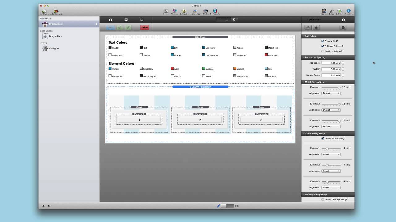
09:02 the next is collapse columns
09:04 and what this setting does is it removes
09:06 all the padding
09:08 between each column so if we turn that
09:10 off and do a quick preview
09:13 we'll notice that we have gaps in
09:15 between each of our columns
09:17 right we have a gutter however if we
09:22 were to
09:22 uh turn that off so if we go here and
09:25 then turn
09:26 collapse columns on sorry
09:30 and then preview we'll notice that the
09:32 the gaps between them
09:33 are removed okay so there's gonna be no
09:36 gap
09:36 between them now the next option is
09:38 equalize heights and we'll go over that
09:40 in just a little bit
09:42 the next is responsive sizing and these
09:45 features
09:46 allow you to define the gap at the top
09:49 the bottom and basically the gutter
09:53 when the columns break okay
09:57 so what do i mean by that so top space
10:00 is current is the space from the
10:02 basically
10:03 it's basically your top margin for all
10:05 three columns
10:06 okay the gutter if we add this say
10:10 one okay um this
10:14 is the space from that is added to the
10:17 top of each column
10:19 now how is that different than the top
10:22 space
10:23 the top space is the amount of space
10:25 that covers the entire top of the three
10:28 okay the gutter is individual space
10:30 that's on top of each one
10:32 now why is that important for
10:34 illustration let me turn off tablet
10:35 sizing
10:37 and you'll notice that um if i were to
10:39 set the gutter to zero
10:41 okay the columns get closer to each
10:44 other okay
10:59 rems okay and this is a relative
11:02 m which is essentially um
11:05 sort of like an m but it's relative to
11:08 the root element
11:09 on most browsers that means 16 so
11:12 3 times 16 is going to be
11:16 48 okay
11:20 and then 5 times 16 is whatever that's
11:22 what that space is going to be
11:24 so you can kind of get do a guesstimate
11:26 on what that is and the reason these are
11:28 important is because uh it'll actually
11:30 expand and contract
11:32 uh on devices so it's it's a really
11:34 great unit for responsive design
11:38 but getting back to this the top space
11:40 is
11:41 here right from the label to this
11:44 background grid
11:45 and then we have our gutter which is the
11:48 from
11:49 you know the top of our our space here
11:51 to the top of the panel
11:53 from the bottom of this panel to the top
11:55 of that panel from
11:56 the bottom of this panel to the top of
11:58 that panel so the gutter is important if
12:00 you want to have
12:01 spacing between your columns when they
12:04 break
12:05 okay and then the i'm going to turn on
12:07 back on tablet sizing
12:09 and then the bottom space is simply the
12:11 space at the bottom
12:13 of all three columns so if we set that
12:16 to three
12:16 we'll have a nice uh you know space
12:19 between let's say we
12:20 wanted another three column stack below
12:22 here so that's how we define
12:23 spacing for all of our columns now let's
12:26 jump into the meat
12:27 here and that's sizing now if we notice
12:30 earlier i turned off tablet sizing
12:32 and that's kind of cool because right
12:34 now we turn off tablet sizing
12:36 and we notice that what is defined on
12:38 the mobile level
12:39 is now inherited all the way up to the
12:41 desktop level
12:43 and i can change that as you see here we
12:45 have mobile sizing set up
12:46 i have column one column two and column
12:49 three
12:50 and i can just simply adjust these to be
12:52 whatever i want
12:54 so i have six and then if i were to
12:56 change this to
12:58 now watch once i get down to six bam
13:01 right i now have six and six
13:04 since the total of those is less than 12
13:08 both of those two columns will show up
13:10 on the same row
13:12 as soon as the addition or the math is
13:15 greater than 12
13:16 it breaks and it will go on to a new row
13:19 of its own
13:21 so that shows you an example of how
13:23 these columns work
13:25 and what's great is you can see this all
13:27 live happening directly inside edit mode
13:29 you don't need to preview anything as
13:31 you resize your columns
13:33 you will see things uh you know resize
13:36 i'm going to turn off this preview grid
13:38 as i as i resize this this one
13:41 let's say i want 12 and i want 12 and
13:44 i want 12. and you go that's what i want
13:46 to be
13:47 in mobile i want it to be like that then
13:50 you can move on to dust onto tablet
13:52 sizing
13:53 now in tablet sizing for a three column
13:56 stack chances are tablet sizing
13:58 four four and four would would work well
14:01 uh because that
14:02 uh will allow everything to still remain
14:05 inside one row
14:07 yet uh you know still it's wide enough
14:10 to kind of show your content but
14:12 if your content is isn't uh maybe you
14:15 want to do you know
14:16 seven and seven and four i don't know
14:20 right i'm just kind of guessing here i
14:22 just want to throw out something
14:23 different because then
14:24 when we go to desktop you can then
14:26 change even further
14:29 and then you know so you can have three
14:31 different sizing
14:32 units here you can have mobile sizing
14:35 tablet sizing and desktop sizing
14:39 and it inherits up so if you turn
14:42 off desktop the tablet sizing is going
14:45 to be used
14:46 on the desktop what's with this
14:48 alignment okay
14:49 so for each column you can set an offset
14:53 or source order and we kind of went over
14:56 those earlier
14:57 where you can actually move and shift
15:01 your columns around
15:03 okay so i'm going to turn off tablet
15:05 sizing again so we can kind of see this
15:07 in action
15:08 so i'm going to reduce column one down
15:10 to six
15:11 columns or six units and then i'm gonna
15:14 i'm gonna define an offset and then i'm
15:16 gonna offset
15:17 that by three
15:20 okay as you see right now i have a
15:24 column that is six units wide if we
15:27 wanted to turn on preview grid
15:28 we'll notice that is one two three four
15:31 five
15:32 six columns wide and it is offset
15:35 by three units because i've i've shifted
15:38 it over to the right
15:39 by three and you can do this with
15:42 everything right so i can then go ahead
15:44 and change my
15:45 my column two and offs that offset that
15:48 if i'd like
15:49 right the same thing and
15:53 not only are the sizing uh inherited
15:56 but so is the alignment
16:00 so if i turn on tablet sizing here if
16:02 you'll notice here
16:04 uh my alignment is set to inherit
16:08 now if i want i can change that and do
16:10 offset zero
16:11 and then kind of reset everything right
16:15 so let's say i want to have it offset on
16:17 mobile but not offset
16:19 on tablet you simply set on the tablet
16:23 to offset
16:24 and you set that to zero and you now as
16:27 you notice here
16:28 my column two now moves over uh to the
16:31 same row
16:32 as column one because the we no longer
16:34 have an offset that's going to
16:36 cause it to break that is the crux and
16:38 the power
16:39 of foundation columns you can have
16:43 sizing alignment it all inherits from
16:45 mobile
16:46 up to desktop and you can override those
16:49 settings or inherit them
16:51 from again mobile all the way up to
16:53 desktop it's very powerful
16:56 okay so if you want to use the equalize
16:57 heights option it is really easy to set
17:00 up
17:01 essentially inside your column stack
17:03 your foundation column stack
17:05 you have to check the equalize heights
17:06 setting now there's a little bit more
17:09 that you need to do
17:10 you actually need to go to each content
17:13 column so in this instance we have a
17:15 panel stack
17:16 and you have to check the equalize
17:18 height setting there as well
17:20 so you need to go to each one and check
17:21 that
17:23 the reason this is the reason why uh
17:25 specific content stacks need to support
17:28 the equalize height
17:29 options because there needs to be a
17:30 setting so again right now that exists
17:33 the panel stack
17:34 the pricing table stack the jack stack
17:37 which is not inside foundation
17:39 and hopefully in the future we'll have
17:40 even more stacks that support this
17:43 great equalize height option but that's
17:45 all you need to do
17:46 as once you set the equalize height
17:49 option in each of your panel stacks
17:51 as well as your column stack you should
17:53 be golden
17:54 uh it's really a piece of cake now let's
17:57 jump
17:57 into the power of the one column stack
18:01 and a lot of people think of why why
18:03 would i need a one column stack well
18:05 let's show you how it differs from the
18:07 normal other column stacks since it is
18:10 just
18:10 one column it's just a kind of invisible
18:13 box right
18:14 that contains things so we still have
18:17 the same thing we still have preview
18:19 grid and collapse columns
18:21 the defining sizing is a little bit
18:24 different you have checkbox to define
18:26 desktop and tablet sizing and you have
18:28 your mobile tablet and desktop sizing
18:30 here at the bottom
18:31 now you also notice that there is a max
18:33 width option and this allows you to
18:35 define a max width of the content that
18:37 you're going to add to it
18:40 now i added this to help people
18:42 transition
18:43 however i i play that you actually try
18:46 not to use max with and please learn how
18:48 to use the grid
18:49 because in a majority of the cases you
18:52 actually don't need a max width option
18:55 in maybe five percent of the cases i can
18:58 actually see that being useful
19:00 however by utilizing the grid system
19:03 chances are you can get exactly what you
19:05 want without
19:06 setting this map miss max with option
19:10 okay so just like any others you can set
19:13 um
19:13 mobile defaults so you can say i want
19:15 mobile to be seven units
19:17 tablet to be six units and desktop to be
19:19 three units if you want
19:21 whatever right and then all of course
19:24 all of those inherit
19:25 up if you don't have desktop sizing
19:27 it'll hear it from tablet if you don't
19:29 have desktop or tablet it'll inherit
19:31 from mobile
19:31 but that's not too exciting what else
19:33 can i do with the one column stack a one
19:35 column stack
19:36 uh has some more alignment options that
19:38 the other ones don't
19:39 and essentially that is sent being
19:41 centered and uncentered
19:43 so what we could do is let's say i want
19:45 my these three columns
19:47 um to be perfectly centered within uh my
19:51 browser window and so essentially
19:54 let's say i want to use a one column
19:56 stack and
19:58 here let's just keep this simple
20:01 um i'm going to set it to be
20:05 six uh well we'll do eight units
20:08 okay um because that's the kind of width
20:10 i want my three columns to be
20:12 but then i want them centered so i set
20:16 the alignment to be centered
20:18 and the content for those eight columns
20:21 are going to be centered
20:22 now you might think well i could just do
20:24 that with offsets
20:26 yes but what if you kind of have like an
20:28 off
20:29 an odd number um let's say you have
20:32 um nine okay
20:35 um because nine uh you have three units
20:39 on each side
20:40 or you know how can you center you can't
20:42 really center
20:43 content when it is nine units wide
20:46 using offsets okay so this is where the
20:50 one column stack is powerful
20:52 um at this point i have a three column
20:54 stack
20:55 that takes up nine units
20:58 and then inside that three column stack
21:01 we still have the same thing right
21:03 now how does that work my one column
21:05 stack is broken up into
21:07 12 units and as we see here i'll preview
21:10 that
21:11 but then my three column is that broken
21:14 up into 12 units as well
21:15 yes so if i turn on this
21:18 now this kind of this might be a little
21:20 confusing to look at here but if you
21:22 notice i have a larger grid
21:24 in the background for my one column and
21:26 then inside my three column i still have
21:29 a 12 unit
21:30 grid it's just smaller so
21:33 foundation every single column will take
21:35 up 12 units no matter
21:37 its total width okay
21:41 so this means that you have no problems
21:43 nesting column stacks within each other
21:47 now granted having multiple previews on
21:50 like this
21:50 could be a little bit confusing so you
21:52 might want to only have one
21:53 or multiple on at a time or not have
21:56 multiple on at a time
21:58 okay so edged edge content how do we do
22:01 it
22:02 what is the mythical force that allows
22:04 us to do this
22:05 well it could not be simpler
22:09 now in order to do this i just want to
22:12 explain
22:13 one thing that i've kind of not
22:15 mentioned
22:17 inside site styles we set a max
22:20 bat a max width for our website and what
22:23 that here is
22:24 1000 pixels so what that means is
22:28 if we preview our site the content will
22:31 never exceed
22:32 1000 pixels what actually
22:35 makes that content obey that setting
22:38 is the foundation column stacks
22:42 so it is the actual column stacks that
22:45 restrict the width
22:46 of its content to be a maximum of 1000
22:50 pixels or whatever you have it set with
22:52 insight styles
22:54 so the key to make something to break
22:57 outside of that max width setting
23:00 is simply not to add it inside of a
23:02 foundation one column stack
23:04 to show you how easy that is let's um
23:07 move this
23:08 image so as you see here when we
23:10 previewed um the content in the image
23:12 both lined up and they wouldn't grow
23:15 past
23:16 this is actually 1000 pixels wide
23:19 okay and we have a small buffer around
23:21 the outside
23:23 but if we were to add this one
23:26 image outside of the foundation column
23:30 stack
23:31 so right now it is outside of any sort
23:34 of foundation column stack
23:35 now we're using an image in this example
23:38 but it could be anything it could be a
23:39 slideshow
23:40 it could be um a jack stack that shows a
23:44 cool background color like i have on my
23:46 foundation website
23:47 all of that bleeds through so let's go
23:49 ahead and preview that
23:51 and what we'll notice here in quick
23:52 preview is that the image now goes the
23:55 entire width of my browser window
23:58 now if you want to see that in action in
24:00 a web browser let's have a look
24:02 so just in case you didn't trust my
24:04 quick preview mode
24:06 this is the exact page inside safari
24:09 and what we notice is my content break
24:11 you know it does not
24:12 exceed the max width of a thousand
24:14 pixels because
24:16 the foundation column stacks respect
24:17 that however this image is not within
24:20 the foundation
24:21 column stack so it takes up the entire
24:24 width of the browser
24:28 it is as simple as that and that does it
24:31 for the grid everybody i hope you really
24:33 learned something
24:34 now something that i want to make sure
24:36 that you know is this grid page
24:39 is really fantastic not only
24:42 is it because i've taken the time to
24:45 write everything out and explain
24:46 everything
24:47 but all of these great examples that
24:49 you've seen here
24:50 are available inside the foundation demo
24:53 project
24:54 so make sure that you check out the
24:56 foundation project and go ahead and
24:58 start playing with these now you can
25:00 either play with it here or create a
25:02 demo project and start playing with the
25:04 grids
25:04 and the columns and seeing how the
25:06 offsets work and how source order works
25:09 now in terms of source order the
25:11 examples that are inside the demo
25:12 project
25:13 are fantastic they're real world live
25:16 examples that you can copy and paste
25:18 into your existing projects
25:20 and tweak to your desire right
25:23 so look at these play with them really
25:25 experience is
25:26 key with i think with anything so the
25:29 more that you play with the grid
25:30 i bet you within minutes you're it's
25:34 going to click with you
25:35 and you'll be off to the races making
25:38 beautiful
25:38 fabulous websites so thank you very much
25:41 everybody
25:42 i hope that you uh enjoyed this i hope
25:44 you learned something
25:45 and i hope you love foundation so go
25:47 forth and make your websites great
25:49 thanks everybody bye
26:04 you"}]
Search the page
0
